[USIPS] Logo Design Collaboration

  • 🐕 I am attempting to get the site runnning as fast as possible. If you are experiencing slow page load times, please report it.
https://www.metmuseum.org/art/collection/search?department=9&showOnly=withImage

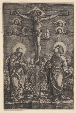
A lot of random examples of various etching and engraving styles through the centuries. If anybody is having trouble figuring out how to do their own work then these may be inspiring!
1736006730173.jpeg
 
1736015794941.png1736015805364.png
I think it would be cool to hide something in the shading of the boulder, similar to how Toblerone has a bear hidden on the mountain.
It doesn't have to be a kiwi bird. I know this is trying to be very separate from the farms.
I think it would definitely be worth the effort and time to hide something in the boulders shading.
Do you have any ideas?
 
  • Like
Reactions: Niall Meanwhile
from what ive read we are still not sure about what to do with the rock
so hide something in it would be premature
plus what should we hide in it?
 

Attachments

  • test15.png
    test15.png
    399.5 KB · Views: 17
from what ive read we are still not sure about what to do with the rock
so hide something in it would be premature
plus what should we hide in it?
1736019873657.png
How about a pig with wings, symbolizing how likely the Internet is going to remain the "upper case I" Internet in the next 10 years.
Maybe ask Null to ask the team of people he's working with for ideas. I don't really know what this company is going to be for i just like logo design.
 

Attachments

  • Colonized.JPG
    Colonized.JPG
    65.7 KB · Views: 7
from what ive read we are still not sure about what to do with the rock
so hide something in it would be premature
plus what should we hide in it?
1736023520142.gif
Perhaps try a style like this? Just dark shade the bottom most curve of it then just use a simple outline, a few detailing lines to show "cracks" and a few smaller patches of dense hatching for grooves in the boulder.
 
Holy shit, I have absolutely no hatching skill. Everything I try looks like shit. I did make some greek-style hair but it doesn't really match hatching AHHHHHHHHHHHHHHHHHHH IMMAH FUCK - A DUDE, DUE IMMAH FUCK A DUDE!

1736045538533.png
 
  • Optimistic
Reactions: K!w!Fartz
Holy shit, I have absolutely no hatching skill. Everything I try looks like shit. I did make some greek-style hair but it doesn't really match hatching AHHHHHHHHHHHHHHHHHHH IMMAH FUCK - A DUDE, DUE IMMAH FUCK A DUDE!

View attachment 6821958
Try laying down a flat black block of colour for the hair then "carving" the curls from the shape. The original image had only the highlights to give the implication of shapes in the hair. For curly hair, simply do that but curly shapes.

Also curly hair still grows in the same silly spiral that straight hair grows in (note how the hair in the original image seems to be coming out from a specific point on the upper back of his head?). Flow is essential, keep a direction in mind.

EDIT: Just some typos
 
Holy shit, I have absolutely no hatching skill. Everything I try looks like shit. I did make some greek-style hair but it doesn't really match hatching AHHHHHHHHHHHHHHHHHHH IMMAH FUCK - A DUDE, DUE IMMAH FUCK A DUDE!

View attachment 6821958
A simple way of doing hatching is just painting the shading in solid layers of gray then putting a line filter through it
 
This is what I managed to get before I read everybody's helpful tips. It's way too busy and the hair will need a complete redo, but...

1736108941201.png

I think I might be figuring this out iteration after iteration. The key is accomplishing the stern shaded look but using less lines. The problem is that I don't have instinct for how to use few lines, make it FEEL dark, and also leave the jagged, hard, stern face features.
so it might a skill issue on my part since i never did digital art before
And my problem is that I've only ever done digital work of a more graphical nature so trying to use digital software to mimic real artistic talent (artist drawing paper references and then guys literally engraving metal plates with chisels after gluing the drawing on) is a real learning experience...
 
  • Like
Reactions: K!w!Fartz
ok ive been genuinely trying to make it work and im still not sure about the result
so it might a skill issue on my part since i never did digital art before

View attachment 6823924
Best one so far.
I think the left foot needs a bit of work. its too long and looks like a sock that is coming loose.
also i know he's muscular and got big mussels but the diameter of the wrists stay the same on a person regardless of how much mussle they build.
1736109355545.png
Here's my attempt at a redo of the left foot.
I think the foot needs to face the camera a little more, not as much as your other one but like a 10 degree turn.
1736109488946.png
So, instead of the red line, it should be the blue line.

Also, while the shading on the boulder looks good from a distance, when you zoom in, it's not practical for a vector/doesn't look good.

Also, how has nobody got any ideas yet for what to hide in the boulders shading? I thought somebody would've had an idea by now.
 
Back