Are those the pictures going on the website? They're shit. The depth of field is off, the background is too sharp. It should be blurred more, like the mystery meat one (thats a woman, real fatty breasts look like that).
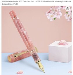
In a product photo you don't want the background to compete with the product. For small items like this pen it works fine, because of the scale of the items and the color story of the picture. Notice how the photo is all shades of pink, with the pen standing out the most, on a contrasting "floor".
It's visually interesting, but not busy. The pen is the obvious focus, and nothing in the picture clashes.

Now look at those pictures of Jaclyn. Notice how busy the background is against an equally busy set of whatever that is. Couple that with the background being almost in focus and your eye doesn't really know where to land. Obviously your brain knows where it's supposed to land, but it's harder than it has to be. The background is largely green as well, and so is the whatever he's wearing. The two shades are both too close to each other in hue and don't match at all. Again blurring it would improve things, but it would be better off against a lighter background, perhaps a brown or a dark blue.
The background in the mystery meat picture is also busy, but it's blurred so it doesn't distract the eye.
I'm not a professional photographer or set dresser. I barely know anything about this, but I do know when something is done wrong, and this is wrong. Any professional would know this and far more.
The lighting isn't great either, it's inconsistent between shots, but I know less about that. Much of that can be fixed in post too, so it's less important than color story and depth of field.
/autism
Edit: also, lol fat


