[USIPS] Logo Design Collaboration

  • 🐕 I am attempting to get the site runnning as fast as possible. If you are experiencing slow page load times, please report it.
I thought I should get feedback before I spent any time refining my submission.
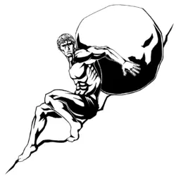
IPS_Logo_Rough.png
I used @Taxidermied Rat 's design as a basis while incorporating some basic changes and trying to overall simplifying the shadows to make it easily recognisable at any size. I also simplified the ground to a single line to maintain the concept but not draw the viewer's eye away from the person/rock.
 
I thought I should get feedback before I spent any time refining my submission.
The only thing that's not on point about this is looking forward, and that I think some of the lesser shadows should be reduced to engraving lines instead of hard black. What this does well, is it handles a problem with the hard black. Black draws the eye, but the shadows being straight down actually draws the eye to the character anyways because they sit on him.
 
  • Informative
Reactions: Oliver Onions
The only thing that's not on point about this is looking forward, and that I think some of the lesser shadows should be reduced to engraving lines instead of hard black. What this does well, is it handles a problem with the hard black. Black draws the eye, but the shadows being straight down actually draws the eye to the character anyways because they sit on him.
draft3.1.png
Does this look fine for shadows on the face?
 
  • Like
Reactions: NoReturn
There was a much earlier draft that has basically the perfect looking head and expression, with traditional greek locks and a more determined face with shadows cast over eyes.
 
  • Like
Reactions: NoReturn
I thought I should get feedback before I spent any time refining my submission.
View attachment 6813263
I used @Taxidermied Rat 's design as a basis while incorporating some basic changes and trying to overall simplifying the shadows to make it easily recognisable at any size. I also simplified the ground to a single line to maintain the concept but not draw the viewer's eye away from the person/rock.

I like this face way more. Looks more mature and badass.
Looking at the viewer is an improvement, imo. Looks defiant and captures the attention of the viewer better than looking down like a soyfag.

Something is wrong with the left leg, though. And the way the spine/back connects to the head. I would recommend asking some artfags to redline this from the anathomy perspective.
 
I'm doing a redraw of one of the previous versions while keeping in mind other peoples attempts
keeping shadows hard and outlines clear
i have questions about the rock
do you want the simplified version of my previous attempt or you want a very round version?
do you want it to be higher on elevation or on the same level as the body?
looking at it now i can definitely see rock needs to be higher
1735832022782.png
 
Last edited:
It's way too abstracted and simplified for what Null currently wants, but if there is ever a need for an extremely simplified version for a really small logo version I wanted to mention it for posterity/inspiration.
I'm quite fond of the works of Hungarian director/animator Marcell Jankovics. Coincidentally, one of the animated short films he had directed was about Sisyphus. It's drawn only in ink strokes, with the strokes drawing Sisyphus getting increasingly more simple the further it zooms out to show the scale of his burden. It's sadly mostly boulder facing, but there are like 1-2 seconds worth of frames of him pushing the boulder with his back against it around the 1:05 mark.
 
Thank you! I was having trouble capturing the je ne sais quoi of your sisyphus expression/face. I think this should be better now?
That's very, very good.

I am curious: if you lift his head up more, does it create an anatomical issue?
 
Not to my knowledge it shouldn't.

Does this angle look good?
Reminds me of those spry Greek pottery drawings, a good and distinct submission to the collab! His toes being like that gives me anxietylike he is holding back the boulder with only the slimmest thread of strength between him and certain death... but also pissed off at the whole thing.
 
  • Like
Reactions: Taxidermied Rat
Ah, yeah this is really good now. The perspective distortion from the particular viewing angle you posted of the model that the initial is based on is gone. The reason that the original had the distortion you copied into the draft is because those perspective distorted parts of the model were outside the 60 degree field of view of the human eye.
 
Back