Apple's App Store art is fucking horrendous | Flat art / Alegria / Corporate Memphis - click for feet

At least it looks drawn
and uses more than four different colors, and has a cohesive aesthetic to it. It's like Alegra but still has at least some soul in there

so I looked around found a subreddit full of examples: https://old.reddit.com/r/GVCDesign/

when it's bad, it's really bad:
1646696055165.png

but when it's good, it's surreal:
1646696197220.png

I guess that's a big component of what makes Alegra so damn contemptable, it's all ubiquitously terrible, and it's like, nobody in any kind of corporate art department does anything even close to imaginative with it.
 
and uses more than four different colors, and has a cohesive aesthetic to it. It's like Alegra but still has at least some soul in there

so I looked around found a subreddit full of examples: https://old.reddit.com/r/GVCDesign/

when it's bad, it's really bad:
View attachment 3052842

but when it's good, it's surreal:
View attachment 3052855

I guess that's a big component of what makes Alegra so damn contemptable, it's all ubiquitously terrible, and it's like, nobody in any kind of corporate art department does anything even close to imaginative with it.
The floppy disks reminds me of some of the best art from BYTE magazine covers.


1646719609764.png


1646719653375.png


1646719734243.png


Maybe I can spinoff a retrofuturism thread
 
The floppy disks reminds me of some of the best art from BYTE magazine covers.
View attachment 3053854


Maybe I can spinoff a retrofuturism thread
Wack how close this was to reality but just off enough to be funny in retrospective. Smart watches with sd card compatibility exist these days and you could probably make one look nearly identical to this.
 
when it's bad, it's really bad:
View attachment 3052842
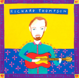
That album had two covers, a rare near-minimalist white and purple one that was mostly on promo copies, and this crappy one. I happened to buy one of the white ones and listen to the album about a dozen times before I saw the standard cover in an ad. I wouldn't have taken it seriously enough to listen to it once if I'd seen that.

From about 1988-95, "adult alternative" album covers that weren't Morrissey or Peter Murphy all looked like ads for a coffee shop in a mall. The style did a great injustice to a few great records, but the kids were right to be repulsed by it and go buy an Alice In Chains CD instead. It was the first true "globohomo" commercial art. The "international style" and Bauhaus and etc. were distinctly European. This shit was from nowhere and/or corporate hell.
 
Last edited:
I stumbled upon some examples of corporate artstyle of the 90's and immediately thought of this thread.
View attachment 3052555View attachment 3052556View attachment 3052559View attachment 3052560
Turns out it has a name, it's called "Global Village Coffehouse". I'm not gonna go explain its background or the themes it tries to convey, you can look it up yourself. What I'm thinking of is: sure, it looks more appealing than Alegria, but is it really so, or it is just my nostalgia speaking?
What do you think?
I like it. It's jazzy and bustling like SimCity. The third one probably shouldn't be included though, that's actually a real illustration with like, shading and art and stuff.
All these illustrations of human with small heads and huge arms and legs always remind me of Tarsila Do Amaral's art. You probably saw one of her most iconic paintings:

View attachment 3054816
I don't particularly like it, but this just screams flat art to me.
screams footfag to me
 
Back