

Lemme start by picking a random cover from that series I mentioned (and before you ask, yes I'm a pasta nigger and no, I don't give a fuck about ketchup in your broken spaghetti, choke yourself on a block of cheddar):

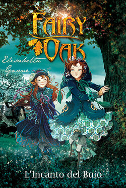
Let's start by aknowledging that the art is pleasant, it's well drawn and the characters have a pretty distinct look, with both poses and expressions alzo immediately giving you a small insight on their personality (respectively the first one one is probably brave and adventurous while the other is a little more restrained but kind) and the clothes grants to the whole thing a very cozy and pleasant look, somehow accentuated by the rough, metal title done with early 2000s 3d art that di call for a many other things, making it fit for multiple covers, but in this case the fairy provides a light source and the text's warm colours ultimately contribute to the comfyness transmitted by the two sisters clothing. The background is also a key aspect, uf you try to argue using a photo is cheating, go fuck yourself, it is a very good baclground that succeeds at doing everything it needs, it melts very well with drawn characters, and title whole transmiting is an air of mistery and intrigue to tho whoever picks up the boom, it makes you ask where the characters are, what are they looking for and what else is outside of your view in said cover. As I said, I never read any of these books, but I often held them in hand, simoly looking at the cover and imagining my story behind the potrayed scene.
Now let's look at this thing.

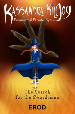
The witch is very poorly drawn and designed, what she's wearing is a very generic wizard dress without almost anything particular and the stuff like necktie doesn't really pop out as much as the artist would think, it is a practical dress, but aside of the striped socks, the whole monotone clothing without accessories of any kind don't says anything about it, and even those socks that I mentioned are immediately ruined by the sneakers fucking the whole witch look.
The pose is generic and the expression is so neutral that I wouldn't be suprised if you were to tell me that this ginger has no soul, unlike the two above.
Background doesn't really tells you anything, it's feels even more generic than the landscape photo and the colours don't fit for a magical witch story either.
If you want to write a magical fantasy novel then you need to potray something that gives a specific type of atmosphere that can be either dark and/or cozy, in a way that makes you think of something like european suburbs surrounded b nature; Orange and black are the kind of autumnal colours that can be used to get something similar easily but this weird black hole or giant asshole thing with the eeeeeevil hand coming out of it doesn't really says anything. Unless it's porn, background usually makes the difference in gaining the attention of whoever looks at it, let it be monochromatic, extremely detailed, a starry sky or even just a fucking orange goatse like this thing. Seriously I don't know how but the hand makes it even worse than it already is.


