Bitching about ugly art thread - For art you think is ugly and want to bitch about

And with this other stuff, what fucking difference does it make?! He tends to draw obvious little boys and sometimes little girls get fucked in the ass by deformed freaks that apparently resemblance human beings but thinks that putting the description of "(These characters are 18 or older)" is going to make everything okay, he draws that sickening stuff often, I don't see what difference would it make if he actually does it.

The scat and gore doesn't make a difference if seeing his stuff makes me wanna vomit regardless. I can't imagine this degenerate doing those kinds of drawing, it would be more horrible than I imagined.
I've seen plenty of coomer artists pull the whole "erm actually CHUD, these characters are all adults!" card all the time, even worse when they have an account on a website that allows that sort of content (like Inkbunny) and only there do they proudly admit what the art truly portrays. Good example is someone like 0r0ch1, where it's so blatantly obvious what kind of shit he draws but everyone just turns a blind eye and pretends it never existed.
 
James Bear
This once again falls under that "overly cutesy/simplified coomer gooner look" I talked about in the Tranny Artstyles thread, but there was just something so off and irritating about it and I couldn't put my finger on what (on top of his unfunny humor and using his gf as coombait).
Glad to know my intuition was proven right seeing as he was caught fucking his sister and apparently abusing his (now ex) gf too.
And speaking of awful youtuber art.

TheWinterer
Let me preface this by saying I don't like VivziePop's (the great fujoshit mind behind Hazbin Hotel and Helluva Boss) artstyle. In fact, even her old art wasn't that good and still has a lot of problems with what her art looks like now (overly exaggerated, swirled lines and twig figures), but was still better than what it is now. So I have to ask why anyone would want to adopt such a shitty artstyle and make it even worse than the person who propagated it like what The Winterer does here. Everytime I find these thumbnails recommeneded to me, I get annoyed the fuck out of this faggot and his shitty art on Deltarune characters. There's something so fucking grating seeing this dipshit take after a shitty "overly swirly" tumblr artstyle and get tons of recognition from it. And just like James Bear, I get a skeeved-out fucking feeling from him like he's definitely got some major fucked up skeletons in his closet. It's only a matter of time before he's caught with grooming minors on Discord or some shit.
He's also trans and a Philipino+Scots mutt btw.
 
my intuition was proven right seeing as he was caught fucking his siste
:stress:
There's something so fucking grating seeing this dipshit take after a shitty "overly swirly" tumblr artstyle and get tons of recognition from it.
It almost feels like a response to more popular cartoons of the past decade and the Steven Universe face.
 
Glad to know my intuition was proven right seeing as he was caught fucking his sister and apparently abusing his (now ex) gf too.
He's now claiming that's all false
1720519554765.png

He has his sister talk in the video but she's so monotone it seems likely she's just saying what James wrote for her.
 
I have a major beef with this "anime but it's not anime" art style that we see in modern western cartoons.
It first appeared in The Legend of Korra, but then got super popularized by Voltron
Technically it started with Avatar: The Last Airbender
Both tla and korra hired (mostly) the same studios AFAIK. And the success and well received animation of them caused those studios to become used more widely, including by Netflix.

Also funny fact, the studios who use(d) this style are almost entirely Korean;
JM Animation
DR Movie
Moi Animation
Studio Mir
Studio Pierrot aswel IIRC but they're Japs.

Also DC hired those, and related, South Korean studios for their animated media, especially the animated movies.

The style mostly got succesful because early DC animated films, the last airbender, and korra used them so effectively.
Naturally netflix and their dogshit properties caused the style to become hated and overused.
 
Last edited:
I wouldn't call this ugly art or anything, but I don't really know any other thread that where to post this specifically, my other biggest pet peeve about anime art in the online western cycles is how almost all artists that do "90s anime redraws" think that 90s = Sailor Moon, maybe sometimes Ranma 1/2 and nothing else.

Examples of this
1720544772258.png1720544988962.png
1720545205420.png

The reason why this bothers me a lot is because 90's were a time period where we seen
some of the most diverse, experimental and exaggerated styles for anime.
1720547007777.png1720546263340.png
1720547034548.png1720546208972.png
1720547069803.png

It's a shame really, you'd think with so many points of references they could go with and draw things based on them, they go with only one art style. The most ironic part of it is that even Sailor Moon, the anime these artist are trying to ape didn't always look super ultra detailed like they draw it, it heavily depended on which animator directed the episode and how much would they go with details. In fact there's this Japanese chart that documents all of the animators that worked on Sailor Moon and how they would draw the character, you can clearly see that details vary depending on the animator.
1720556452777.png
 
Last edited:
"jelly" artstyle. It's more or less repulsive than a standard, horrifying sjw art.
Take korean-styled semi-realistic portraits to the extreme and slap a bunch of stickers in it, or worse.. heavily muted colors. a lot of this artstyle has artworks of serious/unfazed asian girl with large ass lips.
 
Just wanted to say that Bosch is the best. The Garden of Earthly Delights is like Where's Waldo on LSD.


Oh god, the Frida Kahlo worship gets under my skin. The current crop of art school feminist types just like how she looks, not how her work looks. Notice how they're never into, say, Georgia O'Keeffe? Probably because you couldn't pick her out of a crowd. (Despite her paintings being immediately recognizable.)
Thank you for reminding me of O'Keeffe, her work is so refreshing, like the painting equivalent of a candle that smells like laundry.
My-Front-Yard-Summer_hi-res.jpg
I find it fascinating that she was so fond of the horribly toxic datura, I think that if she had ever actually been poisoned by it the hallucinations would have drastically altered the style and tone of her work.
Jimson_Weed_by_Georgia_O'Keeffe.jpg
 
"jelly" artstyle. It's more or less repulsive than a standard, horrifying sjw art.
Take korean-styled semi-realistic portraits to the extreme and slap a bunch of stickers in it, or worse.. heavily muted colors. a lot of this artstyle has artworks of serious/unfazed asian girl with large ass lips.
Can you post some examples?
 
I really hate the kind of "art" that is more of an inflammatory ego wanking by the artist more than anything. The kind of twitter garbage where the characters always have the most retarded shit eating grin across their face and is mixed with some kind of calarts artstyle. Like Hazbin hotel for example.

cringe.png


In mammals like humans, smiling excessively like this indicates the character is afraid and nervous. Not "badass" or whatever other autistic retard shit that makes most of these kinds of artists end up with a thread here. Its like the art equivalent of the beta male gawking face expression thread and frankly, its a red flag whenever I see this kind of retarded shit spammed across the internet even in completely unrelated places. Because 9/10 times the poster is some kind of mentally ill autist outside of explaining why you hate this "art". I am sure it could be worth a thread of its own due to how prevalent it is in recent years.

chimp fear expression.png

Source
 
Drawn by a man who's almost 40.
somehow stiffer after twenty years.jpg
This has the opposite problem of the Vivziepop style. It's a cartoon with no cartooning. Except for the one where they scream, there's no exaggeration. There are a few attempts to vary the expressions and posing (you might've noticed that he used the same "both arms outstretched in the air" pose and added two thumbs up to offset it), and he tried to use lines on their torsos to indicate that they're bending this way or that way. It's just not enough. Few poses use tilting, perspective, or even line of action. Save for a few arms, everything's on the same level. Too even. The antennae are the only things not consistently stiff and straight. Overall it just looks cheap and lifeless.
1721086886696109.png
 
Drawn by a man who's almost 40.
View attachment 6199487
This has the opposite problem of the Vivziepop style. It's a cartoon with no cartooning. Except for the one where they scream, there's no exaggeration. There are a few attempts to vary the expressions and posing (you might've noticed that he used the same "both arms outstretched in the air" pose and added two thumbs up to offset it), and he tried to use lines on their torsos to indicate that they're bending this way or that way. It's just not enough. Few poses use tilting, perspective, or even line of action. Save for a few arms, everything's on the same level. Too even. The antennae are the only things not consistently stiff and straight. Overall it just looks cheap and lifeless.
I adjusted his designs so now tumblr teenagers and twitter fags can like them
Expect million retweets of milquetoast ship
Untitled53_20240717181457.jpg
 
View attachment 6216979
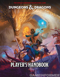
The quality of TTRPG art it's gone downhill I hate this disgusting pastel
the older D&D is way better
There's a lot of information in here being crammed in without it being clear. Black & white illustrations require clarity first and foremost, and have less elements to balance to make it so. The artist in the old edition is able to create focus with patches of light and dark and doesn't have to worry about clashing armor and lighting background colors.

The older illustration has some flaws, it does feel crowded and stiff, some anatomy that can be excused by the woodcut feel, but a greater focus has been put on one thing happening (a fight) and is framed by the bottom arm and the side party. It works well, there's focus and a good sense of character from the expressions, as well as a good use of texture & shading. It's telling a story and placing you in it.

The new one is actually stripped a bit of context: someone used the cropped image for an article but here's a bigger image.
IMG_3566.jpeg
This has framing, but it doesn't have good composition and lacks depth. The anatomy and painting skills are fantastic, but there's a clusterfuck going on with no center focus or drawing of attention. No one is interacting with each other. The colors aren't bad, but it could be more cohesive and could suggest direction more.

dungeons_and_dragons_dd_basic_set_3rd_edition_red_box_Mentzer_edition_1983.jpg
This cover isn't perfect, but it firmly sets a character in a location that is interacting with the enviorment. The movement of the sword & the angles of the character & dragon's position brings the eye in, and contrast of light sword on dark complex dragon mouth makes it stand out to bring focus to danger (dragon) and action (sword). It drops you into a scene of the world instead of a collection of characters posing with some dragons on the background. And yes, you could recolor the character black or any other skin color and generally have the same painting with the same feeling: it's about establishing "come into this world - it's literally popping out of the page!". Meanwhile, the new one is more of a clusterfuck trying to showcase a multiplayer party in different poses kinds just hanging around against their ren fair's photo background.
 
Back