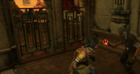
Am I having a memory lapse or does this actually look about on par, visually, with ACII on the PS3?
I don't know if it's partially caused by youtube's shitty compression, but besides some textures, some effects and most models, the minimalistic GUI and the forced animation, this could pass for a mid-gen PS3 game, I agree. I also think that the brown filter smeared over everything (that I've seen so far) helps it invoking a seventh-gen feel to the whole thing.
Now that I have stopped to look at it, it shares a lot of problems with Star Wars outlaws in the presentation department: wildly inconsistent level of detail, assets clashing with each other like they come from different games, pitiful attempts to mask loading times and an insistence on using very complex mo-cap animation on models that can't handle it so they look like somebody dropped an Oblivion character's corpse down the uncanny valley.
It's actually bugging me, I don't what it is but nothing feels like it belongs to the things they are surrounded by, it feels like I'm staring at a game made from parts from other game's cadavers.

On this picture alone there's three generations of graphical fidelity represented on the background: You have a nice-ish tile texture on the floor, that even has a subtle hint of a bumpmaping effect and a crisp texture that might pass for a modern game asset, you have blurry low poly walls and columns that scream early PS3 game or a need for an urgent visit to an ophthalmologist and then you have a metal... fence? door? thing that has a polygon count almost in the single digits with a generic default "rust" texture lazily pasted on without any concern for geometry that wouldn't feel out of place in a VERY early PS2 game. All on the same screenshot. I won't comment on the character's textures since I don't know if they are completely lost on their own noise because they are badly designed or Youtube's compression isn't playing nice with them, so I will give them the benefit of the doubt there. This is a problem every AAA game suffers from, obviously, but there's a craft in hiding your most embarrassing assets and cutting corners for performance's sake, sadly that's mostly a lost art in this gen in general.
On a less technical aspect the game's design is even more of a mess:

I don't know what the fuck is happening with the art design in this game, and I'm not a professional artist or anything, but I can tell from this market sequence alone that something very wrong happened here, and I could spend all day pointing out the amateur mistakes in this part of the game alone, so I will just point out the obvious: having background NPCs dressed in highly saturated, untextured, almost primary colours is a fucking sin when the environments surrounding them are dull, lifeless and brown, your main character is much, much more muted and to add insult to injury you smear brown-tinted vaseline over everything. You can't see it in this shitty screenshot, but even the fruit on the stalls is brown, dusty and depressing. I know what they were trying to do here, the whimsical colourful arabian/oriental market is not exactly original but they failed spectacularly. The contrast makes things feel like every single asset is pulled from a different game, none of them good. I'm going to blame it on excessive outsourcing without even bothering to check the game's credits.

