Business Discord users are cancelling their Nitro after new mobile layout update - Grooming, child predation, CP? I sleep. New mobile layout? Real shit!


Discord users are cancelling their Nitro subscriptions after the popular chat app launched its new mobile layout globally.

Months after Discord’s new mobile layout first became accessible through an in-app Easter egg, the company announced on December 5, 2023, that it will be rolling out to users globally.

This replaces the original app layout that many have become used to, prompting a bit of backlash regarding the change.

Due to the update, users on social media have said they’re canceling their Nitro subscriptions as a way to boycott the changes.

Discord mobile layout update leads to backlash​


In a reply to Discord’s update announcement on Twitter, a user asked if there would be the ability to revert to the original Discord mobile UI.

The company replied that the old layout is no longer going to be available, and users aren’t exactly happy with that answer. In response, many have called for people to cancel their Nitro subscription.
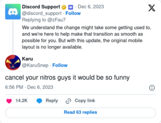
cancel.png
source (a)

“Cancelling nitro. You have no idea how much efficiency and money your ‘update’ will cost me,” one user replied.

Another said: “Yo Discord, I’m canceling my nitro Thanks for the update I never asked for, mobile app was just fine.”

“If they don’t fix this by the time my nitro is up, I will not be resubscribing,” a third user commented.

It’s unknown whether Discord would be willing to revert the new changes, but we’ve reached out for comment and will update you should they respond.

In the meantime, keep it locked to Dexerto for more news.
 
The redesign is baffling not because its bad (it is bad though) but because its so small and also completely needless. If the reasoning behind the set usernames is true that a few people pushed it through when no one could stop them I wouldn't be surprised if this was the same case.
 
The redesign is baffling not because its bad (it is bad though) but because its so small and also completely needless. If the reasoning behind the set usernames is true that a few people pushed it through when no one could stop them I wouldn't be surprised if this was the same case.
not to be a contrarian but i would argue the name change was good as it makes it easier to shill usernames and also makes it easier to remember incase you get banned and want to readd your friends
 
  • Like
Reactions: theshitposter
A bit of a meandering off the main subject of Discord, but why do tech companies and shit always change their UI so often? I don't understand this. They've been re-inventing the wheel for a better part of a decade now and I don't feel like UI has gotten any better since at least 2014. If anything it's gotten worse.

1. Company hires in-house design/"UX" faggots.
2. Said faggots need something to put in their weekly and quarterly reports, they can't just sit there and wait till something actually needs designing.
3. Faggots keep constantly making "cutting-edge" "improvements" to the user interface that only piss off users and the best you can hope is they don't break anything too badly.

Do not hire in-house designers, ever, under any circumstances. Hire a freelancer and then kick him to the curb when finished.
 
Is there something I'm missing?
Instead of DMs being at the top left like here:
View attachment 5550082
Now it's on the bottom here:
View attachment 5550083
Is that it?
from a quick glance at twitter, pinned msg aren't being autoexpanded, waste of space, movements aren't intuitive (like discord was ever usable lol)

after using the pirate mod of yt music for years, i thought one day to manually update the application. only i know the horrors i had to witness.... unnecessary long menus, hidden frequently used options, videos/podcasts in a music player, trending page like trash...
back to 5.39.52
 
Is there something I'm missing?
Instead of DMs being at the top left like here:
View attachment 5550082
Now it's on the bottom here:
View attachment 5550083
Is that it?
The big one is that pending DMs with new unread messages also no longer display on top of the server list. (It provided a very quick and easy way to see who DM'd you and also to reply.)

Now you need to first go to that button on the bottom, find the user that DM-ed you, then scroll to the latest message (because apparently they forgot how to do this), then only read the message.
 
It's not  bad, its just a very poorly thought out design change. Every action that took one or two swipes or buttons is now nested between two or three more steps.
Hardware technology is still moving forward while mainstream (read:majority) software has been continuously moving backward for a long time now. UI for retards BY retards. *sigh*

It sucks that discord is so unavoidable
Is it? I'm not shit posting here, I have never had to use it for anything I do so I am curious. Can you elaborate?

(like discord was ever usable lol)
I checked out one because an obscure torrent site I used set one up. It was retarded. It felt like IRC was raped by web 2.0LGBLTBBQ+.
 
Is there something I'm missing?
Instead of DMs being at the top left like here:
View attachment 5550082
Now it's on the bottom here:
View attachment 5550083
Is that it?
Performance is measurably worse, the things chugging for me loading a single 2-person server of light text chatting. It no longer reopens to the last channel/server you were in, instead defaulting to the 'Messages' tab - This is just one of those needlessly annoying changes where the application got actively worse for no good reason. Some people have said they find the new dark theming harsher, I have no strong opinion there.

Is it that big of a deal? Yes, fuck you, I'm not paying to have something I actually use become measurably worse because some UX designer got bored. When did people get so cucked that they could be shit on and asked to pay for the pleasure and reply "Lol guys cmon its no big deal it could be way worse". I'm not ok with anything else in my life getting shittier and more expensive at the same time, I'm not sure why software would suddenly get some magical exclusion.
 
Yeah, I mean, I'm not going to give Discord a dime, but the new mobile UI sucks all of the balls. It's terrible, and I have no idea who in the hell thought it was an improvement. It literally makes the features I use the most the hardest to get to, and the features I use the least it shoves in my face.
 
It's not  bad, its just a very poorly thought out design change. Every action that took one or two swipes or buttons is now nested between two or three more steps.

Minor in the grand scheme of things, but extremely fucking stupid from an end user experience. There is a way to revert it hidden in some vague corner of settings where you'd least expect, but it is there. Hell if I can remember where though.
Pretty much this, it renders a fairly functional (conceptually, we know about the insane content on it already) site way less intuitive.
 
  • Like
Reactions: Markass the Worst
i checked out one because an obscure torrent site I used set one up. It was retarded. It felt like IRC was raped by web 2.0LGBLTBBQ+.
snahp?

i once encountered a 4k plex server that gave you free access contingent to your regular discord activity
 
It sucks that discord is so unavoidable and absolutely proprietary. If alternate clients were allowed, people wouldn't be subjugated to such bullshit like dumb UI changes.
Unfortunately Ripcord has been MIA since its most recent update 2 or so years ago. A shame, too, since it was ideal for archiving channels and discord content.

I've seen people seething over the mute and deafen icons being altered.
 
Unfortunately Ripcord has been MIA since its most recent update 2 or so years ago. A shame, too, since it was ideal for archiving channels and discord content.

I've seen people seething over the mute and deafen icons being altered.
Oh no, the censorship tools have been moved slightly. The world's ending. Glad I don't have discord, this is gay as fuck
 
Back