Yeah, DBP's keep the Doom spirit, while trying to introduce new gimicks and themes here and there that don't overstay their welcome. I don't know what happened in the last 10-15 years in the general mapping scene, but the wads that get the more attention these days seem to be the "pretty", "atmospheric", "artsy", bloated abominations, because the casuals look at the eye candy screenshots and immediatelly conclude that they're masterpiece works of art, even if they don't have as good of a time playing them as they would with something grounded in the classic roots. I also heavily blame the cacowards influence, and everyone who's associated with them.
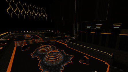
For a long time i've been a pationate critic of wads/megawads that consist of nothing but maps that drag for more than 30 minutes, with nothing but one contrasting color. It's always the same shit - one bright color that's usually, red, green, blue, yellow, teal orange, purple, or pink, and then rest is 80% rusty brown. It makes me wont to puke my guts. And most of the time there's no sky either, because that's shitty trend - black void = atmosphere apparantly. Fuck that, it's ass! Here's a prime example of such map with one color combined with brown diarrhea and no sky.

It's a nice picture, but nothing more. It looks like something that only a hyperactive autistic kid could make. Nothing in it tells me that this is a good Doom level first and foremost. And it's not, it's a piece of shit that drags on for an hour with retarded arena fights and confusing progression. Forgot what the map was called but it was made by that delusional retard Nirvana.
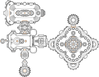
I also despise mappers, who are more concerned of how their map's layout looks when viewed from the automap, rather than design something that is fun to play and navigate. Find me one classic Doom/Doom2/Plutonia Map layout that looks prety in the automap? When are retards like Bridgeburner and Ribbiks going to realize that the automap looks doesn't matter, and trying to draw pretty shapes might take away from the gameplay at the end? I'm talking about shit like this:

Again... this is next level austistic shit, and there are hundreds of examples like it. The symetry alone is a big design flaw. A normal hobbyist mapper will never do this garbage

