Favorite/Least Favorite UI - How to navigate

The Last Stand

Lady Bougainvillea
True & Honest Fan
kiwifarms.net
Joined
Aug 17, 2018

UI (user interface) has been a recurring topic since Modern Warfare II's release. And for good reason. If it's cumbersome to access and use your product, many people may just give up and try something else.
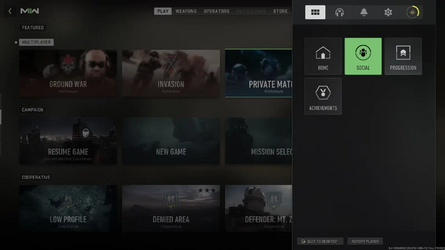
1668968363247.png

Look at all that wasted space on mere tiles with photos and text in them. No description, no personality, no ease of use. I could click on Invasion and not know what the mode is. And don't give me started on designers curating half of their UI for microtransactions. Tiles are not simple to navigate on with controller or mouse.

Contrast that with MW2 from thirteens year ago:


Options are laid out in a listed form. There's a brief description of what that option entails for the player. Everything takes up enough space as needed. Bonus points for the remaster having a moving, interactive background. It's clean, simple and practical for usage.

What's your favorite/least favorite UI and why? What makes a good UI?
 
  • Feels
Reactions: Haffhart
I think the most notable aspect of modern UI is how it has gotten significantly worse alongside the increase of UX. User Experience is about optimizing the experience of a product based on how people actually use it. What's important in that description is that it is not about optimizing for the user, which is what any standard UX Designer would lead you to believe, and often themselves believes. It is not about making an efficient, simple user-flow, even if it can be used in that way.

In reality, UX is an exploitative tool used by corporations to maximize the time and money people spend on a product. Shitty modern UI isn't because UX is simply a diversity-quota department, it's very intentional, and it will become worse as UX increases. It is also a large reason for other modern UI shit like flat/material UI design: corporate, mass producible efficiency. UX directly correlates with the influence corporations have in software, especially games.
 
Assuming we can talk about console UIs:
View attachment 3900678

View attachment 3900681
View attachment 3900687
Note the simplicity, lack of advertisements, and console specific design character not found in:

View attachment 3900720
View attachment 3900726
Missing the other theme kings.


Every manufacturer understood, for a short window, that the experience of everything around the game was as important as the games themselves. Then they slowly lost it, with Nintendo being the last holdout with the wii u/ 3ds. Those versus the switch ui are jarring.
 
Best Windows UI? Windows XP. So modern, yet vintage. Aged like Audrey Hepburn.
Nothing beats Windows 7 in both functionality and design for a desktop operating system. Had Windows stayed that way I probably would have stuck with it forever.

I would say Ubuntu's Unity desktop environment came pretty close as the Linux alternative but it's no longer supported. I have yet to try Unity7 which is it's continuation project.
Worst UI ever? Windows 8.
You should see Windows 11
 
Nothing beats Windows 7 in both functionality and design for a desktop operating system. Had Windows stayed that way I probably would have stuck with it forever.

I would say Ubuntu's Unity desktop environment came pretty close as the Linux alternative but it's no longer supported. I have yet to try Unity7 which is it's continuation project.
Have you tried i3 wm?
 
I loved the AmigaOS concept of dedicated "screens" for different applications you'd switch in between. While that was in many ways a technical necessity of the time thing, I didn't realize how natural and focused it felt to me until I replicated it on accident in my current WM a year or two ago. It's very easy to map out in your mind and after a while you just memorize on what "screen" what program is, especially if your computer runs for weeks. You don't need unecessary and repetitive feedback through task bars or other such things. Windows-like OSes with their stacking windows and taskbars never feel this clean. They feel very cluttered and chaotic. You feel like you need the omnipresent taskbar to have something to hold onto mentally. They're that cluttered.

I also have a soft spot of the MacOS of old. I've never used any MacOS past System 8 but these old OSes had a very specific feel to them that was very "comfortable". I think Apple's insistence (contrary to aforementioned Commodore of AmigaOS fame) for programmers to not get too clever and always go through the OS to create that unified look helped them a lot to not have Commodore's fate.

I started disliking graphical UIs when they became to elaborate. Simple pixel pictograms that were easy to understand and downright "iconic" (heh) making room for complicated renderings of items while being too small to be meaningful anyways. It made everything feel so cluttered and un-straightforward. Windows XPs fisher price UI really turned me off the concept of overtly graphical UIs. The flat designs of today kind of got what the problem is but they're too sterile and boring to feel comfortable.

Modern websites with their scrolling, background pictures and effects, often to hide the fact that they only have three sentences worth of information on them. I miss the huge text paragraphs websites of the old internet.
 
Best Windows UI? Windows XP. So modern, yet vintage. Aged like Audrey Hepburn.
The Luna style was ugly as shit, deserved the "Fisher-Price" pejorative it got at the time and has not aged well at all especially on modern screens. But the Classic style (which was almost the same as Windows 2000's UI) was the absolute peak of pre-Aero Windows. I still give Aero an edge for being an upgrade in both aesthetics and usability, something Microsoft has not repeated since.

Ever since Windows 7, Windows has been a disaster. I still think Windows 8.1 had some salvageable elements to it, but MS threw them all out for the incredibly bland Windows 10 UI. Then they took the dumpster that was Windows 10 and set it on fire with Windows 11. It is an unmitigated UI disaster with all the worst of flatshit: mystery meat icons, lack of depth or vertical hierarchy, removing or hiding features, overly colloquial copy, Corporate Memphis art, etc.

GNOME 3. Not even a contest.
I really wanted to hate GNOME but I ended up liking it a lot. It still has some of the same problems as all modern UIs but it at least does a good job of getting out of my way and letting me work, something Windows can't even do despite Microsoft's insistence on removing features. It is only behind dedicated tiling WMs for a keyboard-centric workflow. If we're going to have to live in a flatshit world then at least I can tolerate this.
 
Best: Norton Commander.
Norton-Commander-5-650-4.gif

Worst: Instagram Stories, I think that's what this is. Pictured: one of my bank apps. (inb4 "why do you have a bank app, are you retarded?": sanction dodging).

photo_2022-11-22_15-26-32.jpg photo_2022-11-22_15-26-37.jpg
The four bars at the top are slides, and each in turn serves as the progress bar.

When the time runs out, the slide changes. If it's the last (or the only) slide, it just fucking closes. To pause the timer, hold your finger to the screen (yes, it means the finger's in the way if I try to read something mildly important like "HOW TO PAY TAXES").
media_FiEgOTmXgAEVVS_.png

Swiping left and right switches between "stories" (collections of slides) - so I open the "how to pay taxes" story, read the text on the first slide, want to read the next page, and it switches to "LMAO BLACK FRIDAY SHOPPING EXTRAVAGANZA 50% OFF !!!!!121! 👛💅👙💄💃👑COUPON GODE GREFISAFAGGOT50 💋". It's tapping that advances the slide to the next one. I don't know of a way to go back a slide.

This cancer has now infected all 3 of my bank apps.

(inb4 "wamen amirite": Instagram is 50.7% male globally)
 
Back