"Mad at the Internet" - a/k/a My Psychotherapy Sessions

I wonder if having Atlas holding up the world would work as an alternative version of the logo.
Some of the meaning is lost in my opinion. I think Sisyphus fits better because freedom on the Internet has rolled down the proverbial hill and needs to be pushed back up. Atlas implies maintaining the status quo.
 
1727988558886.png
maybe the rock could look like the WWW symbol?
 
Some of the meaning is lost in my opinion. I think Sisyphus fits better because freedom on the Internet has rolled down the proverbial hill and needs to be pushed back up. Atlas implies maintaining the status quo.
Sisyphus definitely captures the "uphill battle" of fighting for internet freedom way better. For Atlas, I suppose the way I was looking at it is he's holding up the freedom on the internet that's still left and is fighting to keep it up. I also think Atlas came to mind because from the Sisyphus visual Josh posted, I saw a potential vertical variant of that logo with Atlas holding up the world/internet.
 
This is really close to how I imagine it. There's one or two other fonts I want to find, but this is good.

The logo is not exactly what i want. I specifically want it kind of hollowed out, more sketch/border. I also need to work on the spacing.

View attachment 6483844
How about SNEEDS?
Safeguarding
Networks &
Ensuring
Equitable
Digital
Sovereignty
 
how'd a nitwit like me get so tasteful

View attachment 6483942
That is a really friendly looking logo, so far. Two logos you’ve used that have really caught my eye are the following:

I) From the backside of the silver coin, the “Mind Your Business” logo is how I think of this one:
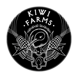
Mind Your Business .PNG
The symbolism is on point for the site. Corn wreathing a lovely & realistic rendering of a kiwi bird. Site logo included between the text centers a focal point, very easy on the eyes, not to mention cool. This is my favorite logo so far, only wish I had some merch with this on it. (One day I’ll get my hands on a coin!)

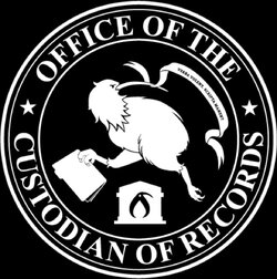
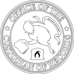
II) From around late Spring of this year. Used on official Rumble Kiwi Farms account, (which hosts special footage, distinct from the MATI live channel.) This one I think of as the official “Custodian of Records” logo:
Custodian Of Records.jpg
Custodian Of Records OG.PNG
It follows in the same vein as the Mind Your Business logo, which I’m very pleased with. Contains main site logo in a similar position & has a kiwi bird depicted in a traditional heraldic fashion. Absolutely stunning! Love the nod to the file folder in the kiwi’s fore-claw, which is appropriate for this logos purpose of archives & records.

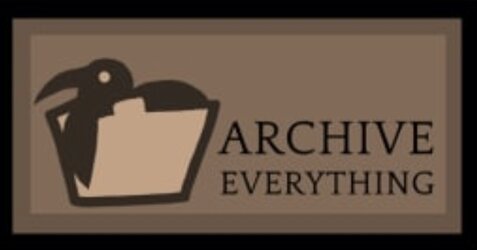
There have been a few other pieces of art that are used for logos & merch that I really like as well, one in particular, the “Archive Everything” patch:
Archive Everything .jpg
Cute, no nonsense, & good advice. Take to heart. Excellent.

All of the above are memorable & eye catching. Your new logo idea is a move in a good direction for its particular purpose. It looks inviting, while still important. Being that the cause, The United States Internet Preservation Society, is important & if successful will come across as something others want to join. It serves its purpose well for a logo. I think looking into Art Deco & even a bit of Art Nouveau fonts might help find the look you’ve envisioned if you haven’t already. Really like this new logo, especially considering it’s general purpose.
 
I) From the backside of the silver coin, the “Mind Your Business” logo is how I think of this one:
I honestly have done a very bad job keeping track of my artists over the years. I forgot who did the coin design and the original t-shirt like the slobbervoid shirt. It doesn't help that everyone's kind of cloak and dagger replying to my emails.
 
I honestly have done a very bad job keeping track of my artists over the years. I forgot who did the coin design and the original t-shirt like the slobbervoid shirt. It doesn't help that everyone's kind of cloak and dagger replying to my emails.
A “Seeking Artists” thread might help find a few of the artists. I’ve made some posts seeking artists in various sub forums & threads dedicated to art like multimedia, meme, & edits, & had very good luck finding the maker of a meme or art piece. Maybe in the Arts & Lit board, or General board? I grabbed the copies in my post above from the OG merch threads, & the Juju thread for Custodian of Records logo, IIRC. People all remember rather random things, & have often been really helpful in properly crediting (or even just naming) artists.
 
it's super frustrating because i have precisely what i want but I don't know how to describe it.

View attachment 6483597

I want a classic American style sketchy outline for Sisyphus. In the long version of the logo, the boulder is probably cut away so that it fits.

View attachment 6483602

With the fonts, there's a specific font I want for the United States part. It's small, elegant, and I think found in classic American iconography -- but it's lost on me what I'm even talking about. I can just see it in my head as clear as day though. It's a thick, wide display font, but it usually writes united states in this very small, casual, lower case lettering.
View attachment 6483626
I've been slowly catching up and collecting art samples in case they come in handy:
image_2024-10-03_171019184.pngimage_2024-10-03_171047226.pngimage_2024-10-03_171113044.png
All it needs is a transgender man kicking the rock back down the hill.
Bing had a similar idea it seems:
image_2024-10-03_171405194.png
 
Back