Software Endorsements

  • 🐕 I am attempting to get the site runnning as fast as possible. If you are experiencing slow page load times, please report it.

Did you like the App?

  • yes

  • no

  • Stop waisting our time


Results are only viewable after voting.
TrackPoint button to behave closer to how it does in Linux, where tapping it sends a middle click but holding it down scrolls with the TrackPoint movemen
I feel like a retard because I never knew that would do anything but move the mouse. My model had mouse buttons above the keyboard just for nub so maybe I just never tried.
Or it's a different thing all together.
 
I feel like a retard because I never knew that would do anything but move the mouse. My model had mouse buttons above the keyboard just for nub so maybe I just never tried.
Or it's a different thing all together.
It's very easy to use and it's extremely ergonomic once you get used to it.
1745010756050.webp
When you put your hands on the home row of the keyboard, you only have to lightly shift your index finger onto the TrackPoint and your thumb onto it's buttons to control the mouse.

The TrackPoint acts like a controller joystick, it detects the amount and direction of pressure put on it and translates it into cursor movement. Left button is left click, right button is right click, and middle button is either middle click or scrolling.

In the Windows drivers you only get to choose whether or not the middle button is meant to send a middle click or act as a modifier key, so that when you hold it down, the TrackPoint is now in scroll mode, and the direction you push it at is the direction you scroll at, and the speed of the scrolling depends on the pressure you put on the TrackPoint. Your usual Linux drivers for it make it so that pressing it once acts like a middle click, but holding it down acts as a scroll modifier. Obviously the superior way to do it so that you can easily scroll websites, but also close tabs and open links in background.

XMBC is meant to parrot that once you set the middle button to middle click in the ELAN driver options. Similarly, if you were to plug in a regular mouse with XMBC with this config, if you hold down the MMB and start moving the mouse around, you'll now be scrolling. This is why it's neat as it's hardware agnostic, so it'll also work on laptops like the older Dell Latitudes that still had their three button TrackPoint equivalent. As long as you have an input device that can send MMB inputs, XMBC will do the rest of checking for how long you're holding it down, whether or not you're moving the cursor and whether or not to start scrolling, and how fast depending on the cursor movement.

Once you get the hang of the TrackPoint you'll find it way more ergonomic than the touchpad since you have to barely move your hand to use the mouse and you only have to lightly push with your index finger instead of swiping around with your entire hand to move the cursor, and when you want to type something, your hands are already in the typing position. And then you won't be able to live without one on a laptop.

Shame it's a dying breed of mouse inputs. Dell and HP stopped putting them, Lenovo still puts them on ThinkPads due to brand recognition and loyalty but they do try and push out new ThinkPad series that get rid of it, and Framework, arguably the next best thing when it comes to durable and repairable laptops, doesn't bother with offering something like this. It's not even a patent issue since that expired in 2017, and since I find it so vital to the way I use a laptop I have no other choice but to buy Lenovo. Seriously Framework, start offering TrackPoint keyboards. It's an untapped goldmine of a market demand.
 
For us Fruitfags - check out Zed as an IDE:
I greatly prefer it over VSCode because it is far more lightweight, the git integration works properly (unlike VSCode which would fuck up my repos all the time), and is not part of the Microsoft botnet. I am only using Zed for SysAdmin shit but it is perfect for that use case.
 
This website allows you to look up comments on any YouTube video via keywords: https://www.commentshark.com/youtube-comment-searcher
Very useful, I recommend bookmarking this if you plan on comment searching for users on cow threads for research.
Crazy how we've just passed the 20 year anniversary of the first YT video and something like this still hasn't been properly implemented. YT comments would still be a cesspool but at least you could navigate through them for what you're actually looking for.
 
(this was originally a message to null, but he suggested i posted it here!)

You might already be aware of all of this, but i thought id let you know just incase you arent.

im somewhat involved in crypto, and know of some nifty options out there for cashing out/paying bills using crypto without needing to withdraw into a bank account and doing it anonymously.

here are a few options that ive used myself :

rewarble:

https://rewarble.com

virtual visa you can buy using crypto that doesnt require kyc up to a large threshhold. you can make as many cards as u need,under any name or billing address you want. ( it works like a normie visa card when online shopping and even links to a paypal account). only virtual visa i found online that always works smoothly and can be reloadable.

know people whove used these successfully to pay their utility bills in the states.

i buy mine from here:

https://tokenstore.io/products/details/rewarble-super-gift-card-usd-open-range-1355


rewarble is most convenient if you want something instant and can delete when youre done with it ( great for auto subscriptions).

others can buy you rewarable top up from non crypto vendors online with their creditcards as well https://www.g2a.com/

another useful feature:

it has options where it sends paypal/venmo payments on your behalf anonymously by just putting the recipient email/number.

SOLCARD:

https://www.solcard.cc

solcard is another virtual card option thats somewhat is more solid if you want something more long term. it has an applepay/googlepay feature.

solcard has a $10k no kyc limit (a month if im not mistaken).

$40 fee to onboard when you sign up.

u can directly pay for anything with apple/google pay options both online and offline.

you can also register the card under any made up you choose

solcard gives all users the same billing address thats based in colorado for their cards.

you top up the card by directly sending solana to the unique sol address you get when you sign up.

BITREFILL:

https://www.bitrefill.com/


i use bitrefill daily for myself and others.

has almost every brand voucher in existance.

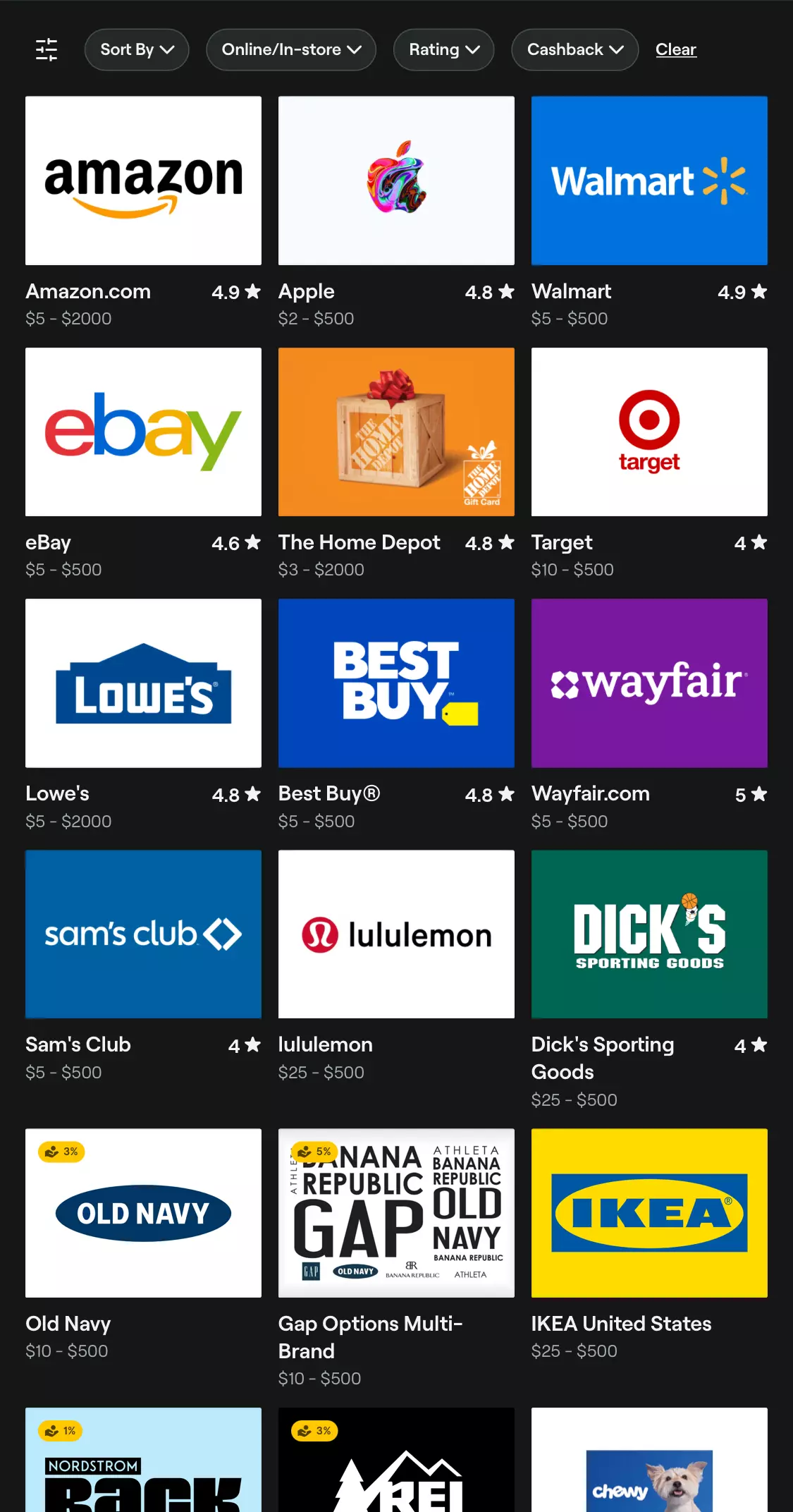
https://www.bitrefill.com/us/en/gift-cards

for example,you can get walmart vouchers, use it on the walmart app and swipe to pay at walmart for your groceries.

or show the qr/pin code saved on your phone to the cashier as payment.


has things like doordash/instacart/grocery delivery gift vouchers which can be used on apps to pay discreetly instead of linking a bank card.


bitrefill even has a several gas station giftcard options, so u can fuel up your car without needing cash or needing a bank account/credit card.

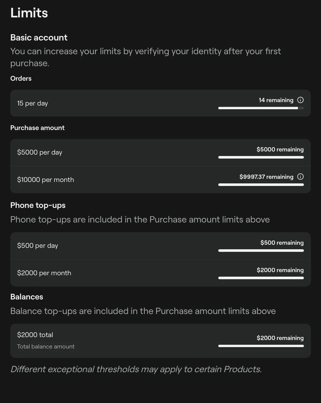
bitrefill has a very generous non kyc limit ( signing up with email is optional)


($10,000 a month.)
IMG_7987.webp
IMG_7988.webp
 
A really nice and relatively obscure pice software I recommend Appflowy.

It’s a FOSS notion alternative. Can be used offline, using their cloud services (free or monthly subscription) or for true gigachads self-host your own cloud. Stable, packed with features and very intuitive to use. It’s my main work horse in Uni when it comes to notes, staying organised, planning out stuff and whatnot. Can’t recommend it enough.
 
  • Informative
Reactions: Jotch
A really nice and relatively obscure pice software I recommend Appflowy.

It’s a FOSS notion alternative. Can be used offline, using their cloud services (free or monthly subscription) or for true gigachads self-host your own cloud. Stable, packed with features and very intuitive to use. It’s my main work horse in Uni when it comes to notes, staying organised, planning out stuff and whatnot. Can’t recommend it enough.
Are you actually self-hosting it?

My experience self-hosting it was dismal. Incredibly shit out of the box security that means your instance is wide open to randoms registering and the ancillary services (like MinIO) are wide open with default passwords. Eventually my instance got fried by an update, could no longer login but the fat client still worked so I just grabbed everything while I could and moved to Obsidian.

At least Obsidian is just .md files so little can go wrong and how you sync is essentially at your discretion, whether Git, Syncthing, whatever. My Appflowy experience was June 2024 to August 2024 so maybe the software has vastly improved since.

Relevant posts
 
Are you actually self-hosting it?
Not at the moment no but will try to get it going later this year when i have the time. For now I’m making do with the free plan. I’ll report my findings then. Development is progressing quickly so no doubt things have changed, especially since they overhauled the deployment process back in October last year.

At least it’s nice that there’s an option, especially since they’re a regular company and not a non-profit Troon brigade like most FOSS projects.
 
This is more of a tech tip rather than a software endorsement per-se: disabling system animations vastly improves the responsiveness on it. When you disable animations, you'll experience how fast your OS actually is when you don't have artificial delays between every action just to make it look fancy.

Windows: Win+R, SystemPropertiesPerformance.exe, and configure it to uncheck these options if you only want to disable animations:
1745751693055.webp
Android: Accessibility settings > Color and motion > Remove animations
Linux: idk look it up yourself

Disabling them on Windows 11 managed to make it feel way more responsive than it was OOTB, it's actually hilarious how much those fancy schmancy animations actually make everything feel more sluggish than it actually is.

As a little extra, some registry tweaks for Windows to decrease some delays to make it feel more snappy I got from an anon on /g/.
Code:
REGEDIT4

; Note: I like to keep these values all the same so there's no surprise pop-ups
; or longer-than-expected waits. I use 100 milliseconds, as it's close enough
; to instant for me, but slow enough that throwing the mouse pointer across a
; control doesn't count as a "hover" and trigger it.

; Windows has a small delay (400ms to be precise) before it starts drawing
; submenus. This is most obvious when navigating the Start menu. This decreases
; that to 100 milliseconds.
[HKEY_CURRENT_USER\Control Panel\Desktop]
"MenuShowDelay"="100"

; This changes how long your mouse pointer must be stopped (or nearly stopped -
; Google MouseHoverWidth for more info) before Windows considers you
; "hovering" over a control. The default, like most things in this list (and
; as such won't be mentioned again), is 400 milliseconds, and this changes it
; to 100ms.
[HKEY_CURRENT_USER\Control Panel\Mouse]
"MouseHoverTime"="100"

; Windows has a delay before it starts drawing window previews in the Alt+Tab
; display. This value is in milliseconds, and 64 hex is 100 in decimal.
[HKEY_CURRENT_USER\Software\Microsoft\Windows\CurrentVersion\Explorer\AltTab]
"LivePreview_ms"=dword:00000064

; This sets the hover time before a taskbar button shows those little live window
; preview we've had since Vista.
[HKEY_CURRENT_USER\Software\Microsoft\Windows\CurrentVersion\Explorer\Advanced]
"ExtendedUIHoverTime"=dword:00000064

; This controls how long you can hover the mouse over a taskbar window preview,
; before it fades out all the other open windows (that is, "peeks" that window).
[HKEY_CURRENT_USER\Software\Microsoft\Windows\CurrentVersion\Explorer\Advanced]
"ThumbnailLivePreviewHoverTime"=dword:00000064

; This changes the hover time of the Aero Peek button (in the lower-right of
; your taskbar if you have it enabled) from its default of 500.
[HKEY_CURRENT_USER\Software\Microsoft\Windows\CurrentVersion\Explorer\Advanced]
"DesktopLivePreviewHoverTime"=dword:00000064
Code:
REGEDIT4

[HKEY_CURRENT_USER\Control Panel\Desktop]
"MenuShowDelay"="200"

[HKEY_CURRENT_USER\Control Panel\Mouse]
"MouseHoverTime"="400"

[HKEY_CURRENT_USER\Software\Microsoft\Windows\CurrentVersion\Explorer\AltTab]
"LivePreview_ms"=-

[-HKEY_CURRENT_USER\Software\Microsoft\Windows\CurrentVersion\Explorer\AltTab]

[HKEY_CURRENT_USER\Software\Microsoft\Windows\CurrentVersion\Explorer\Advanced]
"ExtendedUIHoverTime"=-

[HKEY_CURRENT_USER\Software\Microsoft\Windows\CurrentVersion\Explorer\Advanced]
"ThumbnailLivePreviewHoverTime"=-

[HKEY_CURRENT_USER\Software\Microsoft\Windows\CurrentVersion\Explorer\Advanced]
"DesktopLivePreviewHoverTime"=-
 
As a little extra, some registry tweaks for Windows to decrease some delays to make it feel more snappy I got from an anon on /g/.
Any other registry tricks for more privacy-oriented stuff? Like disabling last access logs and tinkering with the user assist file.
 
  • Winner
Reactions: fartsnstuf
I made a post before in this thread about a way to revert the new Discord UI to what I was before but Discord apparently thinks it would be in their best interests to remove the way you do it so you can be stuck with one of the worst UI redesigns fucking ever. However, again on Reddit, someone found another way to revert the UI that I think is way better. This will require the use of a tool like Vencord or BetterDiscord or anything that will allow you to import and apply custom CSS into Discord.
reddit1.webp
Hey y'all. After Discord nuked the Desktop Visual Refresh experiment, I've been looking around for themes that can recreate the old Discord UI. I came across Oldcord, a theme by milbits that recreates the 2020 Discord UI pretty well.
However, Oldcord has some issues, notably with its bugged profile banners. It tries to bring back the old, cosmetic-less profile banners but there's some issues with positioning if you choose to re-enable the profile cosmetics.
Since Oldcord is a very modular theme, it's possible to just not import the CSS module for the profiles. Below is the CSS to use:
You can use this in your QuickCSS or make a new CSS file in your themes folder
With this, the Discord UI looks like this:
It even brings back the old Discord logo and font for you!
Known issues:
- Open folder icon is oddly squished.
- Some sections in the settings menu look weird, but not unusable.
Once again, full credit goes to milbits for the theme. I am just very slightly modifying it by not importing one of the modules.
Hopefully this can restore some hope in humanity for you all.
reddit2.webp
(Custom CSS)
reddit3.webp
(What it looks like. Not me. Posted by the thread creator)
reddit4.webp
The modified OldCord import code:
Code:
@import url("https://milbits.github.io/oldcord/src/components/vars.css");
@import url("https://milbits.github.io/oldcord/src/components/color.css");
@import url("https://milbits.github.io/oldcord/src/components/imgs.css");
@import url("https://milbits.github.io/oldcord/src/components/other.css");
@import url("https://milbits.github.io/oldcord/src/components/redesign.css");
Either paste this into your QuickCSS (Settings > Vencord > Edit QuickCSS) or make a new CSS file in your themes folder (Settings > Themes > Open Themes Folder), then copy this down into it.
The OldCord file that you download from the GitHub includes profile.css, which is broken with cosmetics currently. As such, you will have to manually import each of the other modules
(L, A, A)
Custom themes also work.
 
Discord UI
You know, maybe it's because I've been rolling a custom UI for so long that I didn't notice the UI for anything but the overlay. Frankly I love the ability to move elements around on it and the overlay itself seems like an upgrade overall.
In short, what makes the new UI bad since I've never seen it?
For me, the fact that It looks like actual digital feces. It just looks like actual shit and I can't understand why anyone would like it. Also that just everything about it is unnecessary/not needed. The old UI was simple and that's what made it good. I don't know what the fuck anyone on Discord's UX team was trying to achieve but my only thought is that it's only comprised of Pajeets which would explain a lot of questions.
 
Back