Article Archive
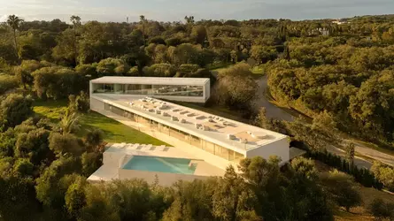
Zigzagging stone volumes offer vantage points across the landscape surrounding this coastal villa in Andalusia, completed by Spanish studio Fran Silvestre Arquitectos.
Named Villa 95, the home is located within the Altos de Valderrama development in the resort of Sotogrande, where it sits on a sloped, forested plot with views of the southern coast.
Fran Silvestre Arquitectos responded to this awkwardly-shaped plot by dividing the home into three elongated volumes that step up the hillside in a zigzag arrangement, creating space in the centre for a large terrace specifically requested by the client.

Fran Silvestre Arquitectos has completed a coastal villa in Andalusia
"This configuration allows the project to rest gently on the terrain, following its natural slope and orienting itself to capture the best light and views," the studio told Dezeen.
"One of the main challenges was to integrate a rooftop belvedere, requested by the client as a social space. To achieve this, it was essential to carefully control the sightlines and ensure privacy from neighbouring properties," it added.
The spaces of Villa 95 were organised according to its three volumes. In the highest volume, the bedrooms are lined by a glass wall and oriented to overlook the rooftop terrace, onto which they have access via sliding glass doors.
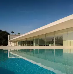
Three stone volumes make up the villa
Beneath this expansive terrace, the central volume contains the day areas, with a large living, dining and kitchen area and office fronted by another glass wall that frames views towards the coast.
Sheltered by the overhang of the terrace above, the living area's panoramic glass wall opens onto a secondary terrace with a swimming pool that sits on the home's lowest volume.
At the bottom of the sloping site, the lowest volume is partially dug into the landscape, housing a garage and technical areas alongside a wellness space overlooking a narrow courtyard.
"The way the volumes conform to the terrain – lightly and precisely – creates a quiet architecture that feels as though it has always belonged," the studio explained.
"The vertical circulation cores are located at the intersection points between volumes, allowing fluid movement throughout the house," it added.
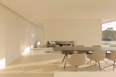
A glass wall flanks the living space
Finished in pale stone cladding and with largely minimal, white interiors, the villa was designed to be "timeless" and flexible, with the possibility of housing multiple generations in the future.
"The choice of materials was driven by a desire for timelessness and connection with the site," the studio said. "Local natural materials such as stone and wood were used in warm tones with subtle grey hues, enhancing continuity between exterior and interior spaces."

The home is finished with minimalist interiors
Fran Silvestre Arquitectos was founded in 2005 by architect Fran Silvestre. The studio previously used a similar organisational strategy for a home in Alicante, which also zigzags up its site in response to the topography.
Its other projects include a minimalist home behind a historic facade in Valencia and, nearby, a residence with a walkable T-shaped roof.

Zigzagging stone volumes offer vantage points across the landscape surrounding this coastal villa in Andalusia, completed by Spanish studio Fran Silvestre Arquitectos.
Named Villa 95, the home is located within the Altos de Valderrama development in the resort of Sotogrande, where it sits on a sloped, forested plot with views of the southern coast.
Fran Silvestre Arquitectos responded to this awkwardly-shaped plot by dividing the home into three elongated volumes that step up the hillside in a zigzag arrangement, creating space in the centre for a large terrace specifically requested by the client.

Fran Silvestre Arquitectos has completed a coastal villa in Andalusia
"This configuration allows the project to rest gently on the terrain, following its natural slope and orienting itself to capture the best light and views," the studio told Dezeen.
"One of the main challenges was to integrate a rooftop belvedere, requested by the client as a social space. To achieve this, it was essential to carefully control the sightlines and ensure privacy from neighbouring properties," it added.
The spaces of Villa 95 were organised according to its three volumes. In the highest volume, the bedrooms are lined by a glass wall and oriented to overlook the rooftop terrace, onto which they have access via sliding glass doors.

Three stone volumes make up the villa
Beneath this expansive terrace, the central volume contains the day areas, with a large living, dining and kitchen area and office fronted by another glass wall that frames views towards the coast.
Sheltered by the overhang of the terrace above, the living area's panoramic glass wall opens onto a secondary terrace with a swimming pool that sits on the home's lowest volume.
At the bottom of the sloping site, the lowest volume is partially dug into the landscape, housing a garage and technical areas alongside a wellness space overlooking a narrow courtyard.
"The way the volumes conform to the terrain – lightly and precisely – creates a quiet architecture that feels as though it has always belonged," the studio explained.
"The vertical circulation cores are located at the intersection points between volumes, allowing fluid movement throughout the house," it added.

A glass wall flanks the living space
Finished in pale stone cladding and with largely minimal, white interiors, the villa was designed to be "timeless" and flexible, with the possibility of housing multiple generations in the future.
"The choice of materials was driven by a desire for timelessness and connection with the site," the studio said. "Local natural materials such as stone and wood were used in warm tones with subtle grey hues, enhancing continuity between exterior and interior spaces."

The home is finished with minimalist interiors
Fran Silvestre Arquitectos was founded in 2005 by architect Fran Silvestre. The studio previously used a similar organisational strategy for a home in Alicante, which also zigzags up its site in response to the topography.
Its other projects include a minimalist home behind a historic facade in Valencia and, nearby, a residence with a walkable T-shaped roof.
