Also

Not sure what this has to do with anything I've said, but not once have I claimed that the Earth hasn't had periods where it was much hotter than it is today, and this certainly isn't new information to climatologists.
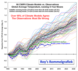
Btw, climate predictions are consistently false, and the falseness compounds with time. Jordan Peterson is actually correct about this. Here is an amalgation of scientific predictions and actual measured temperature:

I've seen that graph before, and what's more, I know where you got it from.
It's from Dr. Roy Spencer, a former NASA meteorologist, and noted climate change denier and creationist, who happens to also be a signatory to "An Evangelical Declaration on Global Warming", which essentially states that global warming can't be real because God won't allow it.
Given the above revelation, I think I've pretty much won this argument already, but for the sake of transparency, I'll try to illustrate how the graph you shared is misleading.
First,
here is the blog post where the graph originated. Spencer admits in the post that in order to create the graph, he used 5 year running averages, and the year 1979 as a baseline. This is misleading for two reasons: first, because baselining data to a single year can maximize the appearance of a discrepancy if that year is not broadly representative of the data set, and second, because a 5 year average is not necessarily representative of each individual value.
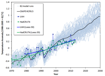
Jos Hagelaars posted an analysis of a similar Spencer graph
here (it's in Dutch, though an English summary can be found
here). Hagelaars presents the same data, corrected to include the annual values instead of 5 year averages, as well as a much more representative baseline of 1986-2005. This is the result:

Here is Spencer's original graph (using the same data) for comparison:

So no, in summary, Jordan Peterson is not correct about variables "accumulating over time"; unless you somehow wish to massage the data by using a single year many decades into the past as a baseline for data that concerns the future, but hopefully, at the very least, you can now understand how the graph you shared is misleading.


