Maybe it have good music, but...
- Graphics looks like shit, as the dev's intention seems to be to try to mimic those old flash games from Newgrounds or at least the PaRappa The Rapper art style
- Gameplay looks bland, at the very least. Looks more like another Doom II WAD, except that a lot of WADs have effort to be unique, like Ashes 2063/Afterglow (these ones are good af), Siren and Elementalism. The billionth "Boomer Shooter" released since the trend emerged.
- GAY AF (both in terms of joyness and faggotry) concept, like a worse version of the Undertale idea of "a game that you beat without killing", and even the preschool grade "humour".
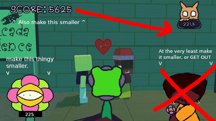
- And fuck, this HUD looks bad as hell. These "boomer shooter" devs don't seem to understand what makes the DOOM HUD looks good:
View attachment 7240196
The "Head" is just a very small detail there, as the HUD shows you a lot of relevant info...
View attachment 7240207
...But here, there's no relevant shit, just this shitty portrait occupying 20% of the screen.
If this is supposed to show your HP through the character's expressions, it looks stupid
because the artstyle is inexpressive.
Veredict: "Troonslop Nostalgia Bait Certified", but everyone knows and I just wasted my time/10
Yeah, I should have also brought up stuff like this in my
HUD post.
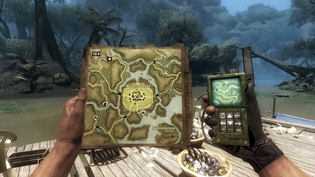
Simplicity is good and all, but when you go too simple AND don't give the player enough information, you might as well have no HUD. Games like Far Cry 2 have a very simple and straightforward HUD, mostly because of the elimination of an always visible map (You have to take out a physical map.)

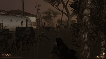
And the HUD only really appears when the character takes damage, pulls out their weapon, or is low on ammo/reloading. There are also radial damage markers indicating where you're taking hits from. The HUD also appears when using 'syrettes' (healing item) Which restore one to two bars IIRC. I haven't played the game in a while, but talking about makes me want to play it all over again.

 (I'm stealing these screen-caps from a walk-through because I don't have the game installed on my system right now)
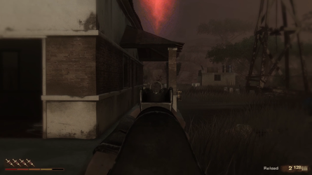
In Far Cry 2, there are two 'primary' HUD elements: Health and Weapons.
Health shows your bars of health, and 'syrettes' above it. While
Weapons show your current ammo and reserve ammo. Along with a
reload indicator to the left of it when low, and a
grenade counter above the ammo counter. They both occupy their own exclusive corners of the bottom screen, so the player only needs to look at those two specific corners to get info quickly.
This is really good. You want your player to use the HUD quick and fast, without trouble or misunderstanding.
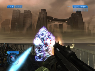
Halo 2, is a little different, as it has three HUD elements. But it still works quite well because of it's simplicity and readability. You won't get confused and it's quick to look at. The radar and health are both stuck together, and the grenades and ammo are both at the top of the screen on opposite corners. I don't see this as a problem, mostly because you'll only really look at your grenade totals when actively using or before directly using them. Like I said, this HUD works because it's so simple but at the same time very useful.

The game: "KIPIDON: We Will Always Love You" mentioned by
@rottenbite77, has the problem with the HUD being far too simple and at the same time, irrelevant. Like, why do I need to see my portrait when it's insanely inexpressive? You might as well not have it. A lot of the elements could have been sized down too, with 1920x1080 resolution in mind. The HUD is way too scaled up, and is far too distracting.
You also have HUD elements relegated to ALL 4 corners of the screen, so it takes more than a second to get more than just one bit of info. If you needed to look at score and time, you'd have to look at the left and right, within 1 to 2 seconds, when it should be half a second. What if you needed to see your ammo and health within a second? Well just look at the two separate corners, with one of them barely giving you ANY info. That being the health. Like what is the portrait even telling you? So I'd say it takes one to two seconds to look at your ammo and inexpressive portrait. Absolutely terrible for quick action and reaction.
The way I'd fix KIPIDON's HUD problems
is by scaling the HUD down, moving some elements more closer to each-other (like the time and score) so you don't always have to look at all 4 corners of the screen. The weapon part should have it's ammo counter have an opaque background so it's easier to read. And also make the portrait more expressive and smaller or go further of not even having it. Honestly I'd go with the latter, getting rid of it entirely or at the very least allowing the player to disable it
in favor of a traditional health meter.
I'd move the score and time down to where the traditional health meter was it if that was done like that.
Here's a shitty concept I made:

At least do something like that. It'd fix some fundamental problems with this HUD. I think the worst problem about this HUD is that it just feels a little lifeless, like it has no real personality. Far Cry 2's HUD has been tied constantly to the game's 'realism' because of how little it gets in the way of gameplay. Halo 2's HUD has always been believable and immersive as you play as Master Chief in the Mark VI MJOLNIR armor,
so the HUD could be believable to the player as the Mark VI is a futuristic armor,
which in Halo 3 and Reach, is mentioned to have a heads-up-display.
But what does KIPIDON's HUD represent? Happiness? Well I don't feel very happy when I look at it.
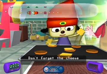
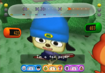
@rottenbite77 mentioned Parappa, and I think that's a HUD that is designed to make the player feel happy while also being insanely useful. I'd also like to bring up Katamari further below.
Both games, have quite memorable HUDs that are informational and nice to look at. The second Parappa screen-cap is from
the full chinese. Which is the bigger cut of
chinese.
Please watch both, they're kino.


Parappa 2's HUD is pretty info heavy, having to show the player their score, their cool meter, the teacher meter which calculates at how well you're following the teacher's lesson. (ie. for
Beard Burger Master, he's more straightforward and strict, but
Guru Ant is more freestyle focused). And the rhythm bar at the very top as well. In Multiplayer, you also have your win and loss counts at both sides of the rhythm bar represented by smiley faces. Also, the cool meter is no longer present, instead being replaced by score counts for both players.
All are quite nice to look at. It's the style I think. It feels very round, which makes it look juvenile which represents Parappa's own conflict of being looked at as a kid. So it is related to the game's tone and theme. So it'd say it counts as a HUD that has soul because it's more than what it looks like.
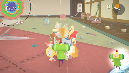
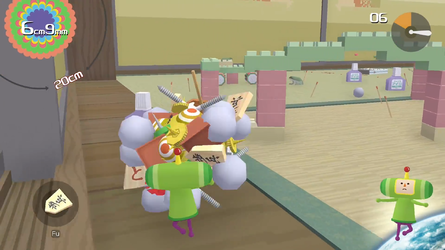
Katamari Damacy (the screen-caps are Reroll) is more simple, but still accomplishes the 'joy' style far better than KIPIDON. The prince's direction is at the very bottom right, far away from the action, and the ball size is at the top left, far from the action too. The timer at the top right is obvious, shows you how long you have to get your ball big. The last item you picked up is at the bottom left and disappears after a few seconds.
This is how you use all four corners without looking obnoxious, by making it far from the action. This HUD also has soul because it relates to the game's happy tone somewhat like Parappa's.


The problem with KIPIDON's HUD is that it's far too irrelevant, and at the same time, soulless. It shows you barely anything actually useful other than just your score and time, then calls it a day. There's no joy to be found in it's mistakes, only sadness and anger. I know it sounds a little dramatic, but it's somewhat true. KIPIDON's HUD as it is, will never be memorable, mostly because it has nothing to say.
A HUD that has nothing to say might as well not exist at all.


