[USIPS] Logo Design Collaboration

  • 🐕 I am attempting to get the site runnning as fast as possible. If you are experiencing slow page load times, please report it.
It is interesting, I really prefer the more outward and downward facing foot leg/foot (in concept if not in execution) as necessary and better but other people abhor it and want it in profile. A statement on art that one aspect has such strong opinions diatomically opposed for different reasons.

:thinking:
I mean it just looks like its broken.
i get you might want the legs/feet out in a v shape showing the sissypus is stabilizing himself from moving sideways but the image is supposed to express he's using as much of his force to push the boulder uphill which means there's not enough strength left to push sideways.
try making the pose yourself and pushing a boulder up a hill see where you place your feet. you wouldn't be keeping your legs spread apart.
It also just looks better anyway (IMO)
also the boulder is too big in that one (IMO)
This is actually where I take the artistic perspective! I want more elements coming "out" of the image so it will make for a more lively coin or intaglio print later. The profile foot makes more human sense, probably. But it would be hard to model to stand out in relief.

Can we get an anon to photograph himself rolling a mache boulder up a hill?
 
Can we get an anon to photograph himself rolling a mache boulder up a hill?
Im not asking to see a photo of him doing it, just for him to do it himself IRL so he gets a feeling of where to place his feet and use that as a reference. you wouldn't spread your legs apart like your welcoming a dick is what I'm trying to say.
I think test 17 was the best version, and basically, all that needed sorting out was the shading, left foot pose/proportions, and boulder shading, hiding something like the Toblerone logo.
as for making a relief version of the logo for the silver coin, I think it would look better with the left foot not rising too far above anything else in the image, especially with nothing else around it sticking out that much, so having it not face the camera is better.
I get that the logo might be in perspective view, not orthographic but I think the camera is so far away from the scene that it matters little.
also, apparently, you are using a blender. I would recommend a CAD software. I personally use Rhino 3D, if you give me the mesh i can use the SubD command and turn the mesh into a perfectly smooth CAD model.
If i could add one of my patterns to the design that would be awesome to see.
 
Last edited:
Wanted to try something a little bit different. I know that the main shape and pose is largely figured out, but I felt like trying an alternate angle for a bit of fun in between other things I'm working on, and felt like sharing in case it's of use to anyone in this thread in terms of getting a different perspective on the design we're working with. I know my anatomy isn't perfect, and the pose probably isn't either, but this is still very much a work in progress that I'm just chipping away at in my spare time.

It's very rough and on the messy side, but the main things I changed were the positioning and size of the head and tweaking the torso, arms, and legs. Feedback would be really appreciated, I totally get how this is a bit of a deviation from the main established design so far, but I felt like the side profile headshot was a bit restrictive and just fancied trying something a bit different to see what you guys think.

Little bit of a side note, but I also kind of liked the idea mentioned earlier in the thread about the boulder being a representation of the globe. Bold continents/country outlines don't really seem to work due to the bolder texture, but I think there could be a more subtle way to do this which could (maybe?) work. My general idea is to roughly represent the abstract shapes of the continents in the pattern of the rockface on the boulder, but I might not have communicated this very well in my example above. I'm not dead-set on including this anyway, just thought it was worth mentioning as a neat idea, maybe?

Also @Null, regardless of whether or not you're into my rendition, what are you wanting to get out of the final logo in terms of detail at a smaller scale? A lot of small details are going to get lost with whichever design you go with. What would realistically be the smallest resolution this thing is going to be used at? Standard A4 letterhead size, or something smaller? Just asking so I and everyone else knows how heavy or light to go on the final details.
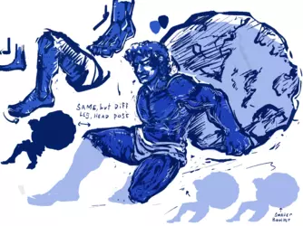

logo_SketchPage.png
 
sisyphean-10.2.png
How about something like this? At this point I think the hair should be curly enough?

This is more detailed than the other version, but when printing them out, not much detail was lost. It has similar losses as the other version with thicker hatching. If you think it's too busy I can make another version with the more simple style. But I really think the extra detail gives it depth.

Otherwise if you do like the rendering are there any other critiques that you have?


Edit: also what I assume it's like to be Null running this forum
nulls weekend.png
 
Last edited:
Nice. I think the shading lines need to have a mostly consistent width and have rounded edges
It's ok if a shading line is slightly wider across its length in some areas, but try and keep them the same width.
Good to see you've taken my advice about the foot to heart.
I preferred your shading on test 17.
It might just be me, but the slop looks too steep, which makes it look less realistic and makes the formatting of the logo on documents more difficult, especially with the text next to it. No human alive could push a boulder that big uphill at that angle.
 
Last edited:
I've contacted a professional brandmark designer for the purpose of finishing this and getting it vectorized. He's not given me a quote yet so if it's too high I'll start giving more feedback and push towards a finish. You've gotten it so close to what I want that hopefully getting it professionally designed won't be too much.

Thanks guys
 
What? The drafts are enormously useful.
Yeah, no fucking shit, retard. Did you have the mind to ask the people who toiled to make them for you before passing them on to someone else to polish? If not, where's the clause that anything user-submitted to X thread is sole property of JOSHUA CONNER MOON to do whatever the hell he damn well pleases?

No offense.
Are you retarded? What the fuck do you think the purpose of this thread is? These are volunteer submissions to create a fucking logo, stupid cocksucker.
 
What the fuck do you think the purpose of this thread is?
I was under the impression it was to create a logo, not to create a draft for a logo that will later be submitted to a professional to finish without mentioning the intention to do so anywhere prior.

Let me make it somewhat more relatable.

Imagine you and let's say CrunkLord and a couple other contribs work on SneedForo for a long-ass time and then one of said contributors forks it, adds a few bells and whistles and resells it as his own software. Would that be nice? Fuck nay.

This isn't to say you're doing the very EXACT same thing, but a). it's comparable, and b). if you see no problem with taking people's work and not even having the courtesy to ask then gee, no fucking wonder you're having an extra hard time finding providers and services because god damn.
 
Bro this logo will represent the work of tons of people, thousands of hours of my time, it will be on websites and printed media. It has to be PERFECT.

Your analogy sucks because
1) when you make foss you are explicitly permitting people to do exactly what you're describing and it happens all the fucking time as part of the industry
2) this is even less prohibitive because it has still helped immensely with GETTING THE FOUNDATION RUNNING which is the entire fucking point. Nothing is lost and progress is made. There was nothing else promised: art contributions all still go towards a brandmark.


Part of the motivation is that I have two good artists submitting competing designs of the same concept. To move forward at this point would require picking one and then forcing him to make revisions to get it just right, then TRACE IT.

The professional brandmark also takes into consideration something I was concerned about: the logo has to look good on print and web, which is easy for a simple logo to do but very hard for a complex logo to do. A professional artist accustomed to this exact problem can handle what a volunteer artist might not even want to deal with.

I don't know how I blasted your ass in the past but it's not even your place to get offended on behalf of other fucking people. If anyone has issues with this who actually contributed work wants to reach out by DM they can
 
Back