- Joined
- Feb 21, 2021
Spoiler alert - everything looks horrible on Anna.
John is so bad at his job:
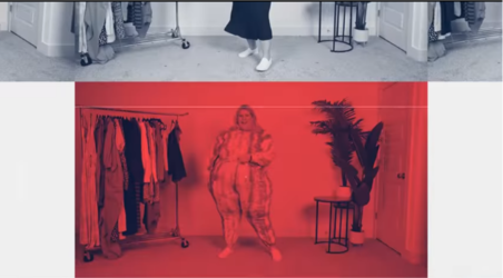
Bro. Lol. this image of them being unable to fit into frame with her. There's also obvious cropping giving the black on the sides that are not even even meaning the shot wasn't centered in the first place
How fucking hard it is to have gotten chairs for to sit by count blobula (pro tip: angle the chairs in so they can actually fit in). That is the bare minimum. You can tell that he directs things without thinking long term because at the end of the video they're all sitting together. That's lazy. When you're recording content you shouldn't "oh sit down, try on, sit down" you record the try-on's first and the commentary that will be tour intro and outtro thoughts last so it all matches. (You sit there, do your into. Cut. Do your final thoughts)
My god. The montage edit on the beginning of the film was too long and because red is a very jarring color to use in art because its so dramatic that it can easily overpower. The music was also the wrong type for what he wanted and it sounded artificially sped up. It didn't match the speed of their movements. If our very own @Catto_Gatto can do better with a phone application this fat retard had no excuse with a degree and pro equipment on why this looks like shit.
Seriously.


They're filming on a neutral beige backdrop so using white chic here only makes her actual set look even less professional. The type of grey scale he chose is also not complimentary to the red. It looks super awkward. This is also a fucking SPRINGTIME shoot for Target tier clothing. This isn't some hot noveau art fag line.
Another example of retardation:
I shittily cropped this image on my phone camera for this example. The shot of Nicole is way too wide. She's not ever centered in her own image and the decorations for the set look sloppy. In their group shots you can see the door. The items on her clothing rack should be less cluttered, and neutrals with maybe a pop of color and not distract from the outfit you're trying to show off. There's also way way too much floor showing giving this isn't a backdrop set with a roll out white for shoots. The solution is so easy which the fix is to tilt your fucking camera up or crop the footage because the carpet is somehow DIRTY. Also get better lighting.
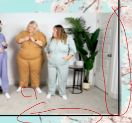
Okay. Now for the image this catastrophe is a part of. This faggot didn't even rule of thirds properly when deciding how far the larger video should overlay on screen nor did he plan ahead of time on how the shots would layout over the bootleg Arizona Green Tea ass background. Which, if I had to bet, is probably a desktop background and not one with overlaying film in mind. The sakura blossoms don't hide that you weren't creative enough to not put something in like....idk.... The name and size of the product as well as whose wearing it? Or anything else useful for the viewer to consume? It would have also been better to zoom in on the trio cutting out the set while they're talking so you can focus on their outfits.
Using two very weird and unevenly distributed camera modes, then laying them at random over a desktop background doesn't do any favors for what is already a very amateur looking set.
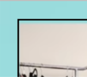
But Now, probably the biggest L and design sin of this whole thing is that he eyeballed the borders instead of using whatever program to do it for you. I very carefully put in a 24px frame within the margins because thats what squared his largest video on the bottom left and...

Bruh gap AND overlap???
Also the top doesn't even fit....

The gaps bruh. You didn't even grid-snap your videos or size to frame... That is literally graphic design/film 101. These are also auto-actions on all programs so it's so fucking easy and literally means he doesn't know how to use the program. This also means that the bottom of the two videos arent lined up nor is the border even worth having because it's just wrong. I fiddled around and no matter what symmetrical layout i used there was no border combination that perfectly encased both videos which proves my theory. This is without even mentioning the large gross gap between the two videos is also, randomly decided and doesn't match the layout at all and has no planned layout.
TL;DR: John is a goddamn lazy hack. Don't pay for art school because here's a degree holding graduate, in action.


