Awful Video Game UIs

I don't have any example of truly awful UI's (woulda put some random MMORPG cos all of them have an overbearing UI somehow), but instead I'll post things that're butt-fucking-ugly.

Literally take any modern JRPG.
FINAL-FANTASY-XVI_20230622134819.jpg
You need to play the game to even understand what's happening in that screenshot.
I miss the simplicity of these blue squares for a menu FF was so wellknown for like a decade ago.
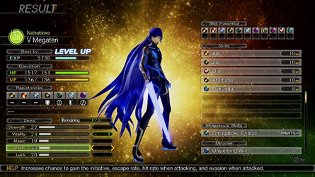
Shin-Megami-Tensei-V11292021-105215-4227.jpg
Same here, even SMT 4 had a better UI and it was on a crappy handheld. Somehow Atlus nailed the UI of Persona 5 just to fuck it up later with SMT 5. That's not even the best example, there are other menus and they're somehow even less intuitive than this shite. The fucking background would prolly kill any photosensitive sperg who even looks at it for more than 3 seconds.
 
I don't think so, compare with Xenoblade 2:

View attachment 5811385
View attachment 5811377
First of all a blue UI is already way more easy on the eye. The gauges are also more readable, for example you can barely see the health. The bottom action ui is also slotted more on the edge of the screen, which gives you more view of the action. The limit break meter is also above the health, leaving the upper right side to see what's happening.

While you can argue that 3 had more features, most of those features were bloat that didn't add anything to the game (if not actively hurt it). In general feature bloat correlates with ui bloat.
Perhaps, but your image is missing a lot of stuff for XB2. Orbs, for example, are a key part of the battle system and yet none are shown in the image. It also doesn't show characters making swooping attack animations (double spinning edge!) while the XB3 image is specifically taken so that it does. It doesn't show boss markings while XB3's does. It doesn't show two or more enemies so no enemy counter is present while 3 always shows an enemy counter. Of course the biggest difference, and one that I also think is very questionable, is that 3 has seven independent characters active at once so you have seven health bars, five possible blue and green circles, etc, it really does get confusing and annoying.
 
as one of the few people who actually played battleborn, that didn't matter much ingame, especially not with those handpicked screenshots. the first one literally reminding you to pick your fucking upgrades which takes 2 button presses in a 30+ minute match. the rest is standard fare and info you want - remember it's a fps moba, you need more to know shit than just health + ammo.

it's literally "I don't do what the game expects of me, why do the alerts and info keep increasing!?!?"

here's how the UI looked 99% of the time:
View attachment 5809254
This, thse cherrypicked UIs lasted for maybe fraction of a second, not to mention it's the PvE campaign - PVP has had no NPC voice comms. I will concur that particle effects of some ult particle effects were obnoxious as fuck.
That most "notorious" screenshot has the following in it:
• Story NPC talking to you, which does not happen in PvP.
• El Dragón's Dragon Splash with a tier 2 mutation that leaves an AoE behind (the yellow squiggly circle).
• Overshield, 99% likely from Reyna's ability (the purple hue around the screen, the gun viewmodel, the shield bar and other player character on bottom left)
• Player's own "ult unlocked" message. Happens once per game.
• Player's own "choose mutation" prompt. Appears every time you level up, to a maximum of 10 times.
• PvE objective marker. Does not appear in PvP.
All your team members unlocking their ultimates at once. Also can happen once per game. In practice, never happens in PVP, because everyone performs differently and levels at different paces.
• "Activate gear" prompt. Appears a maximum of 3 times per game for each piece of gear you equip on a character. Might not even appear during the actual match if you choose all whites with no activation cost and put them to use during warmup.
The rest is the standard HP/level/currency bar, ammo bar, ability bar and a minimap.
Really, BB's UI was the least of its problems.
 
  • Like
Reactions: ZMOT
Red Dead Redemption 2 has pretty awful UI. Whoever designed that should have their house broken into and get raped and murdered.
 
Perhaps, but your image is missing a lot of stuff for XB2. Orbs, for example, are a key part of the battle system and yet none are shown in the image. It also doesn't show characters making swooping attack animations (double spinning edge!) while the XB3 image is specifically taken so that it does. It doesn't show boss markings while XB3's does. It doesn't show two or more enemies so no enemy counter is present while 3 always shows an enemy counter. Of course the biggest difference, and one that I also think is very questionable, is that 3 has seven independent characters active at once so you have seven health bars, five possible blue and green circles, etc, it really does get confusing and annoying.
The orbs aren't part of the HUD since they become part of the enemy models, and the rest won't change the clutter that much even with the flashier animations. There's a good reason why when we heard awful UI we immediately thought of Xenoblade 3, as it's not only bad on the eyes, it also obscures actual important information in favour of unloading information that you don't need 99% of the time or doesn't add anything to the experience.

Thread tax, Cruelty Squad which is awful but fits the setting
1710340833262.png


Aegis Rim for promising you giant robots and instead being extremely basic visualization of the fights
1710340932323.png
 
The orbs aren't part of the HUD since they become part of the enemy models, and the rest won't change the clutter that much even with the flashier animations. There's a good reason why when we heard awful UI we immediately thought of Xenoblade 3, as it's not only bad on the eyes, it also obscures actual important information in favour of unloading information that you don't need 99% of the time or doesn't add anything to the experience.

Thread tax, Cruelty Squad which is awful but fits the setting
View attachment 5811806

Aegis Rim for promising you giant robots and instead being extremely basic visualization of the fights
View attachment 5811810
The orbs weren't part of the enemy models, they just orbited them. If that isn't part of the UI then, well, perhaps it should have been because the game notoriously gave you very little help in figuring out that they were actually hugely important for winning tough fights. I do agree that 2 is much easier on the eyes though. I can't imagine 4 being as busy as 3, which, after all, was trying to have the mechanics of both 1 and 2 going on at the same time.
 
Back