Navigation
Install the app
How to install the app on iOS
Follow along with the video below to see how to install our site as a web app on your home screen.
Note: This feature may not be available in some browsers.
More options
Style variation
You are using an out of date browser. It may not display this or other websites correctly.
You should upgrade or use an alternative browser.
You should upgrade or use an alternative browser.
Worst Redesigns
- Thread starter deermeat
- Start date
-
🐕 I am attempting to get the site runnning as fast as possible. If you are experiencing slow page load times, please report it.
- Joined
- Aug 17, 2018
- Joined
- Aug 8, 2020
He sobered up.Apple Jacks.
Before:
View attachment 6225910
That apple IS creepy.
Now:
View attachment 6225911
The hell they do with the cinnamon guy?
Image tax: WWE went from this

to this

What was "wrong" with the older one?
Womble of Wimbledon
kiwifarms.net
- Joined
- Dec 13, 2022
Still mad they didn't go with this oneLooks okay to me.
Thread tax:
Who designed the London 2012 Olympics logo?
Take a look at Beijing 2008:
View attachment 6250789
Clean, simple, pleasing to the eyes.
Now look what happened four years later:
View attachment 6250793
Who designed and approved that?

- Joined
- Aug 17, 2018
I'm replaying Plants vs. Zombies: Garden Warfare 2; that reminded me that EA/Popcap released a third entry: Battle for Neighborville.
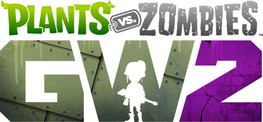
I like how the W has a silhouette of a zombie soldier. Reminds me of MW2's cover art.
Curious, I looked up Battle for Neighborville:
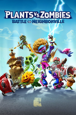
Okay, that base logo is bland as hell. Where's the color? Where's the character?

I like how the W has a silhouette of a zombie soldier. Reminds me of MW2's cover art.
Curious, I looked up Battle for Neighborville:

Okay, that base logo is bland as hell. Where's the color? Where's the character?
- Joined
- Feb 1, 2023
Someone said the London Olympics one looked like Lisa Simpson on her knees giving head and 12 years later i still can't unsee it.Looks okay to me.
Thread tax:
Who designed the London 2012 Olympics logo?
Take a look at Beijing 2008:
View attachment 6250789
Clean, simple, pleasing to the eyes.
Now look what happened four years later:
View attachment 6250793
Who designed and approved that?
- Joined
- Jul 27, 2022
Modern Lisa Simpson would probably do exactly that to support whatever leftist cause of the day she subscribes to.Someone said the London Olympics one looked like Lisa Simpson on her knees giving head and 12 years later i still can't unsee it.
- Joined
- Aug 17, 2018
Technically, this is a redesign. When DMA Design was acquired by R*, they changed their logo for GTA III.
Old logo (from 1994):

DMA's iconic D-Man logo from the N64 days. Look at it, it looks like a cartoon man. D (head), M (shirt), A (pants), so funny.
After GTA III (2001, before rebranding to Rockstar North):
I miss when logos were more creative.
Old logo (from 1994):

DMA's iconic D-Man logo from the N64 days. Look at it, it looks like a cartoon man. D (head), M (shirt), A (pants), so funny.
After GTA III (2001, before rebranding to Rockstar North):

I miss when logos were more creative.
- Joined
- Jul 1, 2015
In addition to all of the ways that Test Drive Unlimited Solar Crown has failed to live up to its first 2 successor games, the cover for it is also plain and unexciting in comparison.
Here's the covers for the first 2 TDU games:
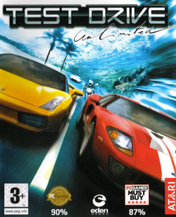
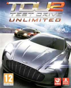
The Lamborghini and Ford GT on TDU's cover, and the Bugatti Veyron and Aston Martin on TDU2's cover, showcases the luxury and lifestyle aspects of those 2 games, and Oahu being in the background tells you where these games take place.
And here's TDUSC's cover:
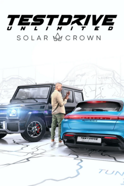
While the Mercedes G-Wagen is considered a high-end luxury vehicle, the Porsche Taycan Cross Turismo, while it is expensive, doesn't scream as being a desirable vehicle, given how EVs are being forced down people's throats, even though people don't really want them anymore. And Hong Kong Island being displayed as just a map background, along with the sterile white background, doesn't scream the same excitement as Oahu's backgrounds.
Here's the covers for the first 2 TDU games:


The Lamborghini and Ford GT on TDU's cover, and the Bugatti Veyron and Aston Martin on TDU2's cover, showcases the luxury and lifestyle aspects of those 2 games, and Oahu being in the background tells you where these games take place.
And here's TDUSC's cover:

While the Mercedes G-Wagen is considered a high-end luxury vehicle, the Porsche Taycan Cross Turismo, while it is expensive, doesn't scream as being a desirable vehicle, given how EVs are being forced down people's throats, even though people don't really want them anymore. And Hong Kong Island being displayed as just a map background, along with the sterile white background, doesn't scream the same excitement as Oahu's backgrounds.
- Joined
- Jun 21, 2021
Gonna do my absolute best to refrain from writing an essay here, but


I'd argue that the early 2010's was one of the worst time periods for Chuck E. Cheese to be redesigned. That was around the time where things like the live-action Alvin & The Chipmunks/The Smurfs were still relevant, and it's the road that a lot of kids mascots took during that time.
What makes it worse is how drastic the redesign was. Chuck's gone through his fair share of refinement and wardrobe changes, but usually the changes were gradual and over a long period of time.

Chuck didn't go from a derby-wearing, faux mob boss to radical skateboarder overnight. As the times changed, his design was softened up but still kept a lot of his core iconography (the general face shape, the teeth, etc.). Even if Avenger-era Chuck E. (which is the skateboarder one) came from the edgy aesthetics of the 90's, it didn't feel as in your face as the current design does. Overnight, CEC Entertainment just went, "This ain't your daddy's Chuck E. Cheese, THIS is the new face of Chuck E. Cheese!" The voice change didn't help either. Went from different flavors of Jersey to... Jaret Reddick.
Speaking of the worst redesigns...


to


We used to be a real country. Great, now I'm sad again.
I'd argue that the early 2010's was one of the worst time periods for Chuck E. Cheese to be redesigned. That was around the time where things like the live-action Alvin & The Chipmunks/The Smurfs were still relevant, and it's the road that a lot of kids mascots took during that time.
What makes it worse is how drastic the redesign was. Chuck's gone through his fair share of refinement and wardrobe changes, but usually the changes were gradual and over a long period of time.
Chuck didn't go from a derby-wearing, faux mob boss to radical skateboarder overnight. As the times changed, his design was softened up but still kept a lot of his core iconography (the general face shape, the teeth, etc.). Even if Avenger-era Chuck E. (which is the skateboarder one) came from the edgy aesthetics of the 90's, it didn't feel as in your face as the current design does. Overnight, CEC Entertainment just went, "This ain't your daddy's Chuck E. Cheese, THIS is the new face of Chuck E. Cheese!" The voice change didn't help either. Went from different flavors of Jersey to... Jaret Reddick.
Speaking of the worst redesigns...
to
We used to be a real country. Great, now I'm sad again.
- Joined
- Jun 21, 2021
If it were any other pizza place, the new interior/exterior would look just fine. CEC Entertainment is following in McDonald's footsteps; they're going for the whole, "Look parents, we get it. We can make our stores look HIP and contemporary! None of those parody posters or canopy lighting or whatever. THIS is the future!"View attachment 6421676
Is that actually a new Chuck E. Cheese's or are you pulling my leg? It looks like a fucking Whole Foods.
EDIT: The new exterior is even worse. Also, they ditched the animatronics for a really bad dance floor.
View attachment 6421682View attachment 6421802View attachment 6421803
It doesn't help that corporate is removing all of the animatronic shows with the dogshit dance floor and TVs. The only locations that are going to stay un-remodeled and have Munch's Make Believe Band are the CEC in Northridge, CA, as well as like two other random locations.
I could go on all day about this.
Not to get all sappy, but never forget what they took from you.
- Joined
- Nov 17, 2019
Are they removing the animatronics because of FNAF?If it were any other pizza place, the new interior/exterior would look just fine. CEC Entertainment is following in McDonald's footsteps; they're going for the whole, "Look parents, we get it. We can make our stores look HIP and contemporary! None of those parody posters or canopy lighting or whatever. THIS is the future!"
It doesn't help that corporate is removing all of the animatronic shows with the dogshit dance floor and TVs. The only locations that are going to stay un-remodeled and have Munch's Make Believe Band are the CEC in Northridge, CA, as well as like two other random locations.
I could go on all day about this.
Not to get all sappy, but never forget what they took from you.
View attachment 6422430
View attachment 6422432
- Joined
- Jun 21, 2021
Nah. CEC Ent. has been trying to phase out the animatronics for about 2 decades now. Back in 1998, they implemented a new stage show called Studio C (which itself was a scaled down version of a much grander stage concept).Are they removing the animatronics because of FNAF?
It featured Chuck E. as the sole animatronic with the other characters being portrayed by puppets on the TV screen. Studio C was developed by Garner Holt Productions, and Mr. Holt himself would go on record to say that his work with CEC would give his company their big break.
CEC Entertainment wanted to renovate all existing stores to have Studio C as opposed to the full Munch's Make Believe Band, but a mass remodeling project for hundreds of store would've been exorbitantly expensive. They ended up scaling the remodels back significantly, but any new store that opened from '98 onwards would have a Studio C.
The early 2010's is where they experimented with shows that had zero animatronics, and they've been pushing that since.
(Sorry for the history lessons, Chuck E. Cheese is just cool to me.)
- Joined
- Sep 29, 2022
This topic and specifically your posts kind of reminds me of a new image macro I found. It comes off as very zoomer-ish as I think that the top image is far too exaggerated (the highly themed McDonald's restaurants were relatively rare, the "1990s Taco Bell" decor wasn't used for that long or had extensive use, and most restaurants didn't have an arcade) but the bottom one is spot-on.It featured Chuck E. as the sole animatronic with the other characters being portrayed by puppets on the TV screen. Studio C was developed by Garner Holt Productions, and Mr. Holt himself would go on record to say that his work with CEC would give his company their big break.
CEC Entertainment wanted to renovate all existing stores to have Studio C as opposed to the full Munch's Make Believe Band, but a mass remodeling project for hundreds of store would've been exorbitantly expensive. They ended up scaling the remodels back significantly, but any new store that opened from '98 onwards would have a Studio C.
The early 2010's is where they experimented with shows that had zero animatronics, and they've been pushing that since.

- Joined
- Dec 14, 2021
I think it's due to 'Super Size Me' and other health scares that caused the neutering.This topic and specifically your posts kind of reminds me of a new image macro I found. It comes off as very zoomer-ish as I think that the top image is far too exaggerated (the highly themed McDonald's restaurants were relatively rare, the "1990s Taco Bell" decor wasn't used for that long or had extensive use, and most restaurants didn't have an arcade) but the bottom one is spot-on.
View attachment 6426757
- Joined
- Oct 2, 2017
And almost exclusively sell black cars. Like it's brave and they stand out, but so does a Kia cause the logo change was sudden, pushed hard as fuck and still looks like KN.View attachment 6273662View attachment 6273664
Whose idea was it to make the Audi rings plain black AND remove the name?
- Joined
- Sep 29, 2022
I think it's due to 'Super Size Me' and other health scares that caused the neutering.
I touched on McDonald's specifically in this thread but it all goes back to their first quarterly loss in late 2002 and their decision to innovate in the stores themselves and not distractions (Chipotle/Donato's/Au Bon Pain ownership, the McDiner concept, the Blockbuster combo stores). It was 2003 when they first introduced "i'm lovin' it", started to roll out the first big store remodel program—under this era, it wasn't "tear down and rebuild" but rather redecorating to fancier insides and even then a bunch of older stores just got red (or metallic) roofs and new paint jobs, rolled out all-white meat Chicken McNuggets, and the "premium" coffee. Part of the later stores, at least in the late 2000s, were when they were expanding the coffee line with Starbucks-inspired drinks and definitely took notes from Starbucks when designing stores.
The Yum! Brands stores have made various parallel attempts to "modernize" the company. The "fun" Taco Bell decor (and the old Pizza Hut designs) were under PepsiCo which got spun off in 1997.
Either way things were changing well before late 2004.


