The Kiwi Coloring Corner - Calling all creative kiwis! Join in a workshop made for those who seek to improve in the arts.

  • 🐕 I am attempting to get the site runnning as fast as possible. If you are experiencing slow page load times, please report it.
Alright, well, I guess this thread finally gets to see the first drawing I've made in four months after all. Thank you, shitty tablet, for deciding to work just long enough for me to use you again.

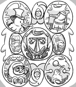
Title: Triumph of the Stickerfags
Medium: Medibang Paint Pro on a half-broken Wacom Intuos.
Challenge Name: Technical Line Work
Description: A portrait of the Four Horsemen of the Stickerpocalypse. From top left to bottom right, one can make out the visages of Admiral A-Log, Captain Can, Ilhara Al-Mosque, and Honorable Horrifico. The figure in the middle remains unidentified, occasionally referred to as Mr. Moai, with his mysterious role in the conflict being more of a folkloric figure and rallying hero than a living, breathing Kiwi.
The piece is accompanied by scenes of idealism and triumph: on the left is displayed a Cow pasture and a scene of the average Kiwi's life before the conflict (what the army was fighting for). On the right is a portrait of the Horsemen's victory, kept shrunken so as not to distract from the faces behind the conflict, with a depiction of a defeated Slobbermutt forced to glue the puzzle pieces that began the conflict back together with his legendary spit. The icon symbolizing the Horsemen as a fighting force borders the piece's top and bottom.
Time Spent: 2 hours and 58 minutes.
Art Specific Critique: Yes, but please be gentle lol. I'm still mourning the tablet and almost everything in this piece is pretty new to me.
Challenge Feedback: I found the challenge pretty fun once I got the hang of it, but the initial premise was a bit vague and could've used some more clarification. That's about it for complaints; it was really fun.
triumph_of_the_stickerfags.png

I'm not putting my references here, I had so many that I'd lag this page to hell if I tried. Just know that I was going for a sort of 18th-19th century lithography vibe. The kind of stuff you see on really old advertisements or portraits.

Haven't got any ideas for future challenges either, unfortunately. I was going to suggest a single-palette challenge but I think someone already got to that before I could lol. I suppose I'll back that one for the future.

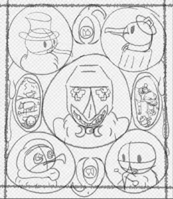
I'll put this one here as the bare minimum because my art was heavily inspired by this specific piece. I don't really think I did it justice, at all, but I suppose that helps set it apart.
1737324924416.png

This was drawn before my tablet went kaput, so the linework is a lot smoother. It took like 20 minutes and I did it around midnight because I forgot I was going to do it earlier in the day. The Null scene is lifted from a very early draft of this, when I had a completely different concept in mind. I liked how I managed to pull off the Slobbermutt in that, so I gave it a second chance at life here. Unfortunately, I forgot to account for the canvas size and it kind of destroyed that sketch lol. Oh well!
1737325014906.png
 
what would have been the way to fix this?
Practically? Erase the part and draw it again. That's what I do. Also, I think the other arm is a bit short too. Hands are supposed to reach the middle of the hip.
You can take a photo and draw an outline over it in paint or something. Helps to see more clearly how it works.
 
I wanted to enter this challenge but I’m intimidated by everyone’s contributions, all of them are amazing and I feel like no matter what I submitted it’d be mediocre. I had a very rough sketch made. I hope the next one will be something I’m more capable of working with :(
I wouldn't worry about how your art compares to anyone else's, I think a big part of this challenge thread is that its to focus on personal improvement. Your first piece in the thread is the only thing to worry about competing against. :)
 
I wanted to enter this challenge but I’m intimidated by everyone’s contributions, all of them are amazing and I feel like no matter what I submitted it’d be mediocre. I had a very rough sketch made. I hope the next one will be something I’m more capable of working with :(
My friend, I know my scribbles are mince compared to everyone's else's, but I don't care.
The important thing is that I'm having fun creating, and as the previous poster said so well, focusing on improving over the months.
Try not to be intimidated. The amazing artists had to start from somewhere, just like us.
You've got this.
 
This is my first completed drawing I've done in years, as well as my first real post on KF. If I screw up posting these pictures please tell me.
I did get to a point I did not want to finish this, cause I did not like how it turned out. I regretted coloring it, but oh well. It's done and I'm posting it.


Title: Pommes De Terre Forestières Enterrées
Medium: Paper, inking pens, sharpies thin and normal, colored pencils, white gel ink.
Challenge Name: Line Work
Description: I wanted to do something with the Bayeux Tapestry in mind. Then JF opened his mouth recently, so I picked him as the subject... then things just slowly moved into a weird French tapestry.
Art Specific Critique: Yes (not too harsh please, it will make me stress sigh)
Permission For User Edits: Yes, I would like to see how it could be made better.
Challenge Feedback: I liked it, it was a good starting point. Felt a little too open ended to me, but I think that just me overthinking

I posted a few different angles of the final drawing, I can't take a good shot of it with my phone to save my life.
Pommes De Terre Forestières Enterrées01.jpgPommes De Terre Forestières Enterrées02.jpgPommes De Terre Forestières Enterrées03.jpg

This is the reference images and sketch work.
refimages - Copy.pngscrap1 - Copy.jpgscrap2 - Copy.jpgscrap3 - Copy.jpg
 
kiwikoloring1.png
Title: The Boxers Retardo
Medium: Clip Studio Paint (Lasso tool and paint bucket for majority, some detailing with G-Pen)
Challenge Name: Technical Line Work
Description: While I did not have nearly as much time as desired for this project, I was struck with inspiration as soon as I started looking for example pieces from challenge related time periods. I decided to depict what would likely have been painted to commemorate the fight at Creator clash 2 where icukkkz was beaten by a literally who Dr. Mike. I also got to learn about a new type of painting I didn't know about (even if I'd seen pieces done in the medium), Fresco. I sadly didn't have any lime plaster, but the vibe is hopefully still present.
Time Spent: 45-50 minutes (5 was spent browsing for references)
Art Specific Critique: Yes. This piece is really outside of my usual style, but I'd love to get feedback on what does or doesn't work for the image. be as harsh as you like.
Challenge Feedback: I like this as a starting challenge, and it provided a good amount of directions to interpret the assignment in.

reference images for the piece that inspired it all:
1737349313258.png
 
But how to draw something behind without it looking tiny and gimpy?
Late but maybe have a part of Bruce that's also getting closer to the viewer like his other hand so that the perspective isn't skewed to him having just 1 smaller limb out of the whole body. One idea is position the feet the same way; have a dominant foot closer and 1 foot back so it can maintain some proportion parity with the hand going behind. I like the shading you did for it though.
I wanted to enter this challenge but I’m intimidated by everyone’s contributions, all of them are amazing and I feel like no matter what I submitted it’d be mediocre. I had a very rough sketch made. I hope the next one will be something I’m more capable of working with :(
Listen, pal, I'll take whatever I can get. Have you seen my rough drafts for the first challenge? I dont know what I'm even doing half the time, but this is all the prelude for the next Secret Santa and possibly other events where you make stuff for other people. Grab a pencil, grab some paper, and I better see something out of you in the next one. :)
 
Sticker Wars Final.jpg
Kiwi birds camping. They speak in sticker.
The slobbermutt, who speaks in slobber, burns the stickers.
Much time passes. The slobbermutt is surrounded by screaming kiwis, they speak in nonsense.
The slobermutt restores the stickers. Everything is at peace. The slobermutt returns to his cave to work on his evil schemes.
Title: Sticker Wars.
Medium: Charcoal on paper.
Challenge: Technical Line Work.
Description: I wanted to make a cave painting based on the current kiwi historical event, the sticker wars. The main inspiration was the event itself. I started looking at paintings of caves, like the Lascaux cave paintings. But then I remembered that me and another user (@CallmeCicada) posted the same page from the manga Billy Bat (The one that had Hitler wanting to go back to the art academy). So I decided to make it more like a comic in reference to that. I used charcoal on paper to use materials similar to those cavemen would have used way back then. As an extra challenge to myself I drew this without erasing anything since cavemen didn't have erasers. As a last minute decision I took a photo of the drawing with my lighter for the presentation to simulate the lighting inside a cave with a candle.
Time spent: 2 hours.
Art Specific Critique: Sure. I haven't used charcoals in a long time, so I would like to hear other's opinion on how it could improve.
Challenge Feedback: I liked the examples used for the challenge. They gave me the inspiration for the cave paintings.
Sticker Wars.jpg
 
Last edited:
I've had so much fun watching the thread over the past couple of weeks. So much good art. Even people who aren't feeling confident have shown a lot of potential. It'll be awesome to see how everyone changes and improves their art over time.

Permission For User Edits: Not for critique reasons, no, but I don't mind anyone wanting to treat it as a coloring book page and give it some color, or add stuff into the blank sections etc.

I adore the knot work on this piece. I'm terrible at drawing Celtic knots, I feel like I get lost in them too easily. Whenever I make an attempt with wire I fuck up the symmetry. This piece is impressive as fuck.

I tried my hand at some kiwi koloring. It was a lot of fun, thanks for the permission.

export202501200304370619.jpg
 
Last edited:
I took a photo of the drawing with my lighter for the presentation to simulate the lighting inside a cave with a candle.
This is genius, it really gives the effect you were going for.

Damn, I love this group that @Double Taps has brought together. The creativity is truly something to be admired.
 
It's done. I'll move to mobile to complete the description later.
edit:
Title: excogitator maori avibus (Google Translated, since lazy.)
Medium: Clip Studio Paint EX
Challenge Name: Technical Line Work + Hatching texture (stolen from Georgio, just because.)
Description:
"o illustratio operantis
quia percutit fortitudinem suam
emundat enim peccata et horror
lucebit enim super orationes et populum suum
elegiam enim concludet haeresim, nirvana enim adducet ad suos
illustris enim excogitator est sanctuarii
oro ut null luna!"
Time Spent: 2~3 days
Art Specific Critique: Yes (not an egomaniac, so I'll take it.)
Challenge Feedback: Cool idea.
Future Challenge Suggestion: Personally, I'd like to see a challenge where Kiwis draw their favorite users/characters from any series with the Slobbermutt on it.

E.G: I'm considering working on Raiden and Fujin, Liu Kang and Kung Lao from Mortal Kombat with the mutt on the picture as a celebration art for my T&H title.
E.G 2: insert your favorite user + Slobbermutt.

It's a test to your capability to look at other users' avatar's references, or your favorite characters' reference sheet/official art, and convert them to your style.
I nominate this for the next hoodie run
 
  • Agree
Reactions: ita
1737381768416.png

1737388947616.jpeg


Bing Chilling and Kung Hei Fat Choy! This month celebrates the year of the Cobra, everybody's favorite annual event and we're starting it early. Rather than with fireworks we've been having bonfires and powwows in good ol Cali, off to a raring start, huh. Lets not get too crazy while we take a moment to count our blessings.

No good celebration is without some snacks and drinks, why dont we hit up the local vending machine and see what kind of num-nums it's got going on. In the spirit of KingCobraJFS, we're also going to be scouting for some sick food combos and hacks to bring our treats to the next level, doodts!

CHALLENGE!!!
Create a snack and drink that you would pick or find from the ominous vending machine. These can be inspired by or be a play on consumables you happen to like irl, joke treats that might not even be edible, or something completely off the wall. Cobes is no stranger to brewing his own hooch, perhaps the machine stocks one of his many meads, you could be a plain Jane and make a bottle of Fanta, anything you might find in a vending machine is fair game. Soups, coffee, sandwiches, pizza, there really is a contraption that can serve pretty much anything, so you wont be without options.

Here are some basic suggestions: Energy drinks / Juice boxes / Bottled or Canned drinks / Vegan or Dairy shakes / Coffee / Chocolate bar / Candy / Cookies / Pack of gum / Bag of chips / Nuts / Soup / Sandwich (boggrito???) / Cigarettes (?)
Your snack and drink should include a label with either a fancy font displaying what it's named, or a little mascot sticker to help sell it. You can even throw in some hip marketing phrases and buzzwords on it like "Delicious!" or "Exquisite!" to really drive home that your snack beats out the rest. If you'd rather make a nutritional label legend beside it with whatever the hell it's made of, have it presented beside your goods.

1737388805640.jpeg
Here's a simple demonstration for those who are visual learners.

1737390021230.png


These are some of the things I like to keep in mind when in the process. The red lines are an attempt at some semblance of perspective. Doing things like this can help with how you make drafts (hopefully). The end result pivoted because I felt like making something PilotRedSun inspired.

For the uninitiated, KingCobraJFS's page can be found here if you want to make something Cobes inspired *Optional*.

Submission Format
Title: Name of your submission
Medium: Did you use a pencil, pen, a program. If so what kind.
Challenge Name: Snack Pack
Description: Tell everyone what's happening in your piece! Doesn't have to be long unless you crafted some lore rich detail for it.
Time Spent: If you choose not to share, be sure to log it for yourself somewhere or on the back to track progress.
Art Specific Critique: Yes/No (If yes, include an intensity like harsh or light)
Permission For User Edits: Yes/No/Please Ask. Other users might have some tips to share about your work that could help you improve.
Challenge Feedback: Too bland? Was it specific enough? Share you thoughts on how the challenge felt
Future Challenge Suggestion: If you have an idea for an upcoming challenge/theme/genre, feel free to include it here.

Patience
Many of you have absolutely blitzed through the first challenge, impressive. Dont be shy to take your time, we dont judge around here if you want to stall the clock. If ideas arent cooking right then and there, come back to it another time with a fresh slate.

Circle of protection to everyone, and fuck sickos. Enjoy.
 
Last edited:
I've had so much fun watching the thread over the past couple of weeks. So much good art. Even people who aren't feeling confident have shown a lot of potential. It'll be awesome to see how everyone changes and improves their art over time.


I adore the knot work on this piece. I'm terrible at drawing Celtic knots, I feel like I get lost in them too easily. Whenever I make an attempt with wire I fuck up the symmetry. This piece is impressive as fuck.

I tried my hand at some kiwi koloring. It was a lot of fun, thanks for the permission.

Oh I love this so much! Really makes the design pop, I'm glad you had fun with coloring him in.
Took me ages to get the curves and such correct, as my hand sometimes wobbles when I concentrate, so he would be all wiggly at the corners sometimes.
 
Oh I love this so much! Really makes the design pop, I'm glad you had fun with coloring him in.
Took me ages to get the curves and such correct, as my hand sometimes wobbles when I concentrate, so he would be all wiggly at the corners sometimes.

I also struggle with shakey lines, especially when I draw with a tablet. My saving grace has been the line and curve tool. Don't be afraid to make your lines a pixel or two larger, it can add boldness and make adding color later slightly easier.

1000002578.png
 
Sorry I'm late (and slightly unfinished) but here's my attempt! (read top down from left to right)
Scan_20250120 copy.png
Title: A Tale of Cycles
Medium: Paper + pencil + alcohol markers. I didn't end up having a working pen for the lines and didn't colour the background in because the state of my markers was iffy and I didn't want to ruin what I had. I have a few supplies to buy for next time it seems.
Challenge Name: Technical line work
Description: The man worships the cat at the altar. He wishes for good tidings at The House of Stake and to not be plagued by rats. But alas, that is not the way the wind blows for the poor man. Perhaps next time
From my research I don't think the ancient Egyptians smoked anything like crack, but they had many types of liquid intoxicants so I gave him bottles instead. I also looked into ancient Egyptian gambling and came across depictions of something similar to what I had the Bossman play with the ratina.
Time Spent: A little while mostly spread out through the first week then crunch this weekend
Permission For User Edits + Art Specific Critique: Sure! But please be gentle, I know it's really not that great lol
Challenge Feedback: I liked the prompt quite a bit, I wouldn't have ever tried drawing in an Egyptian style or any style this ancient otherwise.
Future Challenge Suggestion: Maybe something related to the cow that brought us to the site? Or our first cow in general
I tried taking on too much as someone who can't draw and ended up putting it down almost entirely at one point so it's not as finished as I would have liked but I'm actually pretty happy with it. More than that I'm happy I did end up actually posting it. If I had more time I had come up with the right hieroglyphs to draw but I rapid finished my final version this weekend/this morning and cut them from the final product. I'll probably come back to this later and finish it
First I drew a draft for 3 of the 4 pages, then I scanned them and resized them to fit the finished paper size while also finalizing the plan
View attachment 6880146View attachment 6880149page 1.pngpage 2.png. Then I did my best to draw my final versions with the intent to ink and erase the pencil but God had other plans.
bossman heiroglyphics.png
gettyimages-463916527-612x612.jpgRamses-II-offering-Abu-Simbel-Horus-Aswan.webpsu9yaucbhl381.webpmaxresdefault.jpge3ec7f2ab1a921bd37e03a920d81ec4e.pngrip.jpg
 

Attachments

  • Scan_20250120 copy.png
    Scan_20250120 copy.png
    36.3 MB · Views: 15
Late and gay, but here I am all the same. I was worried my submission didn't meet the criteria since I wanted to ape the 19th century cross-hatched illustration style. I ran out of time to add proper details on the floor and walls, but I'm still happy overall. I also added a short poem at the bottom just in case it wasn't clear what the reference was.
The Fat Wailer.png
I drew heavy inspiration from one of history's oldest lolcows: a deathfat called Daniel Lambert who (at the time) was rumoured to be Britain's fattest man, weighing in at roughly 700lbs in 1805. You can read more about him on Wikipedia if you're interested, or you can just enjoy this painting which I have been obsessed with for years.
Portrait_of_Daniel_Lambert_(Benjamin_Marshall,_1806).jpg
Oh, I forgot to mention Lambert was a jail keeper, which is why I felt he was the perfect parallel for my lolcow art.
 
What a cool idea, I'll post mine!

barbiecola.png


Title: "Candy afternoon!"
Medium: digital, Paint Tool SAI 2.0.
Challenge Name: "Snack Pack".
Description: it's the new Barbie Cola & pack of Jelly Bear Gummies! I just thought of this on the fly, it's not pertinent to anything in Kiwifarms.
Time Spent: I did not track the time, but I believe it should have been between 1 and 2 hours, probably closer to 2.
Art Specific Critique: sure, however you want, and thanks in advance.
Permission For User Edits: you can use it.
Challenge Feedback: I liked this theme.
Future Challenge Suggestion: not right now, I'd have to think about it.

I didn't use references, and the draft was just poor lineart of the silhouette of the can & bag.
 
Back