- Joined
- Jan 11, 2023
Navigation
Install the app
How to install the app on iOS
Follow along with the video below to see how to install our site as a web app on your home screen.
Note: This feature may not be available in some browsers.
More options
Style variation
You are using an out of date browser. It may not display this or other websites correctly.
You should upgrade or use an alternative browser.
You should upgrade or use an alternative browser.
Flags & Vexillology
- Thread starter Null
- Start date
-
🔧 At about Midnight EST I am going to completely fuck up the site trying to fix something.
- Joined
- Jul 18, 2017
Those are some really good flags. I think I know the answer for why Municipal flags in the US are good and the State flags tend to suck ass. It's Virginia's fault for the "seal on blue background" curse. Virginia was for the longest time the biggest state, and quite a few other states got carved out of its colonial remit. When New York and Pennsylvania ended up copying the basic design premise it was all over.
To be sure, it IS memorable. it's got full frontal nudity, what looks like a Dominatrix throat stomping a simp and so on. But it's still literally State Seal on Blue, and I am pretty sure it was the first and everyone else just ended up copying it.
To be sure, it IS memorable. it's got full frontal nudity, what looks like a Dominatrix throat stomping a simp and so on. But it's still literally State Seal on Blue, and I am pretty sure it was the first and everyone else just ended up copying it.
Attachments
Last edited:
- Joined
- Aug 19, 2020
- Joined
- Jun 18, 2021
- Joined
- Aug 19, 2020
It is a good flag, and also the colors of the Rastafarian religion in which Emperor Haile Selassie I is venerated as the second coming of Jesus. Whenever you see dudeweed stuff with the colors it's supposed to be a reference to Rastafarianism which originated in Jamaica.I've always thought the imperial flag of Ethiopia looked quite good.
View attachment 5169524
Kinda odd to make your juneteenth flag color scheme the colors of cop lights but w/e

Last edited:
- Joined
- Sep 18, 2017
- Joined
- Jun 18, 2021
- Joined
- Jul 18, 2017
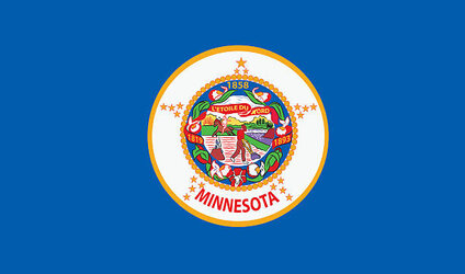
Minnesota is in the process of redesigning their State Flag, which routinely gets ranked as "the worst" in the Union.
Its Current flag.
Its seems every submission tends to riff on the theme of "the north star", since the State calls itself "the North Star State. This one actually looks pretty cool.

I rather like the Green and Blue aesthetic. It works oddly good, and the use of the elongated star to create what's essentially a Nordic Cross (a Nod to the States Scandinavian Heritage I am assuming) is pretty cool.
Its Current flag.

Its seems every submission tends to riff on the theme of "the north star", since the State calls itself "the North Star State. This one actually looks pretty cool.

I rather like the Green and Blue aesthetic. It works oddly good, and the use of the elongated star to create what's essentially a Nordic Cross (a Nod to the States Scandinavian Heritage I am assuming) is pretty cool.
- Joined
- Jul 4, 2022
Flag and seal of the Afrikaner Weerstandsbeweging in South Africa.
- Joined
- Feb 3, 2023
As a Minnesotan, I can confirm our flag is absolutely fucking terrible, but that's not why they keep thinking about changing it. It routinely gets called "racist" by libs and immigrants just because the seal has an Indian on it.Minnesota is in the process of redesigning their State Flag, which routinely gets ranked as "the worst" in the Union.
They'll probably go with this one. It was originally proposed in the 80's or 90's, but keeps cropping back up whenever the topic arises.

This one was proposed on the state's centennial in 1958, and I'm not a big fan tbh. 19 stars because we were the 19th state admitted after original 13, and the big star = North Star. I know it's Red/White/Blue because of America, but I just think of a backwards French flag.

- Joined
- Jun 2, 2019
- Joined
- Jan 20, 2022
- Joined
- Aug 1, 2021
Montreal's flag from 1935 to 1939 looks like an intentionally shitty submission for the KF art threads, when someone uses MS Paint to add a few pre-loaded assets to some quickly made canvass as a joke.
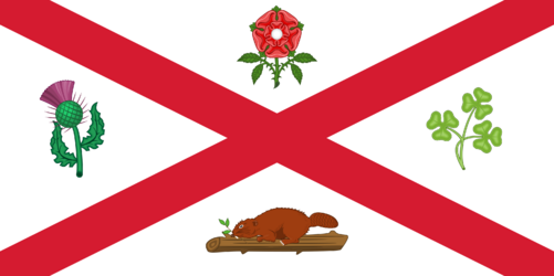
I feel like I remember a recent MATI episode where Null mentions how flags should embrace what makes said state special, stand out... Well, this is what can happen.
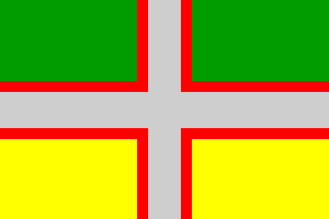
Green is for the forest, possibly in the top position for its age. Yellow is for agriculture, possibly at the bottom to show how the ground provides. Grey is for the importance of the aluminium smelting industry of the region. Cross is a nod to Quebec's Catholic heritage. It mirrors the Quebec flag in its distribution. The red is meant to highlight the population and its blood through labor. It's still in use in Saguenay, where it was created for the region.

I feel like I remember a recent MATI episode where Null mentions how flags should embrace what makes said state special, stand out... Well, this is what can happen.

Green is for the forest, possibly in the top position for its age. Yellow is for agriculture, possibly at the bottom to show how the ground provides. Grey is for the importance of the aluminium smelting industry of the region. Cross is a nod to Quebec's Catholic heritage. It mirrors the Quebec flag in its distribution. The red is meant to highlight the population and its blood through labor. It's still in use in Saguenay, where it was created for the region.
- Joined
- May 30, 2023
Kinda dig the beaver, though. Maybe...Montreal's flag from 1935 to 1939 looks like an intentionally shitty submission for the KF art threads, when someone uses MS Paint to add a few pre-loaded assets to some quickly made canvass as a joke.
View attachment 5341896
I feel like I remember a recent MATI episode where Null mentions how flags should embrace what makes said state special, stand out... Well, this is what can happen.
View attachment 5341891
Green is for the forest, possibly in the top position for its age. Yellow is for agriculture, possibly at the bottom to show how the ground provides. Grey is for the importance of the aluminium smelting industry of the region. Cross is a nod to Quebec's Catholic heritage. It mirrors the Quebec flag in its distribution. The red is meant to highlight the population and its blood through labor. It's still in use in Saguenay, where it was created for the region.
Nah, even dumber than a leaf.
- Joined
- Oct 12, 2019
Full Frontal NudityThose are some really good flags. I think I know the answer for why Municipal flags in the US are good and the State flags tend to suck ass. It's Virginia's fault for the "seal on blue background" curse. Virginia was for the longest time the biggest state, and quite a few other states got carved out of its colonial remit. When New York and Pennsylvania ended up copying the basic design premise it was all over.
To be sure, it IS memorable. it's got full frontal nudity, what looks like a Dominatrix throat stomping a simp and so on. But it's still literally State Seal on Blue, and I am pretty sure it was the first and everyone else just ended up copying it.
BDSM
Call to Violence
Crime (Regicide)
The only 'Seal on a Bedsheet' that I allow.
- Joined
- Jul 21, 2023
- Joined
- Apr 5, 2021
I was kind of curious if there was a flag to represent mankind in general or at least some concepts, but these two kind of stuck out to me.
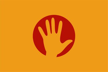
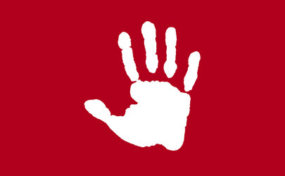
I think maybe the colors for the first one are a little ugly, and I feel like maybe the second one the colors can be flipped. I’m not sure though. I personally like the second one, and I feel like the handprint is a great symbol of humanity itself. What do you guys think?


I think maybe the colors for the first one are a little ugly, and I feel like maybe the second one the colors can be flipped. I’m not sure though. I personally like the second one, and I feel like the handprint is a great symbol of humanity itself. What do you guys think?
- Joined
- May 30, 2023
I dunno, I just see handprints and think of those baby handprint projects new moms make.I was kind of curious if there was a flag to represent mankind in general or at least some concepts, but these two kind of stuck out to me.
View attachment 5462685
View attachment 5462686
I think maybe the colors for the first one are a little ugly, and I feel like maybe the second one the colors can be flipped. I’m not sure though. I personally like the second one, and I feel like the handprint is a great symbol of humanity itself. What do you guys think?

- Joined
- Mar 4, 2015
- Joined
- Jan 19, 2023


