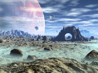
Frutiger Aero and Y2K Futurism Appreciation Thread - When the future looked bright and optimistic, before the world turned gay and retarded.

  • 🐕 I am attempting to get the site runnning as fast as possible. If you are experiencing slow page load times, please report it.

Frutiger Aero or Y2K Futurism?


  • Total voters
    111

Patrick Bait-man

The Perfect Bait-er
True & Honest Fan
kiwifarms.net
Joined
Dec 12, 2022
Before flat designs and Corporate Memphis swooped in and made things look utterly soulless and ugly, there was Frutiger Aero and Y2K Futurism; the two best aesthetics to have ever existed in the history of aesthetics that brought a sense of hope and optimism to what was to come.

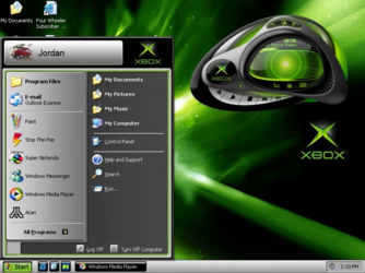
Y2K Futurism​

Y2K Futurism was the aesthetic commonly used from the late 90s to early 2000s, characterized by "slick futuristic fashion, technology, and music." Everything was shiny and chrome, with crazy fashion and new cutting-edge technology at the forefront; and it was the definition of cool.
socket.jpgwindowsxpxboxdesktop.pngoriginal_f267dfb005f5a42190c68d69054bd503.jpg

Frutiger Aero​

After Y2K Futurism's run, Frutiger Aero was introduced and commonly used from the mid 2000s to the early 2010s, characterized by "Skeuomorphism, glossy textures, cloudy skies, tropical fish, water, bubbles, glass, lens flare, sprawling patterns, 'humanism', aero glass, bokeh, Frutiger fonts, Abstract Tech, auroras and bright, vibrant colors (usually greens and blues)." It's a hallmark of the golden age of the Web 2.0 Internet.
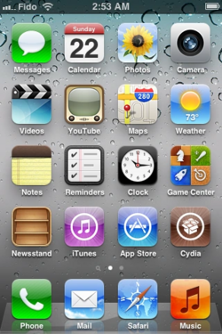
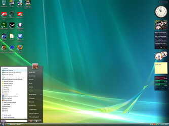
ios5homescreen.pngwindowsvista.jpg

Unlike the futurism of Y2K, Frutiger Aero is all about nature and Earth. It's heavy on glossiness / aero, details / Skeuomorphism and it's the most beautiful, pleasant aesthetic to have ever existed. Fuck the corpo niggers that dropped this look in the mid 2010s.
 
Last edited:
You'll find a vast searchable repository of these styles in the Winamp Skin Museum. For instance, I hit the random skin button and it brought me this first try:

Alien_Metalloid_Build_2-0_.wsz - Winamp Skin Museum - skins.webamp.org.png

Sure you'll find plenty that are just Weird Al or Buffy the Vampire Slayer's face, but there is a lot of cool shit in there. They're all interactable as well. Look at it and know that this is what itunes, spotify, etc took from you. I still wish I could find the coolest visualizer I lost nearly 25 years ago in an HDD crash.
 
You'll find a vast searchable repository of these styles in the Winamp Skin Museum. For instance, I hit the random skin button and it brought me this first try:

View attachment 6159412

Sure you'll find plenty that are just Weird Al or Buffy the Vampire Slayer's face, but there is a lot of cool shit in there. They're all interactable as well. Look at it and know that this is what itunes, spotify, etc took from you. I still wish I could find the coolest visualizer I lost nearly 25 years ago in an HDD crash.
You'll find a lot of old Music VSTs also had this similar, overly detailed look to it compared to how most programmers design them now.
 
Big fan of Y2K but Frutiger Aero is creepy corporate slop and I really disliked it even when it was dominant. Every single other aesthetic from that time (skeumorphism, "soft urban" vinyl stuff, the weirdly-omnipresent class sketchbook/cut-out collage and mixed media boom that doesn't really have a name yet) is vastly superior.

Kinda wish these two aesthetics got different threads, but i'm glad that Y2K is getting any appreciation around these parts so I'll contribute some of that to balance out the greater presence of Aero.

1720574729199.png1720574894427.png1720574925546.png1720574956900.png1720574974173.png1720574988942.png1720575004578.png1720575020332.png1720575070361.png1720575247685.png1720575292196.png1720575314099.png1720575332897.png1720575354501.png1720575679319.png

I had more of these but my browser is starting to complain so i'll leave it here lol

I got pretty much everything up there from here, a pretty decent resource all things considered. There are some especially exemplary gifs starting from about this point in case you're curious.
 
Last edited:
Growing up, I was often spoiled by the beauty of this aesthetic. It felt really optimistic and amazing, then going into the mid-2010's. Those art styles were often replaced by the shitty Memphis corporate art style and corporate minimalism to appeal to the pussified youth like it's some sort of Hug Box or something. I really missed the days Y2K Futurism and Frutiger Aero were the norm.
 
Some more Y2K for the road.

original_efc79d9f3197d349c749d05bdd35be30.jpgoriginal_44302f3a2412da95cd1633f95d979fa7.jpgoriginal_93a35d753a9e5d1ddcb3bbb198847955.jpgoriginal_3124c9d33e3b9c49489129adb33ccbe6.pngoriginal_0e3cb2838563efd01e6ae30ce3b82912.pngoriginal_0f4be0cd5ccf2769f6ef74a4c49273c2.pngoriginal_ddab32b00f64216dfc89a787b71de0fb.pngoriginal_a8e77e4584376436bc2f6bac53699fc8.pngoriginal_77abce65bffe1b4f5ec857612744a17a.pngoriginal_bce54bb1bd1fec112a8fe8dacf7a5c44.pngoriginal_6cae5c1dc35e330242a7c07eacf40e32.pngoriginal_f95577b6b13e449c8b06dc82cb99894e.jpgoriginal_54862629e4388fe739158d2c425fce78.pngoriginal_d01ab9450f31771d0451c42aa692c1b3.jpgoriginal_442bd4687496abcf542f1c5b6e948afb.pngoriginal_edcb4731765a3eaa5140f710c54e922b.pngoriginal_705f74465cde06260d00d9902b779bce.pngoriginal_bc1f2092d4edba53b749a0366f3c4a7c.jpg

The Menthol ad is my favorite photo here. It's existence is almost aggressively stupid. Trying to sell a plain cigarette with the most over-the-top "futuristic" sheen you could think of. It's almost adorable in how earnest it is about being desperate.
 
Last edited:
Crossposting an okay imitation to keep the thread alive.

look at these character profiles.
1733337618696.png1733337633558.png

These kick ass and I love almost everything about them. The emphasis on cartoonish stylization with the gloves and exaggerated proportions, the interesting poses, the pleasant colors in the back contrasting the very bright and colorful character designs, that fucking FONT, the drop shadow! Why can't other Y2K imitators be this good? I love how this is done! If it wasn't for how clean the textures looked (+ the color schemes of the character designs, esp the pale pink blush on tan-brown skin) you could've probably fooled me into thinking this was actually from 1998-2002.
I'll dump some more stuff from are.na when I've got the time, I really love that site and everything on it.
 
Back