Interior Design & Architecture Gore - Alternative title: cursed decor

  • 🐕 I am attempting to get the site runnning as fast as possible. If you are experiencing slow page load times, please report it.

0 0

--- .... / --.. . .-. ---
Forum Staff
🐕‍🦺 Animal Control 🐕‍🦺
💬 Off-Topic Mod 💬
True & Honest Fan
kiwifarms.net
Joined
Nov 25, 2017
I don't know what it is, but there's something I find innately amusing in bad interior design. If beautiful rooms can be described as "interior design porn," I suppose the direct opposite is "interior design gore." In retrospect, maybe this is a bad analogy because I'm discussing how much I enjoy it.

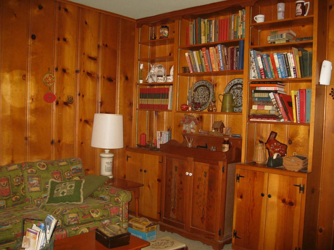
There's a variety of examples of the things I would call "cursed interior design." For instance, there was a thread earlier which cited this as a positive example of good interior design, but to me, it's just hideous. It's simply an entire room seemingly made out of the ugly, spotted wood from wall-to-wall, all the way down to the furniture.
1629385105009.png

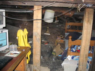
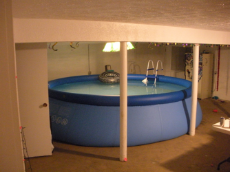
There's more than just that, though. For instance, bad interior design extends to things beyond the simple construction of a room, such as the choice "decor." Some prime examples being an inflatable pool in a carpeted basement, a spiral staircase that looks like its designer made it while actively having a stroke, or a depressing computer station that looks like it's operated by a literal cave troll.
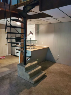
1629385174452.png1629385764477.png 1629385794211.png

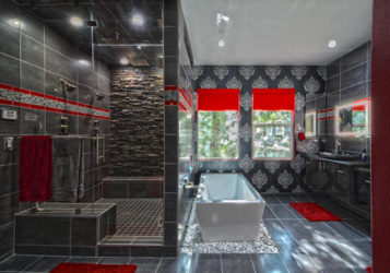
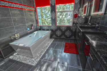
One of my favorites, which has reached an almost legendary status, is this particular room designed by an overenthusiastic (and financially wasteful) creator. This ugly bathroom is so infamous, a Doom mod was made specifically in mockery of it.
1629385404487.png 1629385411538.png 1629385420453.png

There's just something about photos like these where I can't get enough of them, and I was hoping people had some they could share.
 
Great thread idea! I'm not going to lie I actually kind of like that bathroom, but I don't have great taste.
People do comment that they like they design of the bathroom. It certainly is striking, but there's a multitude of things wrong with it. The thing to consider is both "will I stand looking at this on a daily basis" and "how easy is this to maintain?" Bathrooms typically utilize simple and utilitarian designs for a reason.

Functionally, the rocks under the tub is a needless hassle. That's a ton of cracks you need to constantly clean to prevent build up of mold or scum, especially when it's surrounding a source of water. The fake rock wall on the shower is even more of a nightmare, so the whole thing will cause major issues after a few years of use.

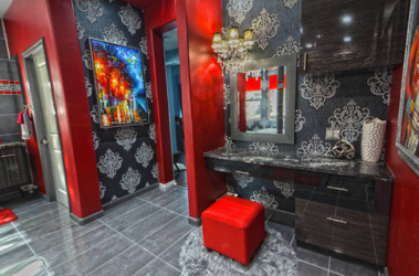
Visually, black and red is a naturally beautiful color scheme, but absolutely not for a room, at least not with such a confused mishmash of the two. The red alone is loud enough, but it's practically fighting with the sharp blacks and gray marble for attention. Beyond the colors, it's just noisy. Tile pattern accents, visually busy marble patterns, and a wallpaper that looks like it came from a gothic castle.

Which leads to the final issue, which is what this is trying to be? Because I don't think even the designer knew. You have this chimera of gothic, river-rock, night club slash nature preserve style that looks like Dracula opened up a kombucha bar. It's the interior design equivalent of a sports car with flames painted onto glitter-coated metal. And unless the rest of your house looks like this visual nightmare, it'll be like you stepped into a portal to another dimension every time you want to brush your teeth.
 
Personally, I feel these "themed bedrooms" are pretty bad, especially for kids. Like I understand you have hobbies, but theming your entire bedroom like that will be a desicion you regret when you either grow out of that phase, or grow up and can't bring a girl into your basketball/car themed bedroom.

1629386839464.png

1629386870559.png
 
Great thread idea! I'm not going to lie I actually kind of like that bathroom, but I don't have great taste.
I agree about the first two bathroom pictures but I’d obviously prefer the windows to be opaque. Everything’s smooth and clean but not a bland white and I love the big open shower. The third image though is just too much. Having a stool and draws in a bathroom is just tacky. If someone is gonna groom or apply makeup in a bathroom, it should be in the mirror above the sink. The wallpaper also has to go, it should be tiled like the other wall.
 
  • Like
Reactions: Aunt Carol
The shit you have is loooow level.
View attachment 2459373
My mom rented a house with carpeting in the bathroom when I was in high school. Old worn down burnt orange shag carpeting with navy blue wallpaper that had silver leaves on it. We hated it so much and the owners didn't care. That old shag carpet was only in the hallway, bedrooms and bathroom. The rest of the house had newer beige carpet in the sunken living room. We tried our best by putting some bathroom mats on the floor around the tub, but it didn't really help. That carpet was nasty even with regular cleanings.
 
The first picture with the wood walls was one of the ideal interiors in the 40's and 50's because they were trying to bring the outside in for a reasonable price. It was supposed to look rustic, mimicking a cabin in the woods. People today don't seem to like the wood wall aesthetic in their interior, painting everything white or muted neutrals, let alone want a summer camp look. It was meant to be simplistic and create a less formal, stress reducing environment.
 
I was going to make a Gatorade joke at first, but then I noticed the Janus cup in the foreground, and then the odd creepy bust by itself in the background, and then that robot thing in the side room, and I want to go home now
I like to think that those rooms are an endless maze, so no matter which corridor you take you will always find yourself in more R̴̨̨̧̢̹̯͕̺̠͍̜̒̓͗̔͊̇̑̕͜͝͝ͅE̴͇̻͍̭͇̲̫̥̩͊̀̊̍̓͘Ḏ̶̡̮̀̄̐̍̐͌͝ ̸̣̰͍̒̾̉̃͛̂̚̚͘͘Ą̵̡̳̻̂̕ͅN̸̲̣͎̠͔̆̇͋̀̈̍́̆̐̿͝͠D̴̨̡̺͇͎̗͍͇̲͍̆̉̓̃̔̾͑͒̑͝͝ ̵̙̟̳͇̤̻̘̄̃̈́͗̽̏̓B̶͎̻̬̻̣̪̣͕͇̳̎͒̕L̴̳̅͊͂̕͜U̴̳̪͚̰̠̫͉͎̹̞͖̪̙̿E̷̖̦̼̦̱͉͖̠̯͊̆̈́̎͊͑͘͘ rooms
 
Anything that lacks contrast looks bad. If it's a room with wood paneling and wood furniture, or white-on-white, or god forbid, concrete-on-concrete.

My sister's friend had an apartment with black wooden floors (not dark wood, black), black wallpaper and everything from the kitchen counter to the miscellanious furniture black with a giant sectional black leather couch in the middle of the living room. The worst part is it was a $1M+ apartment just based on the location. It had very much a 2003 Bam Margera goth chick vibe to it.
 
I like to think that those rooms are an endless maze, so no matter which corridor you take you will always find yourself in more R̴̨̨̧̢̹̯͕̺̠͍̜̒̓͗̔͊̇̑̕͜͝͝ͅE̴͇̻͍̭͇̲̫̥̩͊̀̊̍̓͘Ḏ̶̡̮̀̄̐̍̐͌͝ ̸̣̰͍̒̾̉̃͛̂̚̚͘͘Ą̵̡̳̻̂̕ͅN̸̲̣͎̠͔̆̇͋̀̈̍́̆̐̿͝͠D̴̨̡̺͇͎̗͍͇̲͍̆̉̓̃̔̾͑͒̑͝͝ ̵̙̟̳͇̤̻̘̄̃̈́͗̽̏̓B̶͎̻̬̻̣̪̣͕͇̳̎͒̕L̴̳̅͊͂̕͜U̴̳̪͚̰̠̫͉͎̹̞͖̪̙̿E̷̖̦̼̦̱͉͖̠̯͊̆̈́̎͊͑͘͘ rooms
I am disappointed they didn't paint the fan.

Cool Iron Man suit though.
 
Back