View attachment 3193886
(Commission sheet from Feb 25, 2022)
Still virtually no improvement. I can't even tell what the fuck changed in her art. Slightly more joint folds?
I had some insomnia and this felt like something I could tackle for an easy drawing challenge to relax. I'm doing this more as criticism as a selling tool rather the shortcomings in the art itself. I do think it's a bad drawing but isn't intrestingly bad enough for a redraw by itself.
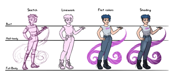
First of the general idea isn't bad. A self portrait is a pretty decent marketing tool for commission work as its not only shows an example what you could get but who is it from. Brand creating an all that. The different steps and background lines to show of what is available isn't original, but it's a well tested template. Easy to read and gives good idea to estimate how much what you want is going to cost, it's used because it works. So the very basics do check out.
Where this falls short is that this self portrait just isn't well done for marketing purposes. The pose isn't a good one for this. It's not only boring and stiff but it's also unclear on what you are going to get. Why is she holding her hand up? I get it's ment to be a hello from the artist to seem friendly and approachable but remember that this supposed to show what you are going to get with each line. A bust is generally just a face, neck and maybe shoulders but this makes it look like one floating arm belonging to that price category.
The legs are boring and badly draw. In general this wouldn't be that bad as most people do tend pay more attention to face and hands but with this format the full body is kind of an up sell. You need show that getting legs is worth of that five extra bucks from a halfbody and this is just not doing it.
The second issue is that the steps just don't stand out enough from each other. Every step should obliviously different from each other and get more impressive to give insentive to spend more money. This kinda fails with both. The sketch and the line work look almost identical, except the sketch is actually bit more interesting looking because it has some shading and darker spots around the face.
Next is the colored ones and again they look almost identical. The biggest difference is the background blob but when the shading is what you are selling it's not a good look. Also this shape and location doesn't play well with the price lines. It makes it look like the bust will have a tiny color hump. Still the bigger problem is that the shading just isn't noticeable enough. I genuinely had to really look if there was any. Most potential clients won't bother so that will eat the upsell potential and at worst confuse them not to order. Since we are here, why is the biggest price hike with the flat colors? That's like the fastest step that you can nock off in ten minutes. Sure it has the highest wow factor compared to the previous step but if you know anything about digital art that pricing doesn't look good.
So after that text wall and before the next one here is my take. While my version doesn't have prices I aimed it still being a marketing material type. My first instinct was to do something more dynamic with the pose, sexier character designs and all that but then figured it would be more informative if I stayed closer to the home. So while did treat Luna as a random character rather than an actual person and did other changes, I tried to stay similar to the original. Similar standing pose, similar proportions, similar clothes and similar colors outside of adding little eye catching pink.

I will admit that my sketch is crap and not worth of any money but that's just how my work flow goes and I didn't feel like deviating too much just for a redraw. This is bit more detailed than my average because I knew I was going to show it but yeah, I know it's still a mess. That to be said I think my method could be better for Luna. I think part of her issue is that she tries to sketch a nice picture rather than do a nice final image. It's normal enough with inexperienced artist that they work in moment rather than think a head. Sketching is useful but it doesn't one for one translate into clean ink lines or nice colors. Overdoing it during sketching just doesn't leave space for the final tools to shine because you end up trying to copy something with tools that don't really work like that.
What I do is a very loose sketch for poses and proportions. Sometimes I do this few times but I just start inking as soon as I have the general idea cleared out. That to said I do little sketches as needed as I work on. This one of the best features of digital art, you can just stop, sketch on a different layer and continue inking. For example with hands I often need little help to get fingers right but I don't bother with them before the arm position pretty final because that affects how the fingers should go. You can see my method with the actual line work being so different from my sketch.
Then about the colors. I took my time with them, long phone calls are exellent for this, but I wasn't that careful and it wasn't anything that laborious. Flat colors I did very flat and fast. Simple clean colors with few extra details and the background element for selling power over lines and set it up for shading. With shading I went mostly with a simple one shadow layer cell shading as it is fast but still gives a strong sense of light and dark. Then I added few little highlights, colored some areas with a softer brush and put in few subtle gradients. I think the colors came out nice and give the bottom area more intrest despite the pose staying basic.
I think it's a huge improvement but I'm biased. So what do you guys think?

