With the dust settled on Gen 7 and another new cat starter around, what do you guys think of Incineroar's design?
I've only disliked it more as time has gone on. A heel-wrester based on Tiger Mask is a fine and all idea, but this is by far and away the worst possible execution EVER. You not only put it on a starter- which is supposed to symbolize the generation and introduce the idea of Pokémon as your friendly pets to you with what's equivalent to a real-life dog (in that it's the most loyal, the best defender against attacks on you
save for a gun, and friendly)- but you give it to the first
cat starter ever. A wildly popular animal.
In a trio of starters that all evolve into representatives of circuses.
And the cat's a fire type
WOW, I WONDER WHAT WOULD FIT THIS CAT BEST.
HM. LET'S DO THE EXACT OPPOSITE OF THAT AND MAKE IT LOOK MORE LIKE THE TROUPEMASTER THAN THE TIGER JUMPING THROUGH HIS RING OF FIRE. GREAT IDEA, TOTALLY NOT EXTREMELY OFF-PUTTING AT ALL.
I didn't even care for Litten on initial release, but as time has gone on i've come to greatly appreciate its clean and effective design. Red and black always look good together, and tying it in with a bomb-fuse tail as well as some yellow cat eyes that look like the center of a flame is a fucking genius way to express that this is a fire type without lazily slapping flames on it somewhere like they do with 70% of other fire types (especially the starters).
Litten also has a personality, but it's not so exaggerated as to overshadow potential for imagination. You can imagine a Litten as more docile, more cranky, more friendly, very easily. Sure, its design language and animations will probably prompt you to think of it in a shadier light- but that's not inherently bad and gives a very good idea of the species' general disposition. Just like Dark/Evil types are known for being underhanded and dirty while types like Electric tend to produce much more hyperactive designs, there's a very light application of humanity to this creature that helps flesh it out beyond looking good. Not to mention it easily foreshadows the final evolution's typing by making it pure Fire but giving it the general air of something
Darker.
Torracat is already throwing some of this in the garbage. You can see in how its posed and how it moves that it's not as comfortable on four legs as it used to be, which is odd for what should surely be turning into some kind of sleek killer-cat type with an attitude. It also grows a nice tumor on its neck that acts as a cat bell- but it doesn't have any patterns on its fur mimicking a proper collar, so it doesn't fulfill the mimicry wholesale, and the way the bell is placed makes moving its head rather awkward if it just sits there as a result. This isn't a dealbreaker or anything, lots of middle stages have odd tidbits like this to differentiate them and show their growing pains, but it does make me a little more wary to the final result and the buff forearms really don't help. Why are they there. What is that.
And now we arrive at the travesty. The heartbreaker. THE ULTIMATE HEEL OF ITS OWN EVOLUTION LINE:
INCINEROAAAAAARRRRR
I'll reiterate. Seriously,
it's not a bad concept. Even if I hate this thing for all it stands for, everything it tossed away, everything it looks like: if this was a one-off or two-stage line in a regular dex, I'd probably be a LOT more friendly towards it. Probably still not friendly friendly, I'd
like it
at best, but I wouldn't be anywhere near this passionate about it.
It's the fact that it's attached to Litten, a STARTER, probably one of the only ones I
actually, truly love, that makes me haaaate it.
Let's start with the actual design before anything else.
This thing looks fucking terrible.

To start with, those hands. THOSE HANDS. HOLY FUCK, WHAT ARE THOSE HANDS.
Most of the line before now has been relatively proportionate. Most of it has been realistically sound.
Those fucking hands look like someone stuck a nail up a human dick and glued five of those onto a palm.
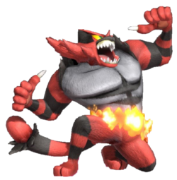
Also, a reminder, this is a Smash render. This is actually Incineroar adjusted to be slightly more feasibly realistic.
Look at this
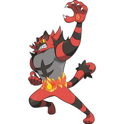
official art.

Awful.
And the hands are just the fucking beginning: they're attached to a pair of thinner arms that taper out from the shoulders. Shoulders which now have big spikes of fur lining them to give the impression of a
ripped shirt. A human accessory on a fucking cat- the first of a few.
Regardless of that, let's examine this torso further. It's an upside-down triangle that's very clearly trying to convey macho muscley abs, an extremely masculine trait, without going overboard. It even has dark lines to emphasize this and look somewhat like a six-pack, again without going overboard and making it a barafaggot's obviously-fetishistic wet dream (even if it wholly fails and 90% of its fanart is gay dudes jizzing it to its abs anyways. 'bout as subtle as Salazzle, really). It's also got the aforementioned "ripped sleeves" which segment the gross ashy-gray parts and the red, probably relating to it finally gaining a proper Dark typing and having that typing be conveyed through its color scheme as its "true evil bursts forth" or some pretentious shit like that. In less flowery terms, it's basically just the design going "hey this is dark-typed now let's convey that with a ripped shirt". The darkness is further emphasized by the rings going down its arms, which are also meant to signify that this is a fucking tiger.
Except it's not, because it is a man. It is a man in a fursuit wearing a ripped shirt and a belt. It has a flaming belt that cuts off its grey part from its (very small) pair of legs, which still look rather cat-like (especially in comparison to those fucking fingers), and don't even have the same amount of digits as its forelegs anymore. It has stylized sideburns in the form of three poofy spikes down the sides of its cheeks and it has very bushy eyebrows signified by them now being their own little hair-spikes above the eyes (worth noting that this is not actually a bad idea and I really like it, it just adds to the humanity of it all). It even has gray irises, which no fucking cat can physically ever have, surrounding its yellow sclera to make it appear more like a human instead of like A CAT. They're a little hard to see in the official art, especially as a jpg, but here's a closer look of its Dream World art to really show what I mean.

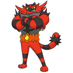
Actually, let's zoom out. Let's look at this image completely.

Look at this pose. This is a human pose. This is a pose that states "I am cool and confident, and will fuck you up if you cross me." This is very human behavior that is not shared by any other species as far as I know.
This is applied to a design with a human jawline, at least two pieces of human clothing (arguably more if you count the mask pattern, but I think that's getting petty), human hands. It furthers the awful uncanniness of this fucking tragedy.
Here's a fun fact. Snivy actually had a very similar pose in the vanilla Black and White games. As part of its idle poses, it would cross its arms and stick up its snout.
This was changed in the sequels to be it brushing itself off instead. Something
far more animalistic that still conveys its stuck-up nature well. None of its evolutions or other animations continued this trend of human behavior, either, and most Pokémon are generally assumed to be like that. Animalistic. Pets. Friends. They are your dog or your cat. They eat kibble and they can't speak.
They are not 5' tall wrestler men who gloat about how evil they are and spend their time following 10 year old kids around as "their masters".
AND HEY, WOULD YOU LOOK AT THAT, THEY GAVE IT A FLAMING BELT. ALL THAT SUBTLE CONVEYANCE OF ITS TYPING WAS TOO MUCH EFFORT, I GUESS, AND THEY JUST SLAPPED SOME FLAMES ON IT ONCE AGAIN SO THAT PEOPLE WOULD REMEMBER THAT THIS THING BREATHES FIRE. GREAT.
Ugh, I'm getting off-topic. The long and short of it is: fuck this design. It threw away everything good Litten had going for it (subtle conveyance of its typing, hints at a greater personality with room for interpretation, a very simple and clean design that isn't cluttered with human-like objects or fancy patterns beyond what it needs to convey its typing, a house-cat/tiger hybrid that leaned on the former with hints of the latter, pleasant colors) for a shitty wrestler schtick that is questionable at best and extremely fucking creepy at worst. It is probably the first Pokémon I've ever truly hated and that hate has only grown more pronounced with time.
I haven't even talked about how it looks so obviously like a fighting type and yet it's dark anyways (I realize it's dark because of its heel elements; I just mean that most people won't catch onto that, and most "clothes with muscles"-type designs are fighting, so it's confusing), the fact that it runs like a fucking gorilla instead of like a CAT (mainly because I can't find the gif), how it's arguably patient 0 for this
really uncomfortable "starters as characters" trend that is never going to die (because it's been explicitly stated as the goal from the series' developers) and has produced the worst trio of starters in the series back to back to back for over 5 years straight now, alongside the fact that this philosophy is seeping out into more and more and more designs that
aren't starters over time because making Planets of Hats is far easier than taking time to think of anything as a diverse whole with almost no consistent mindset, aaaany of that.
This is like surface-level ranting.
Surface-level.
I'll take my top hats now, I don't care lol. Fuck Incineroar and fuck the fact that I spent half an hour still seething over Incineroar half a decade after its release.
God I miss when I liked most of this series' designs by default.


