Navigation
Install the app
How to install the app on iOS
Follow along with the video below to see how to install our site as a web app on your home screen.
Note: This feature may not be available in some browsers.
More options
Style variation
You are using an out of date browser. It may not display this or other websites correctly.
You should upgrade or use an alternative browser.
You should upgrade or use an alternative browser.
"Post your Art" Thread
- Thread starter The Hunter
- Start date
-
Want to keep track of this thread?
Accounts can bookmark posts, watch threads for updates, and jump back to where you stopped reading.
Create account
- Joined
- Feb 23, 2019
- Joined
- Dec 21, 2020
very happy how face turned out
i don't have many chances to do close up so i figured its the perfect chance to utilize dotted hatching
and got a new tablet (the one with support from manufacturer)

i don't have many chances to do close up so i figured its the perfect chance to utilize dotted hatching
and got a new tablet (the one with support from manufacturer)
Last edited:
- Joined
- Apr 12, 2021
- Joined
- Dec 21, 2020
i need some feedback
1st do you think i need background on last 2 frames
2nd does it look like the same person
3rd did i fuck up the anatomy? cause i feel like i did
edit i probably did the upper body bigger then it should be


1st do you think i need background on last 2 frames
2nd does it look like the same person
3rd did i fuck up the anatomy? cause i feel like i did
edit i probably did the upper body bigger then it should be
Last edited:
- Joined
- Aug 2, 2021
- Joined
- May 19, 2024
Im suffering art style crisis
Do yall prefer current one which takes 10+ hours per page for so
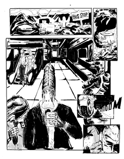
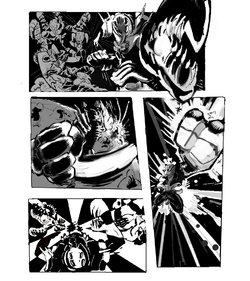
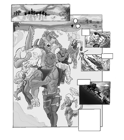
Or
Like idea of an art style that looks more goofy and colourful like how it originally was supposted to look like. Just trying to make shit thats both appealing and can attract enough attention or keep people comin
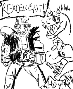
Do yall prefer current one which takes 10+ hours per page for so


Or
Like idea of an art style that looks more goofy and colourful like how it originally was supposted to look like. Just trying to make shit thats both appealing and can attract enough attention or keep people comin


Marzipan Apple
kiwifarms.net
- Joined
- Jan 15, 2024
1st: No. In general, it's not necessary to include a background in every panel. Overloading the page with backgrounds can feel cluttered and make it hard to read. I still suggest adding some shading to the empty areas in the bottom two panels to break up the large white spaces.i need some feedback
1st do you think i need background on last 2 frames
2nd does it look like the same person
3rd did i fuck up the anatomy? cause i feel like i did
edit i probably did the upper body bigger then it should be
View attachment 7139389View attachment 7139475
2nd: Yeah, they do look the same. I actually thought it was the same person before reading your post. Make their hair different if you could. That's the main thing making them look alike.
3rd: The arms look a little too long, but otherwise the anatomy looks fine to me.
Amazing art as always, my man. I don't know how you have the patience for all that detailed hatching.
- Joined
- Dec 21, 2020
im biased towards 1st version, but its probably because its somewhat similar to mine. makes it look more serious.Im suffering art style crisis
it supposed to be the same person, i just wasnt sure about consistency between frames. never had to deal it with it before. at least on this scale.I actually thought it was the same person before reading your post
i think you are rightThe arms look a little too long
heres a fix now i think it looks just right
AutismI don't know how you have the patience for all that detailed hatching.
Last edited:
- Joined
- Mar 13, 2021
1. No, I don't think you do. Especially since the focus is her expression.i need some feedback
1st do you think i need background on last 2 frames
2nd does it look like the same person
3rd did i fuck up the anatomy? cause i feel like i did
2. Yes, but I think that the hair looks darker in the second frames vs the first. Like she looks blonde in the first brunette in the second.
3. A little, but your edit already made it look much better. In case you're curious I will still include my feedback though.
So this is kind of how her body reads under the clothing.

Mainly the left hip doesn't look quite right and the crotch looks too short. The Right thigh also reads a bit long.
Here is a modified wire frame which I think reads a bit better.


Then here is the difference in terms of how it would somewhat rendered:


Though obviously yours's looks much more nicely rendered .
.
In case you want to play around with the layers I included a krita and photoshop file in the zip.
Mainly the left hip doesn't look quite right and the crotch looks too short. The Right thigh also reads a bit long.
Here is a modified wire frame which I think reads a bit better.
Then here is the difference in terms of how it would somewhat rendered:
Though obviously yours's looks much more nicely rendered
In case you want to play around with the layers I included a krita and photoshop file in the zip.
Btw it's really cool seeing your work! Your linework/rendering skill are really great!
Attachments
waratteruN
kiwifarms.net
- Joined
- Feb 13, 2023
Shine-369
kiwifarms.net
- Joined
- Dec 9, 2024
Cars were art back then. The steering wheels alone are pretty cool looking. Wouldn’t wanna slam my face into one going 90 though.
- Joined
- Sep 26, 2023
- Joined
- Dec 21, 2020
Thank you it was very helpfulSo this is kind of how her body reads under the clothing.
View attachment 7145118
Mainly the left hip doesn't look quite right and the crotch looks too short. The Right thigh also reads a bit long.
Here is a modified wire frame which I think reads a bit better.
View attachment 7145123View attachment 7145122
Then here is the difference in terms of how it would somewhat rendered:
View attachment 7145121View attachment 7145120
Though obviously yours's looks much more nicely rendered.
In case you want to play around with the layers I included a krita and photoshop file in the zip.
Btw it's really cool seeing your work! Your linework/rendering skill are really great!
i did 2 versions and not sure which one is better
progress so far
the "blond" version
and my first attempt at the dude
i originally wanted to give him simple baggy clothes but it ended up look like some sort of jumpsuit

and "brunette" version and my second attempt at his clothes that looks much nicer imo

and my first attempt at the dude
i originally wanted to give him simple baggy clothes but it ended up look like some sort of jumpsuit
and "brunette" version and my second attempt at his clothes that looks much nicer imo


