I guess it's my turn to bitch and moan about the Reactions update a bit since it's been a few weeks now and it seems to have stuck around. It hasn't really changed my experience in terms of how I treat reactions, but I truly think it's made my "user experience" (hate that term but can't think of a better one) worse so I feel the need to explain how in hopes that something might be done about it.
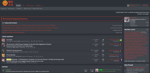
Watched threads have become annoying. I tend to go to the homepage by default when checking the farms, so now I not only get a tiny tick on the bell telling me which threads have new content but also a massive red title to my left distracting me. I no longer get to see recent posts in the lolcow board first- instead, nearly a third of the column to my left is taken up by notifications I am already checking and/or featured posts which I typically check once and then never again.
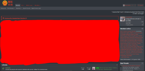
Of this entire page:
 More than half
 of it is taken up by shit I don't check more often than once a week or stuff that I already check regularly, across the site, through other, much less annoying means.

I now need 3 scrolls down to get to the same content I could previously access with maybe half of one scroll. I could always zoom out enough that the useless sections are minimized, but at that point it becomes hard to read and the fact that it carries over to every single section of the site (instead of just zooming out the home page or a thread) makes viewing images nigh-impossible.
I've noticed that it's made me bother looking for new content a lot less- instead, I tend to just stick to my watched threads/featured because it's the most accessible and catches my eye before anything else.
I don't know if there's any way to make the latest watched column collapsible or something, but if you can then please do it. It's very large, very distracting, and extremely redundant on the home page.
As for reactions: I do not care about the funny internet points. I am not obsessed with getting good-boy karma or seeing every single person who reacted to every single post. I'm mostly upset because I've now lost a very good way to judge the types of people I'm looking at.
I used reaction scores as a general way to gauge how good posters are, pitting their score against their message count. If some dude had 300 messages but 3000 points, I'd probably give his posts some thought and maybe even follow the guy. If I see some retard with 5000 posts and 400 points, I know to avoid him for being terminally online. If someone has 20 messages and -3000 score, I'd know he's an interminable retard whom I should disregard entirely.
Sure, the positive/negative dichotomy helps a
tiny bit, but 99% of the users on this site have a positive score (if only by virtue of it being much harder to send 3000 messages vs gain 3000 reaction points). It's also partly useless in cases where Negative reaction scores pop up because those guys tend to have pink triangles anyways.
There is no longer any reliable way to distinguish a quality poster outside of either obsessively observing their posts or scrolling through pages of user comments on their profile (half of which are made by people butthurt at them for stating an opinion, the other half of which is someone asking for a link to something).
I can live without ever knowing how many reactions I have total, or what type of reaction I get the most of (outside of Like). It's annoying, it removed a fun tidbit I used to sometimes pay attention to when trying to improve my posts or just wanted a quick overview of my reaction history, but I can live with it even after the initial humor of your total reaction score always changing wore out its welcome 10 times over. But losing the ratio specifically has made getting to know users at a glance cumbersome at best and impossible at worst, which has made browsing and engaging with the farms more of a pain.
The closest thing to the old reaction score ratio is using someone's join date to judge whether they're a newfag, but even that is made unnecessarily tedious by not showing it directly underneath a person's profile picture, instead requiring people to hover over it for a few seconds if they want to know.
Why? Seriously, why do this? The immediate first answer is "to get people to stop paying attention to join dates", but what's the point of that when those join dates are still visible? Why hide them only for posts and not for profiles too? People will still judge others based off of join dates this way, it'll just take longer to get the same result. Either hide the dates entirely or make them visible under profile pictures again, please, this shitty compromise makes things worse for everyone.


