[USIPS] Logo Design Collaboration

  • 🐕 I am attempting to get the site runnning as fast as possible. If you are experiencing slow page load times, please report it.
I would say even smaller, just because I want the focal point and geographic center of the image to be on the person.
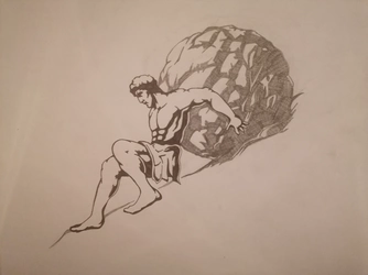
Is this enough
IMG_20250103_001951.jpg
Is he supposed to be crossing his right leg over his left leg? If not, might want to revise that thigh shading near the loincloth, in my opinion.

I'm going to try sketching up some contributions when I get home from work, but I think by and large it's looking good so far.
I see what you mean
Easy fix would be just reuse the light spot or get rid of it completely
 
The only thing that's not on point about this is looking forward, and that I think some of the lesser shadows should be reduced to engraving lines instead of hard black. What this does well, is it handles a problem with the hard black. Black draws the eye, but the shadows being straight down actually draws the eye to the character anyways because they sit on him.
I misread your feedback and added a sawtooth effect to the existing black so I'll fix that tomorrow, but I did change the head so it's looking sideways now, although I'm not sure the expression captures the spirit properly.
IPS_Logo_Rough_Profile.png
 
That's also really good and I like that it shifts the center of the image to the character and stays in a square. I think that @DefinitelyNotMe's is basically perfect, though.

If we took that and got the head looking right, I'd like to see a version with engraving hatch lines instead of the triangles.
 
@Null there are a lot of really nice submissions in this thread, is your next step to pick one? Or are you going to have a professional do a final render? Just curious what else you need/want.
 
@Null there are a lot of really nice submissions in this thread, is your next step to pick one? Or are you going to have a professional do a final render? Just curious what else you need/want.
I'm kind of waiting for one that's extremely close to what I have in my head, then ask for it to be traced into a clean vector for touch ups. Nothing is perfect yet.
 
I figure the logo design process is essentially done but I sill wanted to art-fag a little so here are some... probably useless little icons. Any changes can be made upon request, but I tried to get a variety to start with. There is a mix of With/without text, Terracotta/White-ground style, and 300p/60p styles.

sissy.gif b60.gifsissy.gif a60.gifsissy.gif d60.gifsissy.gif c60.gif

sissy.gif b500.gifsissy.gif a300.gif

sissy.gif d300.gifsissy.gif c300.gif

There was an attempt to create more elaborate animation (sliding down the slope, head bobbing, torso/shoulder heaving, ect.) but I think the more simple animation reads better.

EDIT: Reattached the images because I somehow fucked it up the first time.
 
I may be going a bit off the fucking rails doing work beyond Josh's immediate scope of just having the figure head finished but I am having a lot of fun and consider it practice, so... My inspiration is the Walking Liberty and the Prudential logos, you'll see the rear mountain is a fusion of her dress lines and the sun. When I do the Boulder King (waiting to see how other people's designs roll out) I'll favor shading him very darkly with illumination as the cut-lines so that he is the focus of the picture. The background will be busy but he'll just be this kind of... solid force of nature in the middle.

I also have to figure out how to better make the boulder stand out from the very busy background and blunt Boulder King but I'll research that later.

1735865042923.png
 
  • Like
Reactions: K!w!Fartz
I figure the logo design process is essentially done but I sill wanted to art-fag a little so here are some... probably useless little icons. Any changes can be made upon request, but I tried to get a variety to start with. There is a mix of With/without text, Terracotta/White-ground style, and 300p/60p styles.
This is actually awesome, I might use this for something.
 
I may be going a bit off the fucking rails doing work beyond Josh's immediate scope of just having the figure head finished but I am having a lot of fun and consider it practice, so... My inspiration is the Walking Liberty and the Prudential logos, you'll see the rear mountain is a fusion of her dress lines and the sun. When I do the Boulder King (waiting to see how other people's designs roll out) I'll favor shading him very darkly with illumination as the cut-lines so that he is the focus of the picture. The background will be busy but he'll just be this kind of... solid force of nature in the middle.

I also have to figure out how to better make the boulder stand out from the very busy background and blunt Boulder King but I'll research that later.
People have suggested a seal before but I really have a precise idea of what I want and it's just sisyphus/boulder/cliff line.
 
I thought I should get feedback before I spent any time refining my submission.
View attachment 6813263
I used @Taxidermied Rat 's design as a basis while incorporating some basic changes and trying to overall simplifying the shadows to make it easily recognisable at any size. I also simplified the ground to a single line to maintain the concept but not draw the viewer's eye away from the person/rock.
Him looking at the viewer in that pose makes it look like he's trying to hide the boulder behind his back and it brings me joy.

"Whatcha got there Sisyphus?"
"Nothing!"
 
heres a scan, a png and an svg
it lost some detail in the process but its barely noticeable
if needs be i can touch up on those
This is the best one so far, in my opinion. It just needs bank note engraving lines for shading.
 
I found some simpler engraved seals from Virginia. This style may work and be easier than relying on banknotes or coin-style engravings.118be889a554ab3a295840-780001369.jpgstock-vector-seal-of-the-state-of-virginia-usa-vintage-engraved-illustration-trousset-encyclop...jpgQN6XDLPXOJF6TMTFDSIJXXRZ6E-520284664.jpg
 
Do we still need engravings though? It will be barely noticed on smaller scale
I can make it but it will only basically add a third color - gray.
 
Back