>comparing this shit to Wallace and Gromit
View attachment 4860012
Take it back, lad.
Wallace and Gromit is definitely better but you can't deny there's heavy influence from it in this schlock
Even the fucking teeth look the same now, with how rounded they are and the way they're stuck in such wide bean-shaped smiles
It's like they took all the questionable elements of Gromit and forced them to fuck CalArts, resulting in this abominable invasion of bee-stung faces with huge schnozzes
EDIT TO AVOID DOUBLEPOST: To add onto this, Wallace and Gromit is
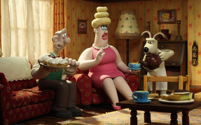
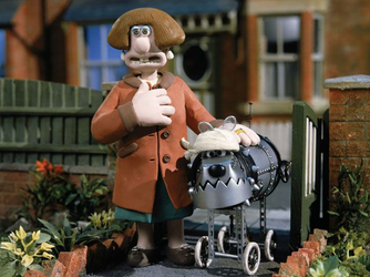
consistent in that every single thing adopts this softer, clay-like look (lmao I wonder why). Bird beaks become soft triangular cones, dog noses (which are usually more triangular and sharp) become round and clown-like, etc etc.
Most importantly,
hair does not look realistic. It looks clay-like and almost completely solid, with very rare exception. The backgrounds are also noticeably affected by this, with many objects being devoid of excess detail and almost looking toy-like in places (again, very obvious as to why, but it still contributes to the stylistic image of the films). See:


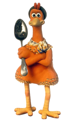
Even in a film like Chicken Run, where the aforementioned conical beaks are more detailed because the main characters need more variation in expression that the cones can't provide, it never leaves the realm of soft stylization and only vaguely resembles its realistic counterpart (even if I still find it kind of uncanny). Feathers are rarely emphasized, realistic materials only come from entire objects instead of different parts of characters, and everything is fit into a clay-like mold.

It's also worth noting that Aardman forgoes most permanent facial hair to instead opt for physical stretching of the face, like having skin-unibrows to convey emotion usually expressed by eyebrows. They stretch and squash character proportions to
convey expression, not to permanently stylize how the proportions are handled. Many characters remain proportioned reasonably like a normal human, with most of the exaggeration going towards the face (and the hands, for some reason).
Whereas this awful new wave still tries to be "realistic" to appeal to the faggots who're watching this and genuinely think raytraced Unity with hyper-realistic grass is the peak of graphical performance. It's uncanny- it's cartoonified proportions and realistic background mixing with psuedo-claymation 3D that's also trying to be 2D with its exaggerated expressions and physical comedy. It's a shit ton of stylistic clash that looks AWFUL and is arguably even worse than CalArts itself (AT LEAST THAT HAD SOME CONSISTENCY).


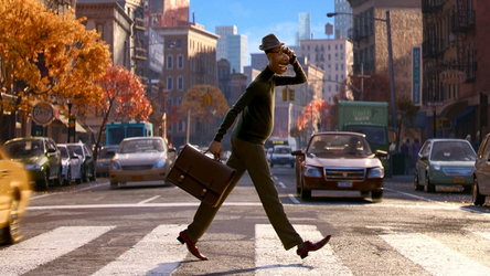
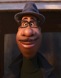
Look at this (first) picture. This is a cartoony man amongst realistic cars that are significantly smaller than him walking on a realistic road in a realistic city with realistic lighting. His hair is animated in such a way that you can almost see the individual bristles of his realistic mustache, and he's wearing realistic clothes.
But his proportions are completely abnormal. His head is shaped like a bowling pin, his cheeks and nose look like they've been badly stung by all manner of vespoids and left untreated for months, and his eyes are unnaturally small compared to everything else (including his glasses, which are typically meant to
emphasize the eyes instead of draw attention to how fucking small they are like they do here). His ears are barely visible, while his lips are enormous- with them taking up a solid 1/3 of his face (with another 1/3 being dedicated to his fuckhuge nose). This is does not change with expression- at least, not nearly to the same degree as Aardman- it remains consistent throughout most facial animation and is generally shown as "how the character looks".

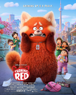
Here you have the same problems. Hyper-realistic fur on cartoony proportions on a very realistic background. And yet here you also see a mostly-simplified backpack (real ones usually have way more pockets; even the smallest ones have more detailing on the sides, like cupholders or other things) alongside a realistic briefcase, confusing the stylization further. The expressions are cartoony, the proportions are cartoony, the materials and background are all
very realistic.
I'm nowhere near an expert on this shit, so take my irritated rant with a grain of salt, but this kind of constant clashing drives me up a wall and I needed to rant about it. There's Aardman influence here, but (again) it's like they saw an Aardman film once or twice, took its proportions and rounding of everything, tried to force their own realistic and anime shit into it, and then drew it with their usual CalArts style and expected it to work.
shitty rant on stylistic clashing and bad interpretation of good influences over


