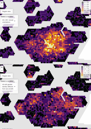
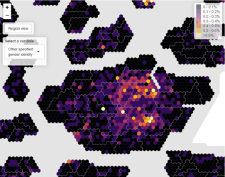
The data nerds in the Commons Library made an annoying to look at but insightful heatmap. You'd
generally expect LGB people and T people to show a similar distribution, as they'd go to more accepting areas - but they actually show the opposite distribution in many places.

LGB tends to concentrate towards Central London in this example and some of the nicer suburban areas. The T is predominately concentrated in shitholey bits of Outer London. There could be some confounding variables at play (e.g. trans people being poorer) but mostly these are areas with high concentrations of poorer immigrants, because they got confused by the question. If we accept confused ESL people are unlikely to say they're non binary or write in "gender dysmorphic bi-genitalia pansexuelle" into the other box, it makes more sense.

Concentrations around New Cross (Goldsmiths College), Brompton (Imperial College) Clapton (trendy expensive area) and Vauxhall (gay area). Which is about what you'd expect - reasonably well off younger people saying they're non-binary.
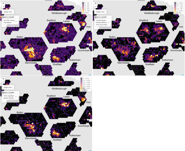
The trend is even more pronounced in Northern cities.

Generally speaking, data insights from the Census are used as an evidence base for policy decisions. I have to wonder if they're acknowledging that this data is shit, or if they're actually going to fund a bunch of transgender outreach programmes in Bolton and Bradford.


