- Joined
- Nov 14, 2012
bro LOOK AT THIS SHIT
they've been charging me $100/yr, I had set this up like 6 years ago for someone else and had put it on a personal card like a retard. i went to finally cancel this shit and this was the cancellation process.
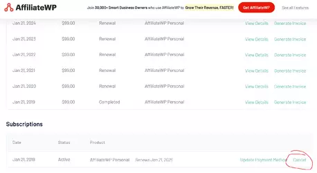
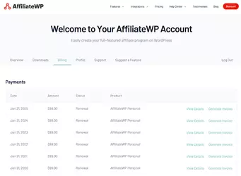
first, finding the fucking cancel button is an insane task. It's under billing but beneath all your invoices. cancel is a plain link. there is no way to cancel from the subscription page or your license page.
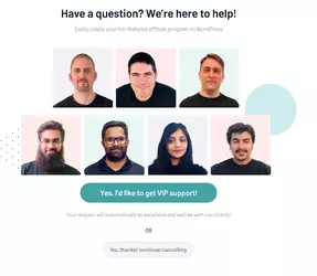
second, "lets make this right". they offer to let you contact someone for help in case you're a retard.
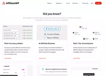
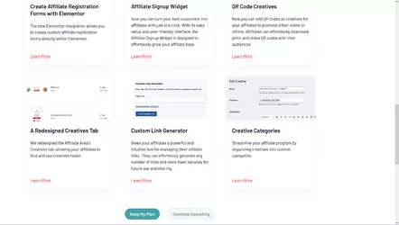
third, a HUGE fuckoff page with all sorts of bullshit that serves no purpose except adding another 3000 pixels to scroll past to find cancel.
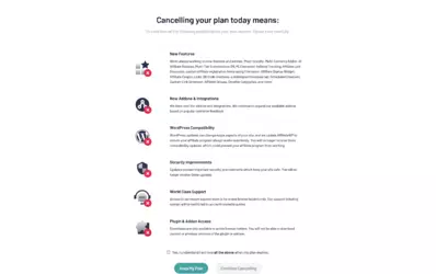
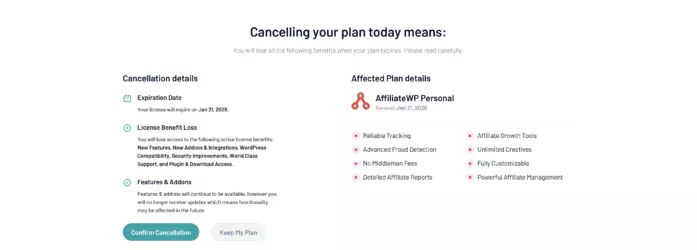
fourth, a confirmation page explaining YOU'RE A LOSER!! LOSING BIG BENEFITS!!! it even makes you click a little box to make sure you're SERIOUS.
(consumer reporting agencies find that every single click in a cancellation system has dropoffs)
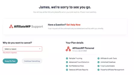
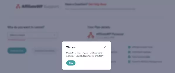
page five, you gotta tell em why. if you don't tell em why, they won't let you proceed. you can't just skip past this shit. you have to write something.
this one is the WORST page, because this one actually tripped me up and made me think that the cancellation was confirmed. The "We're sorry to see you go" message makes it look like it's all said and done, but it's accepting optional feedback. this is NOT the case, this is NOT a cancellation page, this is another cling page.
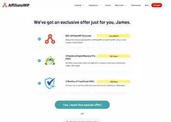
page six, now they're really desperate. Look, just click this button to get a fucking discount, idiot! we'll let you stop this shit if you just let us take 40$ a year instead!
page seven is the actual cancellation page, but there's a caveat: this is the ONLY PAGE where the primary button (green) is the cancel button. All prior pages emphasize the stay subscribed, but on THIS ONE they play a trick where if you click the faded button it just takes you back to the main page so you have to start all over again.
Their site is also slow as fuck. Each of these pages takes 5+ seconds to load. Google shows that the average web consumer these days expects loading times under 0.75 seconds. This is literal psychological warfare on the customer.
Every single page made me sit and stare for several seconds wondering if it finally got cancelled. These pages all look like cancel confirmation pages with other alternatives but none
they've been charging me $100/yr, I had set this up like 6 years ago for someone else and had put it on a personal card like a retard. i went to finally cancel this shit and this was the cancellation process.
first, finding the fucking cancel button is an insane task. It's under billing but beneath all your invoices. cancel is a plain link. there is no way to cancel from the subscription page or your license page.


second, "lets make this right". they offer to let you contact someone for help in case you're a retard.

third, a HUGE fuckoff page with all sorts of bullshit that serves no purpose except adding another 3000 pixels to scroll past to find cancel.


fourth, a confirmation page explaining YOU'RE A LOSER!! LOSING BIG BENEFITS!!! it even makes you click a little box to make sure you're SERIOUS.
(consumer reporting agencies find that every single click in a cancellation system has dropoffs)

page five, you gotta tell em why. if you don't tell em why, they won't let you proceed. you can't just skip past this shit. you have to write something.
this one is the WORST page, because this one actually tripped me up and made me think that the cancellation was confirmed. The "We're sorry to see you go" message makes it look like it's all said and done, but it's accepting optional feedback. this is NOT the case, this is NOT a cancellation page, this is another cling page.


page six, now they're really desperate. Look, just click this button to get a fucking discount, idiot! we'll let you stop this shit if you just let us take 40$ a year instead!

page seven is the actual cancellation page, but there's a caveat: this is the ONLY PAGE where the primary button (green) is the cancel button. All prior pages emphasize the stay subscribed, but on THIS ONE they play a trick where if you click the faded button it just takes you back to the main page so you have to start all over again.

Their site is also slow as fuck. Each of these pages takes 5+ seconds to load. Google shows that the average web consumer these days expects loading times under 0.75 seconds. This is literal psychological warfare on the customer.
Every single page made me sit and stare for several seconds wondering if it finally got cancelled. These pages all look like cancel confirmation pages with other alternatives but none


