- Joined
- Mar 29, 2014
Navigation
Install the app
How to install the app on iOS
Follow along with the video below to see how to install our site as a web app on your home screen.
Note: This feature may not be available in some browsers.
More options
Style variation
Apple's App Store art is fucking horrendous | Flat art / Alegria / Corporate Memphis - click for feet
- Thread starter Pissmaster
- Start date

- Joined
- Jan 4, 2020
Well, autistic people do tend to enjoy simple shapes and bright colors.
- Joined
- Aug 1, 2017
Are we at a point where there's specialized software to create these or are people still doing them by hand in illustrator or other vector software? A whole lot of the moving ones I see move in a very specific identifiable way with a very specific set of easing factors and timings and it reminds me of the early days of Flash where most movies were 12fps because nobody ever bothered to tweak the settings to look good.
Glad I'm not the only one who saw this shit. I wanted to post it here but closed it before I got a screen and was half convinced I hallucinated it.
Glad I'm not the only one who saw this shit. I wanted to post it here but closed it before I got a screen and was half convinced I hallucinated it.
PurpleMooCow
kiwifarms.net
- Joined
- Apr 12, 2022
HERE YOU GO
kiwifarms.net
- Joined
- Oct 31, 2020

what the fuck.
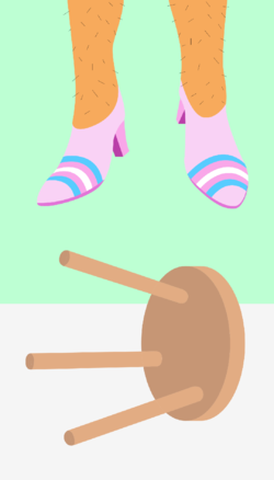
huge feet. huge hands. small heads.
hmm.. wait where have i seen this before.
small feet, small hands, huge heads.
i figured it out, it's reverse anime.
- Joined
- May 14, 2021
I think it’s a little of both. Tech startups (or really any startup for that matter) that don’t want to hire in-house artists to design their web UI can just buy a preset pack of .ai files and have an intern fuck around with the colors to match the vision of the management. Conversely, larger, more established companies can justify saving money by hiring on a revolving door of freelancers and ask them to work in this art style rather than take a perceived financial risk by doing something different. It also keeps those same employers from having to hire on artists full time and with benefits.Are we at a point where there's specialized software to create these or are people still doing them by hand in illustrator or other vector software? A whole lot of the moving ones I see move in a very specific identifiable way with a very specific set of easing factors and timings and it reminds me of the early days of Flash where most movies were 12fps because nobody ever bothered to tweak the settings to look good.
- Joined
- Mar 29, 2014
Also it's the inverse of what people consider cute, so cute must be "problematic" - along with beauty.small feet, small hands, huge heads.
i figured it out, it's reverse anime.
(and individuality too from the looks of it)
- Joined
- Apr 28, 2022
I hate both.I keep reading "Alegria" as "Algeria".

- Joined
- Jan 12, 2017
Big feet, big hands, huge heads. Still animu.small feet, small hands, huge heads.
i figured it out, it's reverse anime.

But your theory makes so much sense and I hate it.
- Joined
- Sep 26, 2019
Granted, that kind of style in anime (and JRPGs) was the thing to do throughout the 2000s. Looking for examples, I noticed that it's generally spunky characters that have the biggest feet, like the bigger the feet = the spunkier the character. Go figureBig feet, big hands, huge heads. Still animu.
View attachment 3227172
But your theory makes so much sense and I hate it.


- Joined
- May 29, 2021

- Joined
- Sep 12, 2018

They couldn't make this shit any less appealing if they tried.
- Joined
- Feb 7, 2021
The one silver lining for globo-homo art is that it makes it very easy to create shitposts out of their love of Bahaus minimalist art. In fact, there used to be threads in /pol/ that legitimately made such parodies of a parody of art.
So effective that mods in /pol/ would go out of their way to shoah the threads. Either shipping it to /bant/ or outright banning it.

So effective that mods in /pol/ would go out of their way to shoah the threads. Either shipping it to /bant/ or outright banning it.

Attachments
-
 1622712301034.png467.9 KB · Views: 489
 -
 1622712268220.png234.6 KB · Views: 509
 -
 1622712202736.png181.2 KB · Views: 514
 -
 1622712170526.png81.8 KB · Views: 517
 -
 1622712137746.png1,000.8 KB · Views: 529
 -
 1622712105259.png42.6 KB · Views: 521
 -
 1622712333466.png359.4 KB · Views: 482
 -
 1622712431201.png15.3 KB · Views: 457
 -
 1622712463010.png124.7 KB · Views: 704
 -
 1622712495176.png56.6 KB · Views: 477
 -
 1622712950225.png96.3 KB · Views: 465
 -
 1622714588604.png20.4 KB · Views: 472
 -
 1622719469522.png57.5 KB · Views: 483
 -
 1622721210909.png138.2 KB · Views: 488
 -
 1622712005729.png482.4 KB · Views: 477
 -
 1622711973347.png60.5 KB · Views: 431
 -
 1622691162703.png90.4 KB · Views: 420
 -
 1622692567051.png31.2 KB · Views: 417
 -
 1622697155927.png362.2 KB · Views: 434
 -
 1622699345779.png50.7 KB · Views: 457
 -
 1622708095785.png144.9 KB · Views: 471
 -
 1622708137888.png149.2 KB · Views: 456
 -
 1622708171025.png88 KB · Views: 443
 -
 1622711855506.png82.1 KB · Views: 419
 -
 1622709613301.png133.7 KB · Views: 421
 -
 1622709418861.png196.3 KB · Views: 408
 -
 1622708462515.png48.9 KB · Views: 415
 -
 1622708430131.png85.3 KB · Views: 436
 -
 1622708271824.png125.1 KB · Views: 450


- Joined
- Apr 12, 2021
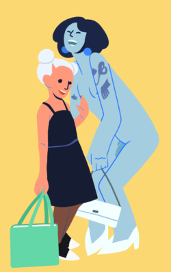
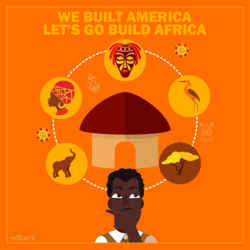
I see they’ve changed their packaging since the White Pride Skittles:View attachment 3254360
They couldn't make this shit any less appealing if they tried.

- Joined
- Oct 19, 2018
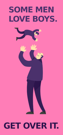
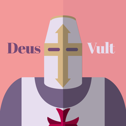
Say what you will about the message but this is a nicely executed attempt at Art Deco composition (these faces though) and yes I will die on this hill.
- Joined
- May 25, 2013
reminds me of those weird murals at Denver International Airport
- Joined
- Apr 19, 2017
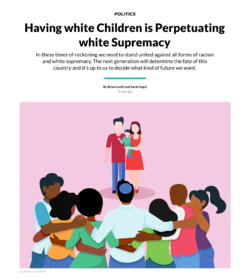
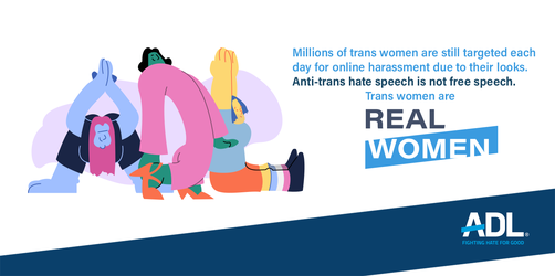
Tried to post this the other day, but the site wouldn't cooperate. Stolen from @JambledUpWords

Seems like the lady shit this out real quick after the shootings. But wait, it gets better:

It's all the typical pro-woman, pro-black, fuck wypipo, troon worshipping garbage that these talentless lazy hacks love so much. A lot of 3rd and 4th generation Asian American "artists" love to play the equality card while taking a dump on white people and "whiteness" as a whole, and Courtney is no exception.

Woah there, Courtney, you might want to check your WHITE PASSING privilege with your white lady name, bad dye job, and freedom to shit on entire groups of people as part of your "designer" career.
- Joined
- Oct 6, 2016
I like how the text is in this dumpy ugly font that then has to be microscopic to fit in all the retarded talking points.Tried to post this the other day, but the site wouldn't cooperate. Stolen from @JambledUpWords
View attachment 3323952
Seems like the lady shit this out real quick after the shootings. But wait, it gets better:
View attachment 3323985
It's all the typical pro-woman, pro-black, fuck wypipo, troon worshipping garbage that these talentless lazy hacks love so much. A lot of 3rd and 4th generation Asian American "artists" love to play the equality card while taking a dump on white people and "whiteness" as a whole, and Courtney is no exception.
View attachment 3324001
Woah there, Courtney, you might want to check your WHITE PASSING privilege with your white lady name, bad dye job, and freedom to shit on entire groups of people as part of your "designer" career.
- Joined
- Mar 12, 2019
Even as a kid I found that design kind of weird. It gives off creepy hippy vibes (probably because they were designed by then middle aged boomer hippies).I stumbled upon some examples of corporate artstyle of the 90's and immediately thought of this thread.
View attachment 3052555View attachment 3052556View attachment 3052559View attachment 3052560
Turns out it has a name, it's called "Global Village Coffehouse". I'm not gonna go explain its background or the themes it tries to convey, you can look it up yourself. What I'm thinking of is: sure, it looks more appealing than Alegria, but is it really so, or it is just my nostalgia speaking?
What do you think?
The thing is it still has some soul to it. The one of the reasons modern corporate design feels souless even by the standards of corporate aesthetics of the past is the use of prefabed vector images. Someone had to sit down and draw those images. Nowadays its people picking out refabbed assets and changing some colors around.
And we have to remember the overall business culture of today, which is now dominated by middle aged millenials (the decedents of the creepy hippies), who despise anything that is remotely transgressive or challenging. This shit usually goes for this forced feeling of child like exuberance with bright cheery cartoon characters, that just rings hollow and fake (they'll use light pastel colors and even throw in some shading when they want to add an air of sophistication). This cartoony bullshit comes off really fucking weird when they use it with anything involving sex.
- Joined
- Aug 1, 2017
Global Village has a special place in my heart for manufacturing the modem I first used to get online (whee 2400 baud) so I automatically associate coffeehouse with telephony and bbs/usenet shitposting. It also translates very well to low resolution so if you were digging around inside the system on an early Mac and saw the coffeehouse guy icon on something you'd know it was some part of the tcp dialup stack. I think the whole Allegria movement would be less grating if it had a defined meaning like that instead of being everywhere in every context.