- Joined
- Jun 2, 2019
Navigation
Install the app
How to install the app on iOS
Follow along with the video below to see how to install our site as a web app on your home screen.
Note: This feature may not be available in some browsers.
More options
Style variation
You are using an out of date browser. It may not display this or other websites correctly.
You should upgrade or use an alternative browser.
You should upgrade or use an alternative browser.
Flags & Vexillology
- Thread starter Null
- Start date
-
🐕 I am attempting to get the site runnning as fast as possible. If you are experiencing slow page load times, please report it.
- Joined
- Nov 24, 2024
- Joined
- Oct 19, 2024
My personal favorite flag has to be the Republic of Venice.
It manages to break literally every rule of vexillology by including at least a half dozen colors, being so complicated that it takes a paragraph to describe, and has possibly the strangest silhouette of any flag ever designed (the rectangular segments to the right are actually streamers that fly separately from each other), but it still somehow works as a coherent and elegant design completely unmistakable even when drastically simplified or seen at a distance on a naval battlefield.

It manages to break literally every rule of vexillology by including at least a half dozen colors, being so complicated that it takes a paragraph to describe, and has possibly the strangest silhouette of any flag ever designed (the rectangular segments to the right are actually streamers that fly separately from each other), but it still somehow works as a coherent and elegant design completely unmistakable even when drastically simplified or seen at a distance on a naval battlefield.
- Joined
- Dec 25, 2020
In the state I reside in, Illinois, they are working on choosing a new flag. Here are the 10 finalists; personally I don't mind the current one, but I would say it's a bit clustered. I'm curious to see what the vexillologists here would say would be the best option/way to go.
Info on the final flags can be found here (A).
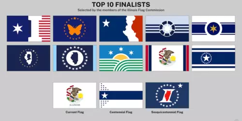
Here is a larger image of the current Illinois flag:
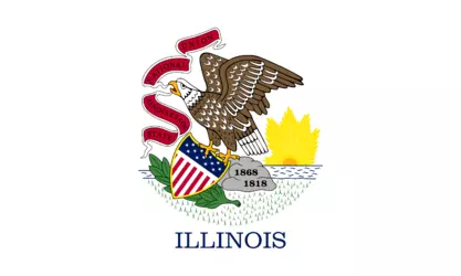
Info on the final flags can be found here (A).

Here is a larger image of the current Illinois flag:

- Joined
- May 30, 2023
I like the butterfly flag, the other ones seem too abstract. Plus, no other state has a butterfly on it so you would be immediately distinct.In the state I reside in, Illinois, they are working on choosing a new flag. Here are the 10 finalists; personally I don't mind the current one, but I would say it's a bit clustered. I'm curious to see what the vexillologists here would say would be the best option/way to go.
Info on the final flags can be found here (A).
View attachment 6771174
Here is a larger image of the current Illinois flag:
View attachment 6771193
Meriasek
kiwifarms.net
- Joined
- May 16, 2020
- Joined
- Dec 9, 2019
First two are the best. Third one is impossible to draw. The ones with single stars and some stripes are North Korea coded. The last one looks like an airline logo.
- Joined
- Nov 27, 2024
I had the idea of redesigning the Philippine flag with pan-Arab colors and changing the sun on it to look more like the star on the flag of Jordan.

After making that I made this. I have no use for it at the moment but it does look nice.

After making that I made this. I have no use for it at the moment but it does look nice.
- Joined
- Oct 19, 2024
Really, the main issue with the current flag isn't that it's ugly, necessarily. Official seals just aren't great vexillogical elements, at least in most cases. They're complicated, with lots of small details that don't show up well at a distance, and they usually don't use the same kind of color scheme that you want for a flag (where the best designs are generally going to have a small number of somewhat bold, gently contrasting color fields; seals are more likely to use a naturalistic style). In the US, too, several states use them on their flags, which makes them harder for a casual observer to differentiate at a glance, and leads to a feeling that they're bland and derivative when set side by side. That's exactly what you don't want people to feel when they look at the single most widespread and recognizible symbol for your state, unless of course you're from West Virginia and are too neurologically crippled by generations of incest and exposure to coal mine run-off to understand the concept of intentional misrepresentation.I'm curious to see what the vexillologists here would say would be the best option/way to go.
Most of the contenders are definitely better from an aesthetic perspective. Even the one that just adds vertical red and blue stripes to both edges of the white field at least manages to be marginally less boring and more creative (although honestly, the main advantage is that it actually looks like a flag; the current one is literally just the seal placed dead center on a white background).
Where a lot of them start to seem like they're not really suitable replacements is in the fact that this is supposed to be a state flag, very few of which are well-known enough to have inherent symbolic meaning for the general population outside the state itself. That is, unfortunately, the most likely reason for so many to include seals, writing, or both. My personal favorite, taking only its visual appeal into account, would be the second from the left on the top row. Love the simple colors, love the Minimalist style, love how it's obviously a body of water just based on the weighting of the layout. What the fuck does a life preserver have to do with Illinois, though, and why is the entire field Lake Michigan? Honestly, it would be perfect for Chicago if you ditched the PFD and replaced it with the city's horizontal line of three six-pointed stars. The fact that the thin blue rows above the blue field seem to be the Great Lakes mirage, which allows you to see Chicago over the curvature of the Earth, works ridiculously well for that...and also for deliberately ignoring the overwhelming majority of a state known primarily for its vast stretches of prairie and farmland. Recognition is an issue for all of the other abstract options, too, to a greater or lesser degree. That six-pointed star is unique to Illinois, but it can't pull the same weight as the lone star does for Texas, or the Big Dipper and Polaris for Alaska. The center flag in the second row down actually manages to throw in a shitload of very appropos symbolism, with green rows for cropland, blue for both the sky and the lake, and Chicago's three stars on the "shoreline" near a rising Sun, but it's meaningless if you're unfamiliar with the star. Some others have the star as literally the only part easily readable as representing anything specific without the designer's commentary.
The center top flag really deserves to be mentioned separately from the other abstract designs, because Jesus Christ. Usually, if I know what the flag itself represents, I can figure something out about some of the individual elements. The best I can do here is that it kind of looks like the Major League Baseball logo, and the Cubs are from Chicago. I'm sure that horrible eldritch shape in white has some significance, it's too detailed not to, but the only thing that comes to mind is the Japanese urban legend of the Kunekune, a wiggly white abomination that stands out in rice fields on hot summer days and drives anyone who looks upon it to madness. There's sort of a vague suggestion, conveyed entirely via the layout (and very poorly, if it's actually deliberate) of the shoreline, but then why use a jarring color contrast to inundate the land beneath the waters of the deluge, while turning Lake Michigan into a sea of blood? Also, that fucking star, oh my God. I kind of miss all those other attempts to turn the one purely Illinoisan hallmark into the new lone star, because the designer of this flag seems to have consciously chosen not to add anything reasonably correlated to the state by using the most generic possible star shape instead. Art uses imagery to communicate, and this artist is clearly transcribing some forbidden language channeled by an old seaman from the merchant marine who jumped ship with a stolen lifeboat in the Drake Passage for reasons still unknown, then turned up blind and naked on the shoreline in Southern Argentina, whispering about eyes in the deep. In summary, they are clearly trying to wake something up from its million year slumber by passing ritual glyphs off as a flag, and I would not have sex with them.
With that, only a few options are left. Top left is obvious because it's an "I". You can sometimes get away with text on flags, and this one pulls it off. It's got that star, but it's not isolated like in the others. If you told me this was a state flag, I would immediately guess Illinois. Immediately afterward, though, I would ask why Illinois' flag was so ugly. It's right out. Assuming that the sesquecentennial flag is involved in the contest, it's probably the one that manages to cram the most Illinois stuff into that little rectangle, monogramming a state map to avoid any risk of confusing it with Hawaii (and here, again, I miss the star; if you're going to put up that many chips, just go all in). Here, though, the "I" does look tacky, so no. The left two flags on the second row from the top are, in my opinion, the best. The design's simple, it's clearly the outline of Illinois, and the Abraham Lincoln silhouette is a nice touch that's also pretty recognizable. I prefer the leftmost of the two, just because the size of Illinois on the second feels too large for its layout and works better broken up into a less monotonous shape, but they're both nice.
Really, though, they're all better choices than the current flag. Well, almost all of them are, anyway. I refuse to think about that thing sitting top row center anymore than I already have. Tbh, the possibility that it might be some kind of contagious meme that cements itself in your mind and turns you into something no longer truly human has just occurred to me. While that's unlikely, I've already had too much exposure while describing it. I refuse to go back up on that roof to shovel any more debris until I know that what I'm handling is not, and has never been, part of an active nuclear reactor.
Last edited:
- Joined
- Feb 6, 2018
That's way too much going on there, and it's super hard to recreate for a mercantile vessel to fly. As a banner or standard, sure, but I can't imagine any premodern fleet being able to produce these en masse and fly that flag on all their vessels in order to identify their ships. This is the medieval equivalent to the US state flags that just have super ornate seals/coats of arms on them.My personal favorite flag has to be the Republic of Venice.
It manages to break literally every rule of vexillology by including at least a half dozen colors, being so complicated that it takes a paragraph to describe, and has possibly the strangest silhouette of any flag ever designed (the rectangular segments to the right are actually streamers that fly separately from each other), but it still somehow works as a coherent and elegant design completely unmistakable even when drastically simplified or seen at a distance on a naval battlefield.
View attachment 6760186
- Joined
- Jun 2, 2019
- Joined
- May 14, 2022
anybody have the flags of the cossacks during that ww2 thing

Xenu
kiwifarms.net
- Joined
- Feb 5, 2024
I've been playing flagle (or flaggle), a game where you are given a blank flag while you try to guess what nation where its from, while each wrong guess reveals a bit more of it. Now there are some flags that are hard to guess and some of them I find very frustrating, now I would like to share this experience in this thread so that you can also find how bullshit some of them are. I will go from easiest to hardest with the following flags that are presented for you to guess before clicking on the spoiler.
This flag is pretty easy to guess

Malta, not a hard one since it's popular for being one of the smallest nations in Europe and their unique history of the Knights Hospitaller presence in the region.
Another one to guess although very obvious know which is from.

Paraguay, although this flag is already showing its country's name, it's a bit difficult to guess if the coat of arms is hidden when you are playing flaggle but it's easy to tell it's not the Netherlands if the color at the top or bottom is vibrant or not.
Now this is where it gets a bit difficult, most of these countries you may not heard of because they don't appear much in the news headlines.

Tajikistan, if you know which continent that is Central Asia, then you would imagine trying to guess which '-stan' flag its from, is it Uzbekistan? No, is it Kyrgyzstan? No that one has a red Xbox logo on it, is it Turkmenistan? Oh screw this, how the hell am I suppose to know which stan flag it is.
Now lets head over to the African continent, now I gave the hint away because almost every country in that shithole has awful flag design so it is hard to tell which flag its from or perhaps that you have never heard that country before.

Benin, I like its format.

Burundi.

Burkina Faso, looks awful to look at.
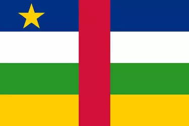
Central African Republic.
I find the continent of Africa difficult since it has so many shitholes in the Sub-Saharan region with shitty flags that they're not iconic for me to even remember.
Although here's one of the Caribbean, also a difficult continent.
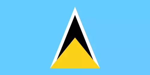
Saint Lucia, a name I haven't heard of before.
Now here's one that's complete bullshit.
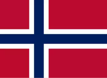
Svalbard and Jan Mayen, for some reason it's considered as a separate country despite being part of Norway, WTF? I kept guessing Norway until it told me that its isn't, I'm still calling them Norway because that answer is retarded.
In the beginning I mentioned two different words of flagle and flaggle, flagle (flagle.org or flagle.io) has the easiest ruleset while flaggle (flaggle.net) is hardmode for vexillologists, just for clarification if anyone wants to play the game.
This flag is pretty easy to guess

Malta, not a hard one since it's popular for being one of the smallest nations in Europe and their unique history of the Knights Hospitaller presence in the region.
Another one to guess although very obvious know which is from.

Paraguay, although this flag is already showing its country's name, it's a bit difficult to guess if the coat of arms is hidden when you are playing flaggle but it's easy to tell it's not the Netherlands if the color at the top or bottom is vibrant or not.
Now this is where it gets a bit difficult, most of these countries you may not heard of because they don't appear much in the news headlines.

Tajikistan, if you know which continent that is Central Asia, then you would imagine trying to guess which '-stan' flag its from, is it Uzbekistan? No, is it Kyrgyzstan? No that one has a red Xbox logo on it, is it Turkmenistan? Oh screw this, how the hell am I suppose to know which stan flag it is.
Now lets head over to the African continent, now I gave the hint away because almost every country in that shithole has awful flag design so it is hard to tell which flag its from or perhaps that you have never heard that country before.

Benin, I like its format.

Burundi.

Burkina Faso, looks awful to look at.

Central African Republic.
I find the continent of Africa difficult since it has so many shitholes in the Sub-Saharan region with shitty flags that they're not iconic for me to even remember.
Although here's one of the Caribbean, also a difficult continent.

Saint Lucia, a name I haven't heard of before.
Now here's one that's complete bullshit.

Svalbard and Jan Mayen, for some reason it's considered as a separate country despite being part of Norway, WTF? I kept guessing Norway until it told me that its isn't, I'm still calling them Norway because that answer is retarded.
In the beginning I mentioned two different words of flagle and flaggle, flagle (flagle.org or flagle.io) has the easiest ruleset while flaggle (flaggle.net) is hardmode for vexillologists, just for clarification if anyone wants to play the game.
GothicArchitectureEnjoyer
kiwifarms.net
- Joined
- Jul 13, 2024
I'm a fan of alternate history, so I tried my hand at a couple alternative history flags.
The flag of Norway in a world where Jesus was ran over by a 2004 Ford Focus:

The flag of Romania in a world where Vlad the Impaler actually was a vampire and was still in charge and was also gay and drove a 2004 Ford Focus:

The flag of Norway in a world where Jesus was ran over by a 2004 Ford Focus:
The flag of Romania in a world where Vlad the Impaler actually was a vampire and was still in charge and was also gay and drove a 2004 Ford Focus:
- Joined
- Jan 23, 2024
Tbh, I like the redesign that is just the old flag, but with the red and blue stripes on the side and the removal of "ILLINOIS" below the seal. The rest of the flags look mostly trashy though. The one with Lincoln's silhouette is a nice idea, but is otherwise bland. As I type this I just realized that the top middle flag is also doing something similar with his face and the Western border of the state, but man, it just does not look appealing.In the state I reside in, Illinois, they are working on choosing a new flag. Here are the 10 finalists; personally I don't mind the current one, but I would say it's a bit clustered. I'm curious to see what the vexillologists here would say would be the best option/way to go.
Info on the final flags can be found here (A).
View attachment 6771174
Here is a larger image of the current Illinois flag:
View attachment 6771193
However, the Illinois State Flag will never be as good as the flag of its superior neighbor, Missouri


This is the second only state flag (besides California) to feature bears on it. They are grizzlies as well, which aren't even native to Missouri lol.
- Joined
- Feb 6, 2018
ChompChomp
kiwifarms.net
- Joined
- Feb 2, 2025
Wasn't Lincoln born in Kentucky?In the state I reside in, Illinois, they are working on choosing a new flag. Here are the 10 finalists; personally I don't mind the current one, but I would say it's a bit clustered. I'm curious to see what the vexillologists here would say would be the best option/way to go.
Info on the final flags can be found here (A).
View attachment 6771174
Here is a larger image of the current Illinois flag:
View attachment 6771193
Also, I'll never unsee this.

- Joined
- Sep 15, 2024
Karakhalkin-Gol
kiwifarms.net
- Joined
- Feb 1, 2021
I wish the middle row, far-right one would win, even if it’s only because it bears a superficial resemblance to the North Korean flag.In the state I reside in, Illinois, they are working on choosing a new flag. Here are the 10 finalists; personally I don't mind the current one, but I would say it's a bit clustered. I'm curious to see what the vexillologists here would say would be the best option/way to go.
Info on the final flags can be found here (A).
View attachment 6771174
Here is a larger image of the current Illinois flag:
View attachment 6771193
Thread tax:
This is the current flag of Mississippi. I do not like it. The only item on the flag that clearly represents their heritage is the flower. I don’t like the thin stripes being yellow, and the top middle star being bronze irks me.

I find the older state flag much more appealing. I appreciate the straightforward representation of their southern heritage.

Last edited:


