- Joined
- Dec 17, 2019
Simple mockup of the extent Discord's rating system should be copied:

You don't want >3,700 unique emotes but you do want this form of displaying them under posts. The same way they show up in the current post reaction summary, but truncated to the icon and count only. That's how I did this mockup. And replacing the "Like" button with a "React" button since alarm clocks, trash cans and top hats aren't exactly a gesture of thumbs up.
Oh yeah, by clicking, for example, the "Informative" icon/count, it wouldn't add the "Informative" reaction, but would instead bring up the list of users who reacted to the post with that reaction. Giving reactions should stay as-is, in the reaction selection menu. Keep in mind that there is no cursor on mobile and even on desktops people generally don't understand that there are hover over functions, like with the greyed out Quote and Reply buttons, so making it clear that something is clickable and then have it do something on click is the best way to do it from the user experience standpoint.
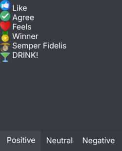
Speaking of, I'd also change the behavior of the "React" button so that it doesn't have a hover over functionality, but instead opens up something like this after being pressed:

Just a rough mock-up but IMO this would be the ideal design for the reaction picker. The current Facebook approach is just bad with this amount of reactions that unlike on Facebook aren't all positive. It's also more text heavy, which improves usability. The category names are in text, and besides the reaction icons you have their names visible by default.
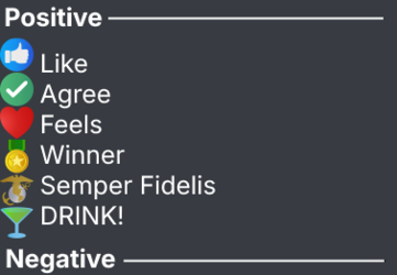
Alternatively, you could ditch the categories and instead have a single scrollable list with categories, since probably there aren't that many reactions to warrant category tabs, so something like this would be simpler and more user friendly. All reactions would be visible by default, less is more, the KISS principle and so on.

You'll want some sort of categorization and ditching of the Facebook style pop-up selector with the current amount of reactions available, just look at this:

It's 60% of the width of the post you're reacting to, it's silly and will get janky on narrower screens. A pop-up list would be the best way to handle it, it's readable, easy to use and scales well. It's also why browsers need to start moving away from the silly horizontal tab bar and implement vertical tab lists but I digress.
It's what I already said but with a bit of visualization. The current system is fine, but this is what I believe would make it more usable and manageable, both from the user standpoint and the admin standpoint if you were to add more reactions, assuming that the reason you've decided to not add any more is because of the current clutter from the UI standpoint. A list selector would alleviate that.

You don't want >3,700 unique emotes but you do want this form of displaying them under posts. The same way they show up in the current post reaction summary, but truncated to the icon and count only. That's how I did this mockup. And replacing the "Like" button with a "React" button since alarm clocks, trash cans and top hats aren't exactly a gesture of thumbs up.
Oh yeah, by clicking, for example, the "Informative" icon/count, it wouldn't add the "Informative" reaction, but would instead bring up the list of users who reacted to the post with that reaction. Giving reactions should stay as-is, in the reaction selection menu. Keep in mind that there is no cursor on mobile and even on desktops people generally don't understand that there are hover over functions, like with the greyed out Quote and Reply buttons, so making it clear that something is clickable and then have it do something on click is the best way to do it from the user experience standpoint.
Speaking of, I'd also change the behavior of the "React" button so that it doesn't have a hover over functionality, but instead opens up something like this after being pressed:

Just a rough mock-up but IMO this would be the ideal design for the reaction picker. The current Facebook approach is just bad with this amount of reactions that unlike on Facebook aren't all positive. It's also more text heavy, which improves usability. The category names are in text, and besides the reaction icons you have their names visible by default.
Alternatively, you could ditch the categories and instead have a single scrollable list with categories, since probably there aren't that many reactions to warrant category tabs, so something like this would be simpler and more user friendly. All reactions would be visible by default, less is more, the KISS principle and so on.

You'll want some sort of categorization and ditching of the Facebook style pop-up selector with the current amount of reactions available, just look at this:

It's 60% of the width of the post you're reacting to, it's silly and will get janky on narrower screens. A pop-up list would be the best way to handle it, it's readable, easy to use and scales well. It's also why browsers need to start moving away from the silly horizontal tab bar and implement vertical tab lists but I digress.
It's what I already said but with a bit of visualization. The current system is fine, but this is what I believe would make it more usable and manageable, both from the user standpoint and the admin standpoint if you were to add more reactions, assuming that the reason you've decided to not add any more is because of the current clutter from the UI standpoint. A list selector would alleviate that.